A distributor checks an order before calling the manufacturer. A dealer looks for vehicles that need attention. A service partner finds the customer record behind a request. These are everyday jobs, and they make a useful starting point for an industrial portal. Give each one a clear route, the information needed to make a decision and an understandable next step.
Our selection of the best industrial distributor portal examples for 2027 brings together three complementary references. FleetEdge shows a commercial vehicle dealer workspace in detail. Propigô shows how a distributor-facing interface can organise payments, customers and requests. Bosch Rexroth’s public account and store documentation shows how an industrial manufacturer explains different customer relationships and ordering routes.
The selection is an editorial guide to planning, rather than a performance ranking. The examples are existing projects and services reviewed for a 2027 brief. The two visual case studies come from their creators’ public Behance presentations; the Rexroth example comes from public manufacturer documentation. We distinguish what those materials show from what we recommend for your own portal.
For the public-facing part of the journey, explore our industrial website design examples for 2027. For product selection before or after sign-in, see our industrial digital catalogue examples for 2027. This guide follows the relationship further, into the tasks a partner returns to complete.
What makes a useful industrial distributor portal example
We looked for visible work: customer records, filters, requests, equipment information, roles and routes through several connected screens. A polished entry page helps establish an identity, but a portal brief also needs to explain what happens once the partner gets inside. That is why these examples include dense working interfaces alongside the ideas behind them.
Each reference contributes something different. FleetEdge connects the dealer to an installed fleet. Propigô gives several tasks a consistent navigation system. Rexroth makes account type part of its public explanation. Use those strengths to build a brief around your distribution model, whether your partners sell products, support installed equipment or coordinate a continuing service relationship.
Explore FleetEdge’s dealer screens · Explore Propigô’s distributor workspace · Review Bosch Rexroth’s account model · Build your 2027 portal brief · Read the portal questions
FleetEdge makes the dealer relationship visible after the sale
FleetEdge’s dealer presentation puts customers, vehicles and service information into a coherent workspace. Aditya Jha’s case study for Tata Motors is particularly useful because it shows the interface alongside the reasoning behind it. The project boards are dated 2023 and the Behance presentation was published in 2026. We selected it as an existing design reference for a 2027 portal brief, with its commercial vehicle context kept intact.
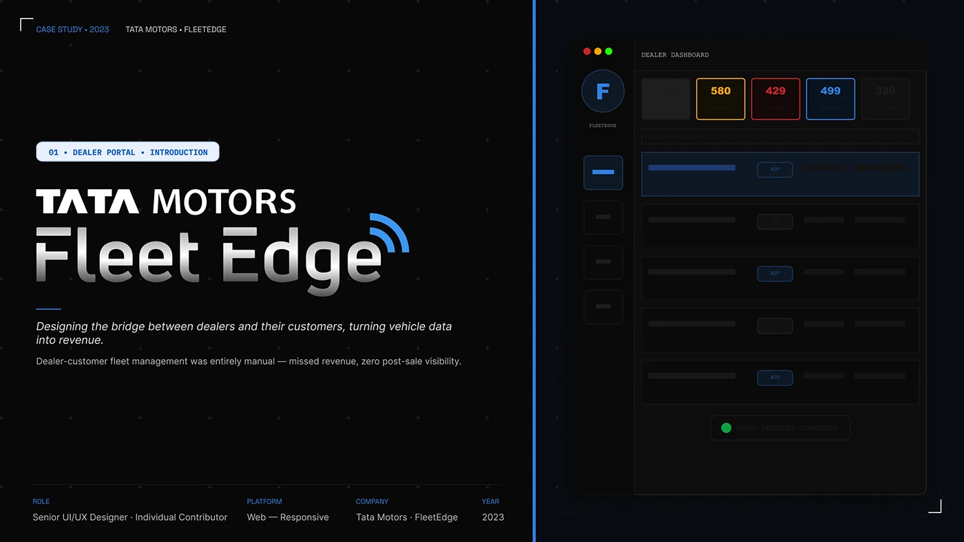
The opening board gives the product a strong identity and sketches the dealer dashboard. Its proposition is a continuing relationship with the customer’s vehicles. For an industrial manufacturer, start the same conversation with the installed product: what should the partner be able to find after delivery, and what useful action can they take with that information?
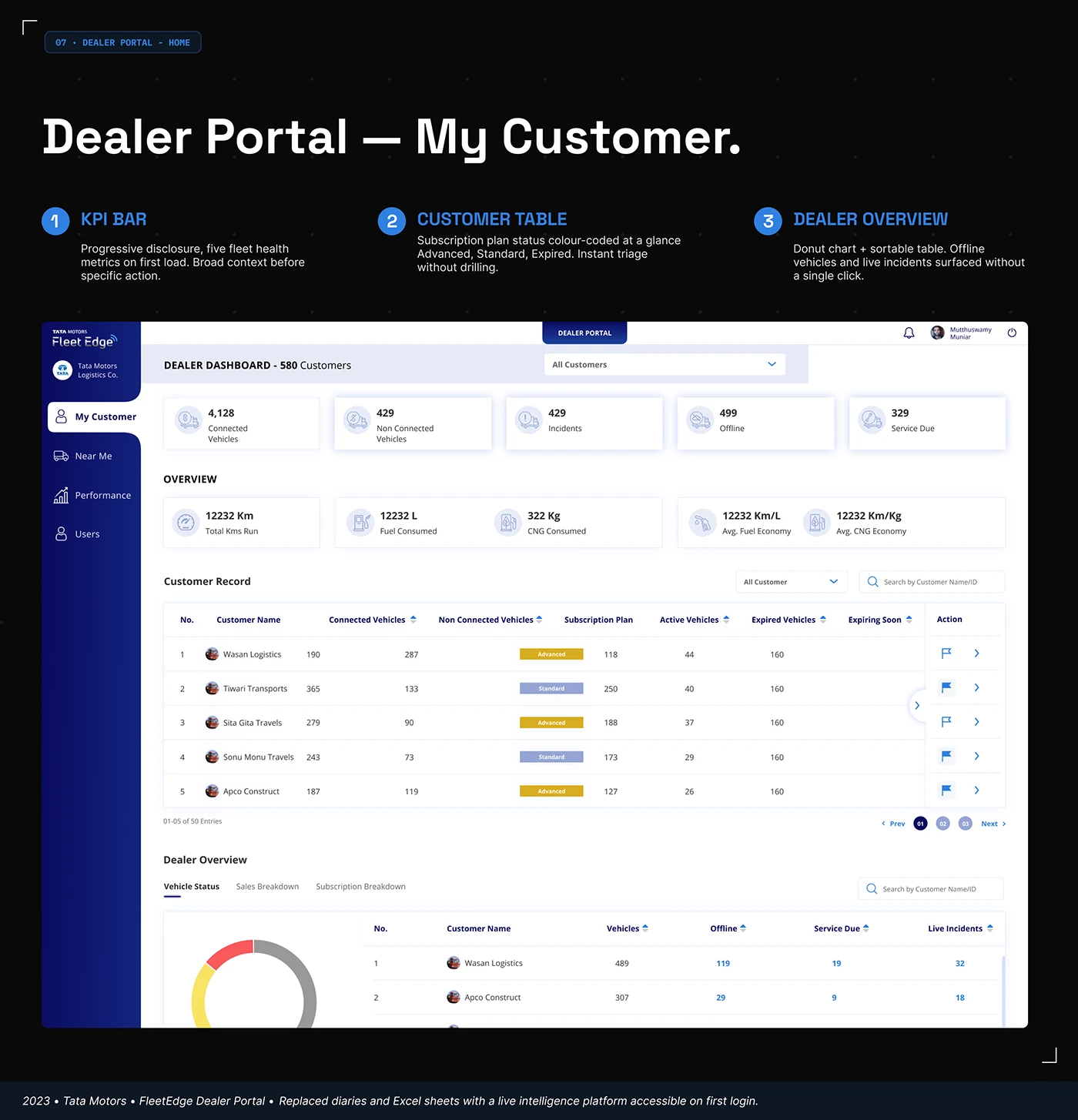
The My Customer screen gives the question a detailed visual answer. Fleet condition cards sit above searchable customer records and a dealer overview. Subscription badges and action columns give individual records a place in the wider picture. The hierarchy moves from a broad summary to a specific account. In your own portal, choose the first screen from the decisions a partner makes at the start of their working day.
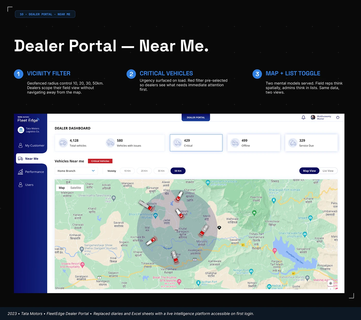
Near Me changes the view to a map without abandoning the navigation. Branch, distance and critical-vehicle controls appear alongside a map and list choice. This makes location a useful way into the records. A portal for service partners could benefit from a similar arrangement where authorised location information supports their task. A parts distributor may instead need a warehouse or delivery-location view. The map earns its place through the work it helps organise.
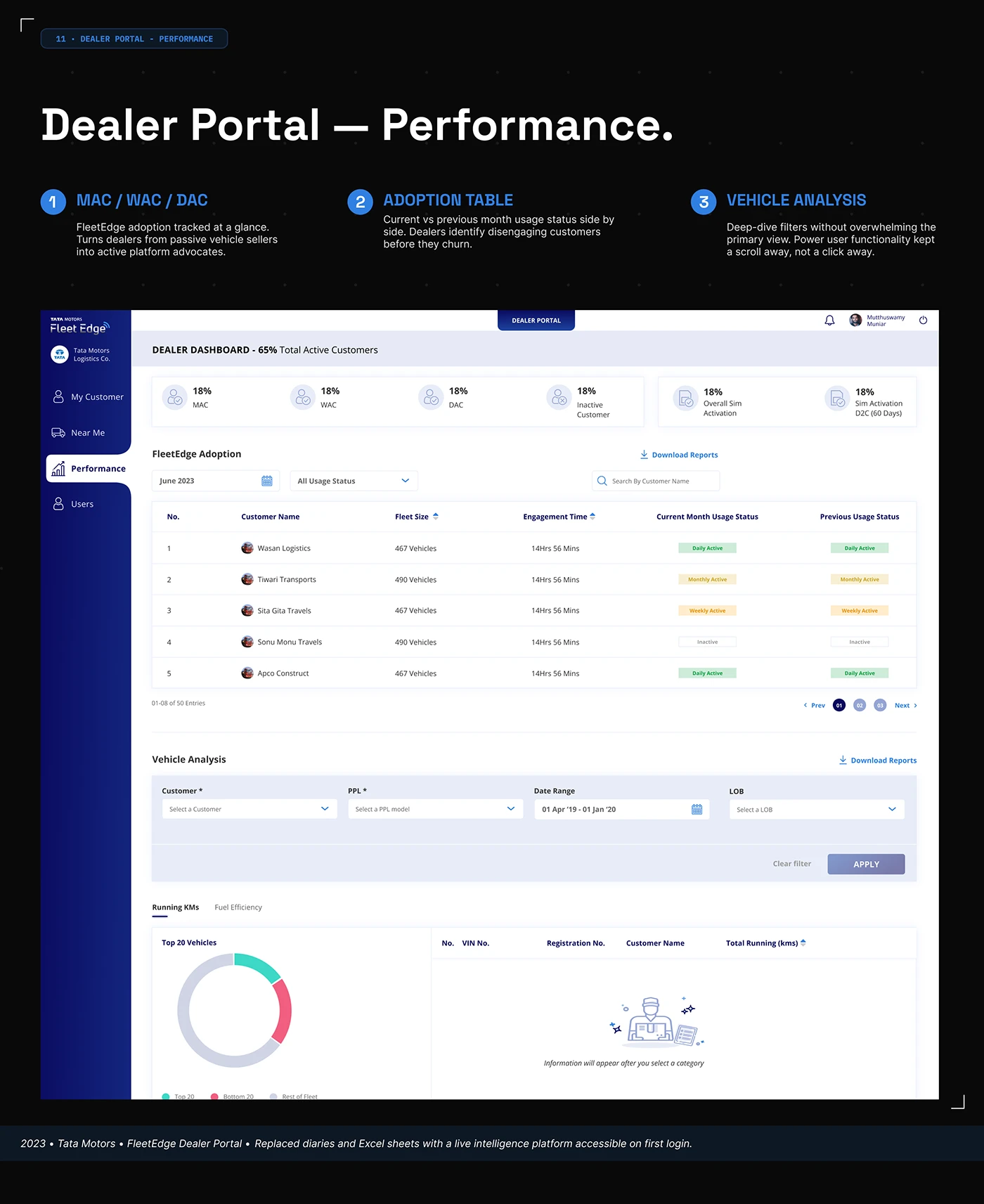
The Performance screen pairs account activity with filters and a comparison of current and previous usage states. Further down, a vehicle-analysis area asks the user to select a category before displaying information. That empty-state message is a small, worthwhile detail. It explains what to do next. For your own portal, review the screen before any filter is selected as carefully as the screen after a successful search.
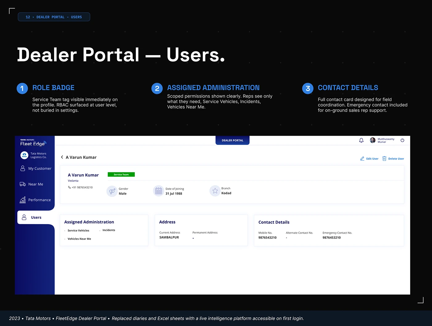
The Users design gives the role a visible badge and places assigned administration alongside the profile. Edit controls and contact information have their own positions. We can inspect that layout; we cannot validate access enforcement from it. The design lesson is to make the account context understandable. Decide which responsibilities need to be explained on screen and which actions belong to the person viewing the profile.
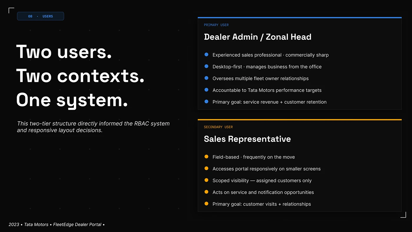
The role board distinguishes an office-based dealer administrator from a field sales representative. Their starting points differ even when they work with the same customers. Use that distinction to plan the review. An account manager at a desk may compare several records; a representative on a visit may need one record and one next action. Give both a genuine task, then see where their routes can share a system.
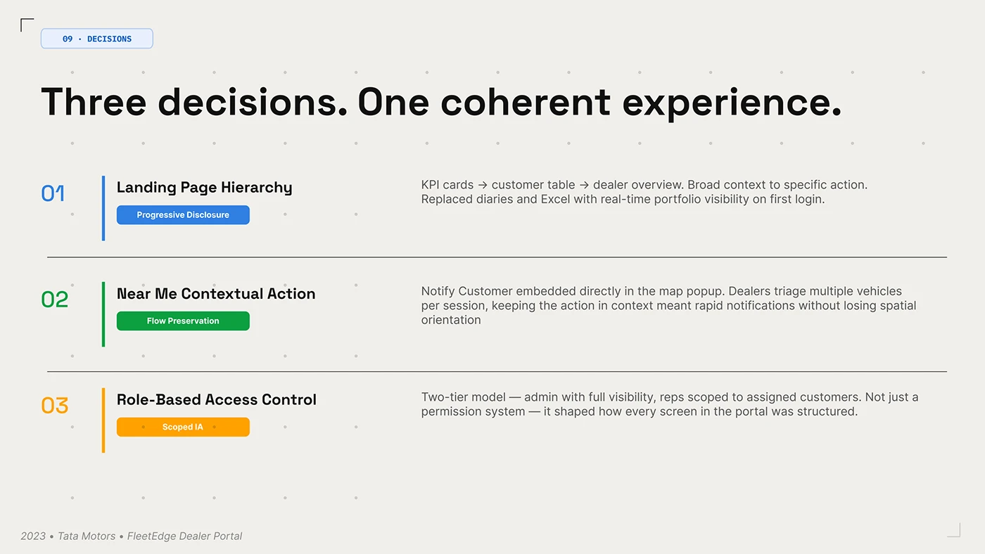
The decisions board connects the homepage hierarchy, a proposed contextual customer notification and the role model. It shows how navigation, action and scope can be planned together. The notification behaviour is the designer’s description, rather than something we have tested. For your own design, keep an action close to the information that explains it and specify what context survives when the person starts that action.
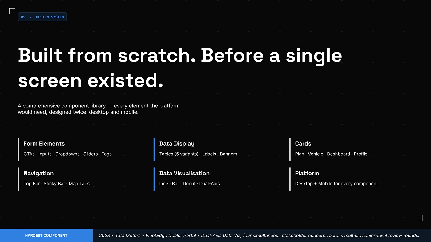
The component inventory includes forms, tables, cards, navigation and charts across desktop and mobile. A portal brief can use this as a practical checklist. Choose one demanding table, one long form and one status-rich record before approving the visual system. Those examples reveal whether the proposed type, spacing and controls can carry real work across the different pages.
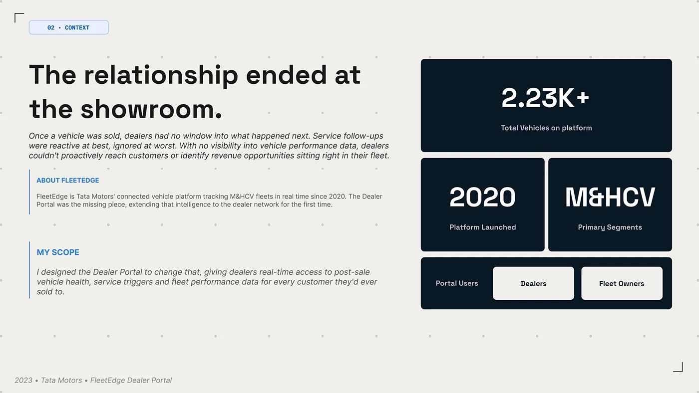
The context board places the dealer and fleet owner within the same product story. The useful question extends beyond a single dashboard: what information does the partner need to maintain the relationship? Build that question into a manufacturer’s brief using a real installed product, a service request and the person responsible for responding. The board’s displayed scale figures are not the basis of our selection.
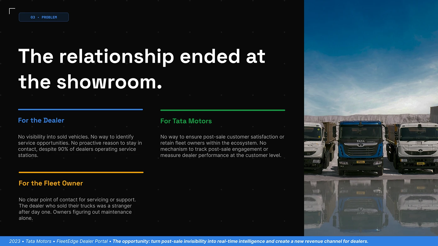
The stakeholder board separates the dealer, manufacturer and fleet owner beside commercial vehicle photography. It is a good prompt for writing the portal’s responsibilities. One party may maintain the record, another interpret it and another arrange the next step. Make those handovers explicit in the project brief so the interface can show who owns an unresolved request or a service opportunity.
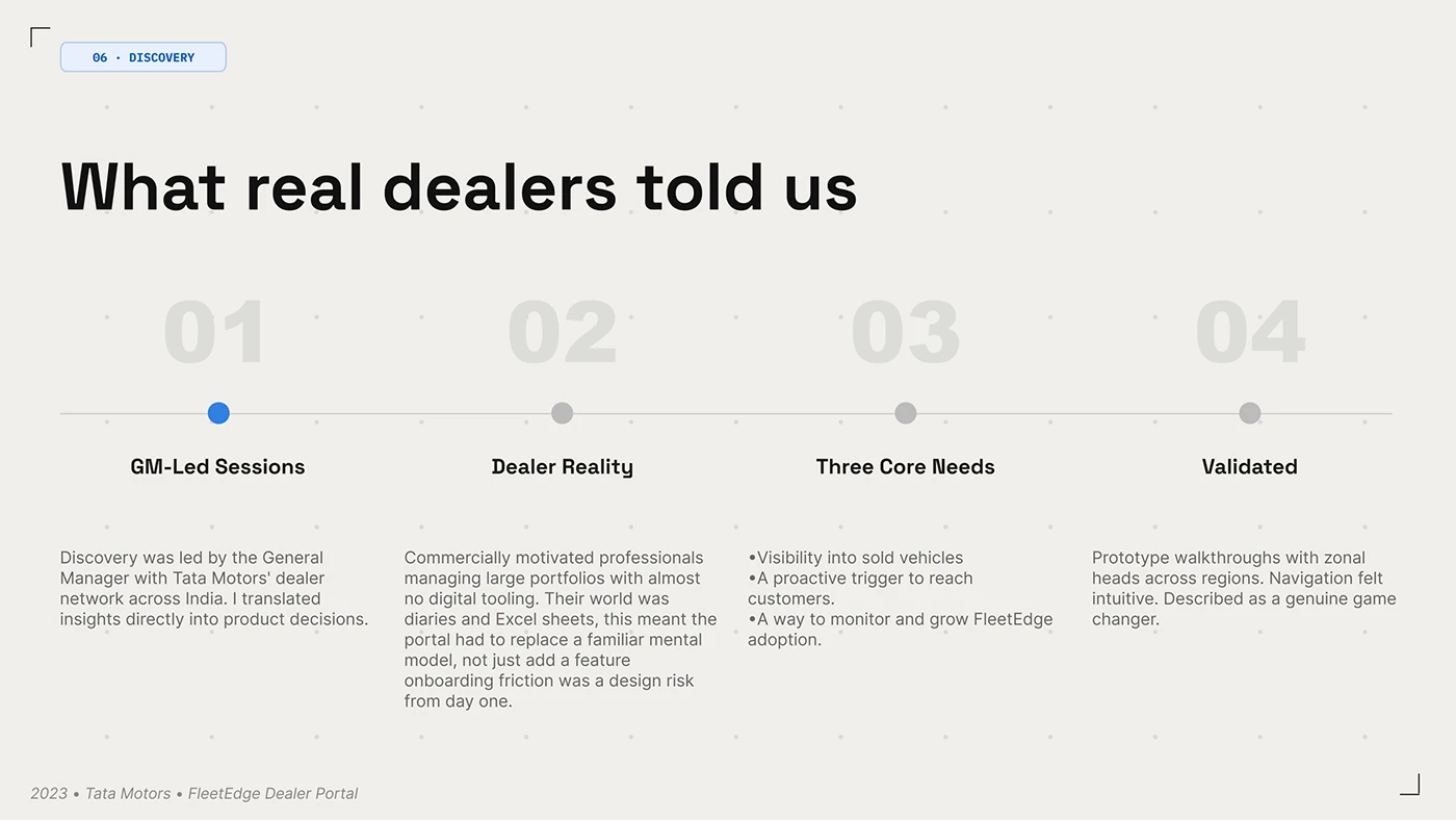
The discovery board describes sessions with dealer leadership and prototype walkthroughs. That gives the presentation a visible route from discussion to design. In your own project, add people who carry out the daily tasks to the review. A manager can define the commercial priority; a field representative can explain the details that decide whether the route is practical during a visit.
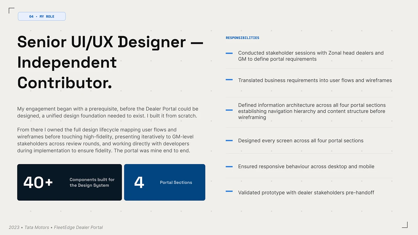
The scope board connects requirements, flows, information architecture, screen design and prototype validation. It gives a useful shape to the commissioning process. Agree which person owns each decision and which evidence will be reviewed at each stage. A portal can involve several internal systems, but the partner should experience a clear sequence through the work they have come to complete.
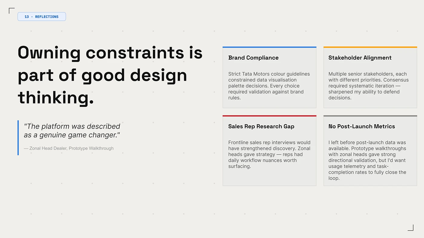
The reflection board is unusually valuable: the designer explicitly separates prototype feedback from unavailable post-launch metrics and identifies a gap in frontline research. That helps a commissioner understand what the case demonstrates. Use the reviewed screens as design references, then set your own task-completion and adoption measures. Prototype approval and sustained use answer different questions.
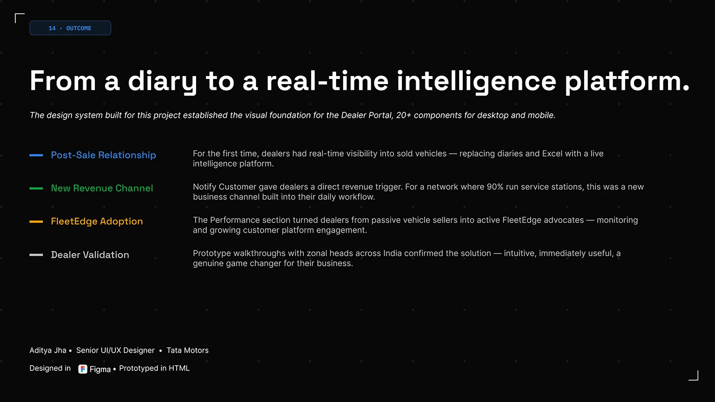
The closing board brings the intended post-sale relationship, service opportunities and platform adoption together. Those are the project’s business ambitions, rather than measured gains established by this review. For a manufacturer planning 2027, define the chain from information to action to follow-up. An attractive dashboard becomes more useful when the team knows who will respond to what it reveals.
Propigô gives the distributor a consistent place to work
Propigô’s navy and yellow identity travels from the login screen into a working interface of tables, filters and requests. João Dias and Itallo Minatti’s Behance presentation makes the connection especially clear: the same navigation frame holds payments, transactions, tracking, terminals and customers. This is a payments and distribution reference selected for its organisation of partner tasks. We have reviewed its public design presentation, rather than an authenticated industrial ordering system.
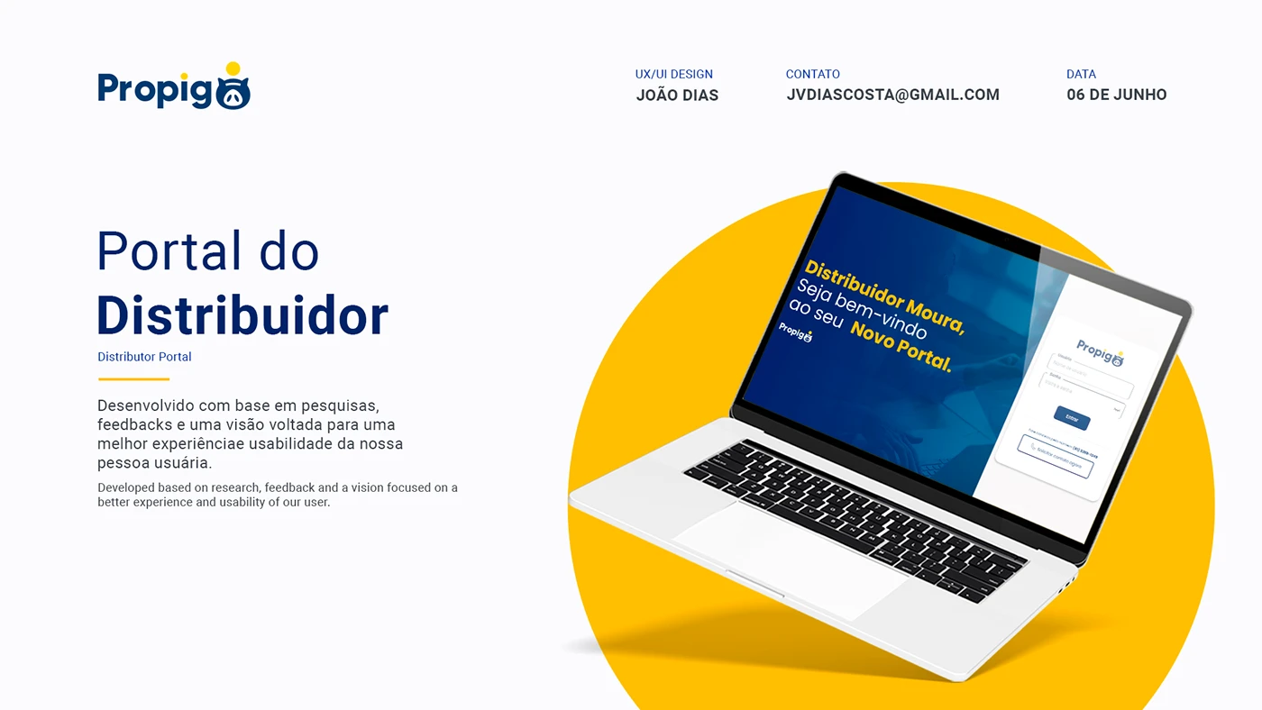
The cover calls the project a distributor portal and shows a branded login beside a welcoming message. The useful design move is continuity. A partner can recognise the business before entering the workspace. For an industrial portal brief, specify that relationship between the public website and the account entry, then decide what practical guidance belongs on the page for somebody who cannot yet sign in.
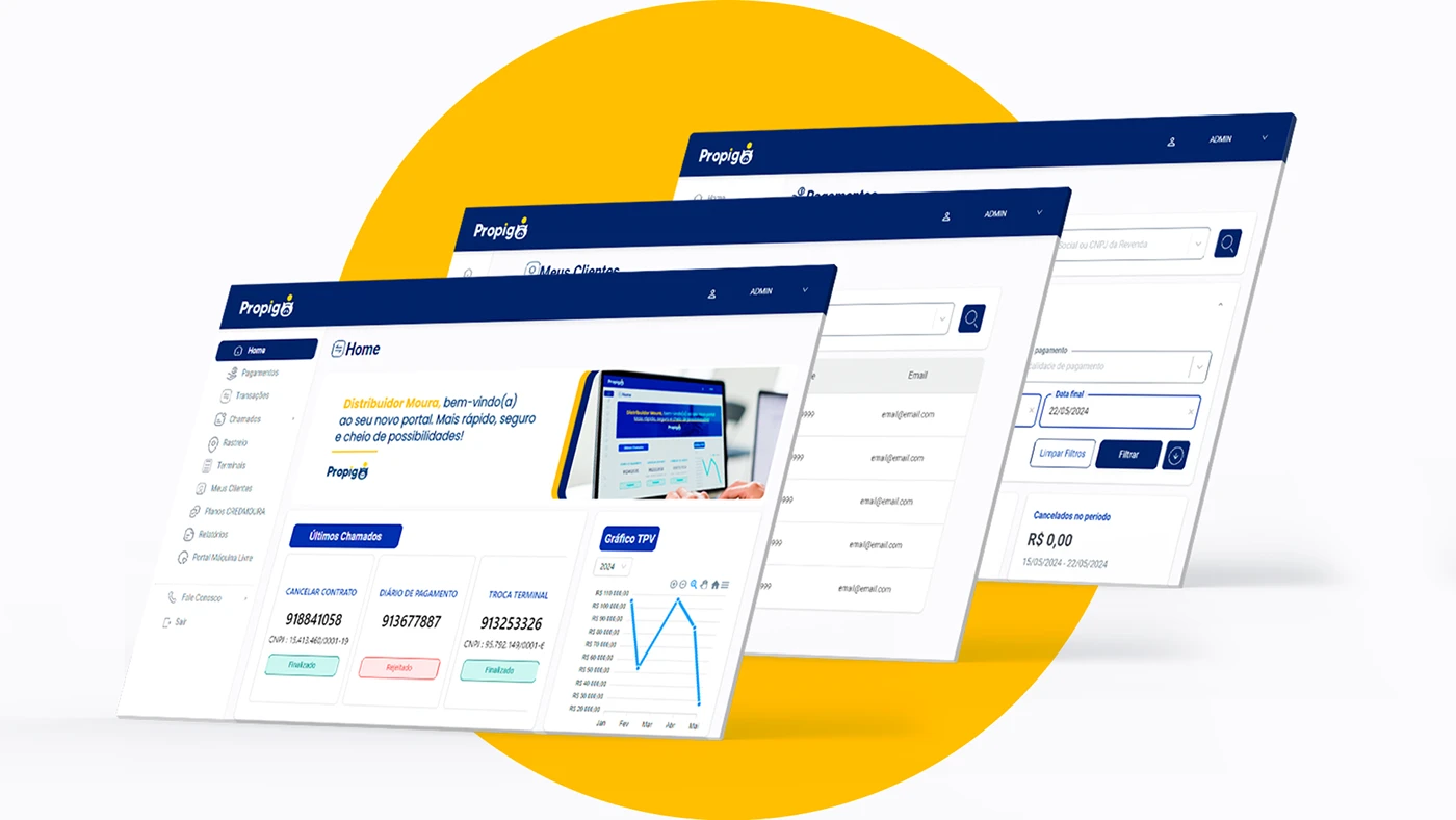
The layered screen board brings the work into view. Home includes recent requests and a chart; the other screens show customer records and payment filters. Navigation stays in a familiar place as the main task changes. That gives a portal review a concrete starting point: ask whether the partner can identify the current section and return to another task without learning a new interface each time.
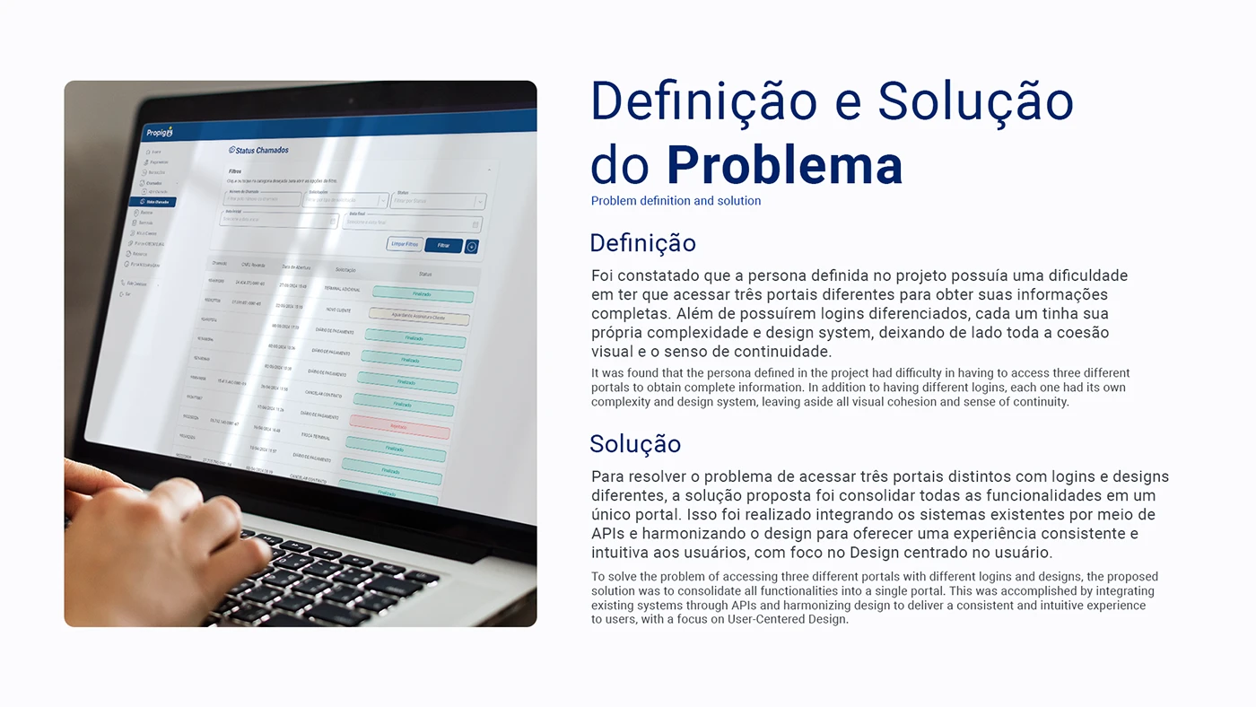
The creators describe a proposal to bring three separate portals together, including their different logins and design systems, through an integrated experience. The accompanying request-status screen illustrates the visual consistency they aimed for. We have not inspected the underlying APIs. The planning lesson is to map the actual journeys before choosing the portal boundary: which tasks need a shared account, which records belong together and which existing systems should continue to own them.
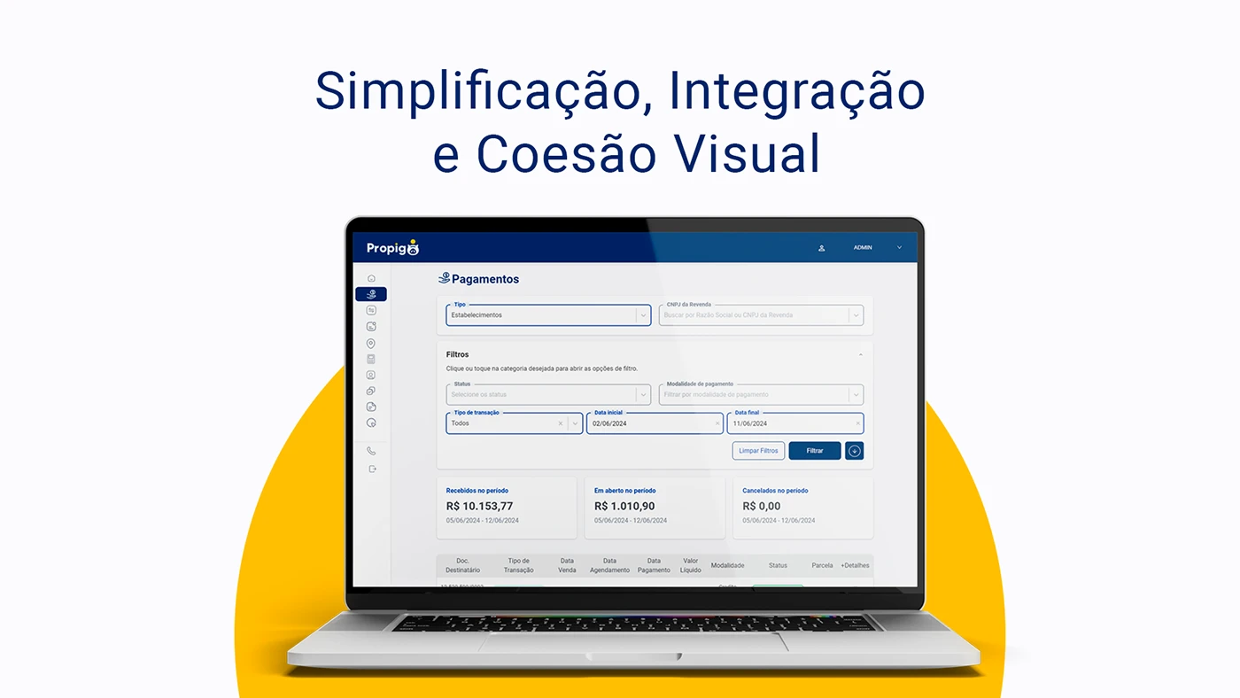
The payment view gives its filters a visible area above the totals and table. Partner search, transaction type, payment modality and dates help define the displayed information. An industrial equivalent might need an order reference, delivery destination or document date. Choose those fields from the partner’s working questions. Make the selected period and account clear enough that a total can be interpreted, rather than simply making the number larger.
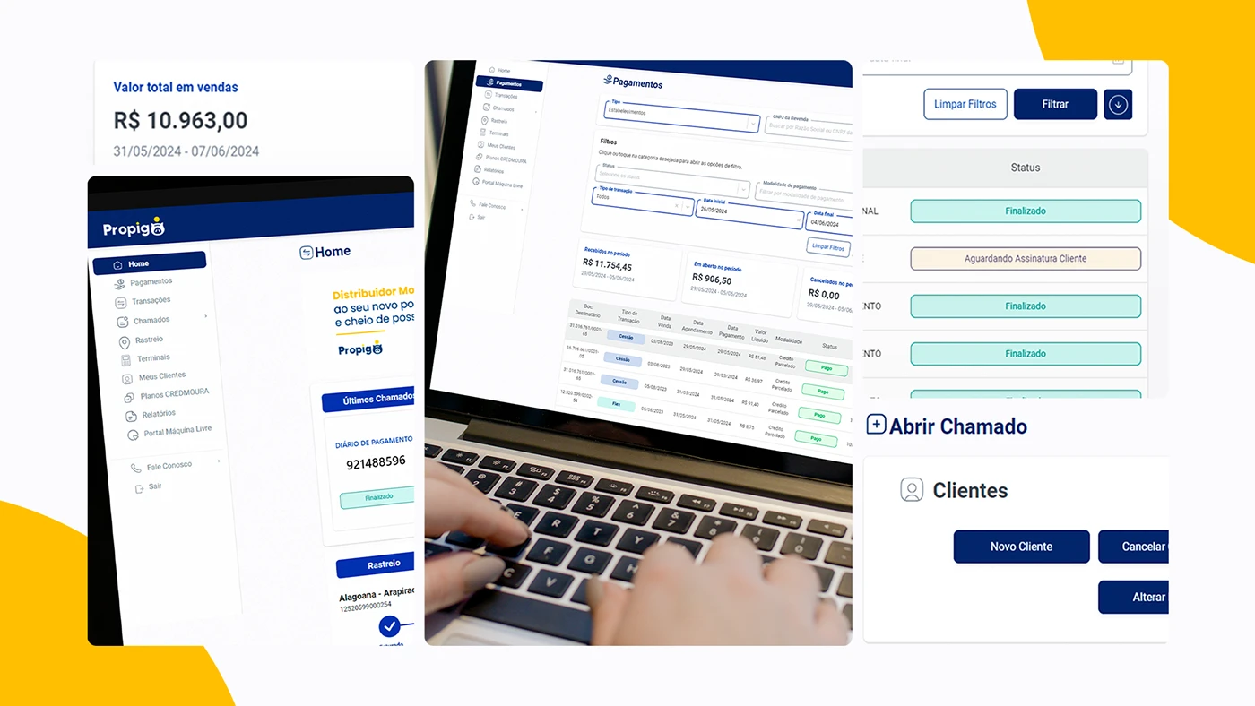
The detail montage is particularly useful for states and actions. A request can be marked as finished or waiting for a customer signature; opening a request and editing a customer use recognisable controls. For your own portal, pair every status with an explanation of what happens next. A partner should be able to tell whether they need to act, wait or contact someone. Test the wording with the team that actually handles those requests.
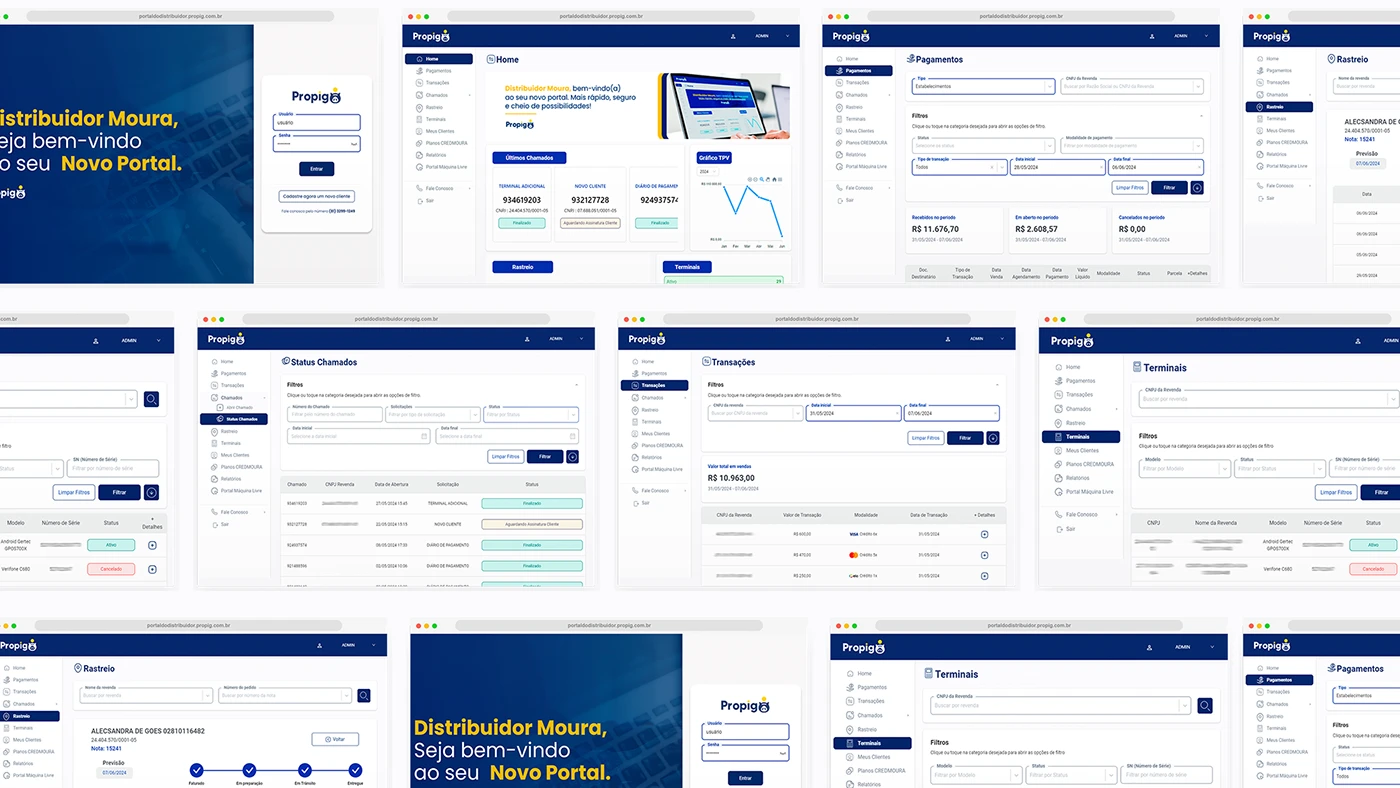
The wider collage connects login, payments, requests, tracking and terminal records. One tracking view shows stages along a delivery route; another table gives equipment a model, serial reference and status. These are useful visual references for linking a record to its history. They do not establish industrial inventory or asset integrations. In an industrial brief, bring a genuine order or machine reference to the review and follow it through the proposed screens.
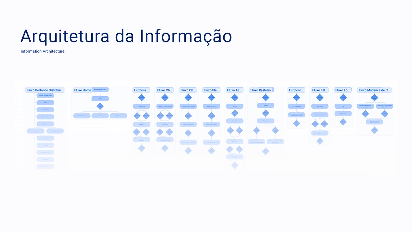
The architecture board maps several task flows alongside one another. It makes room for work beyond the dashboard: login, contact, requests, terminals and tracking all have their own paths. Build a similar map around a small number of real partner jobs. Include a changed order, a missing document and an unresolved request so the design conversation reaches the situations that need a clear explanation.
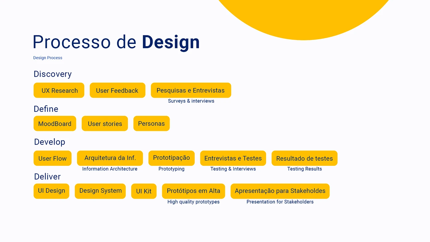
The process board connects discovery and user feedback to flows, prototypes, testing and the interface system. It documents the proposed method; it does not publish research results. A useful commissioning brief names who will review the work and what they will do in it. Invite a distributor, an account manager and an operations colleague to complete the same task from their own starting points.
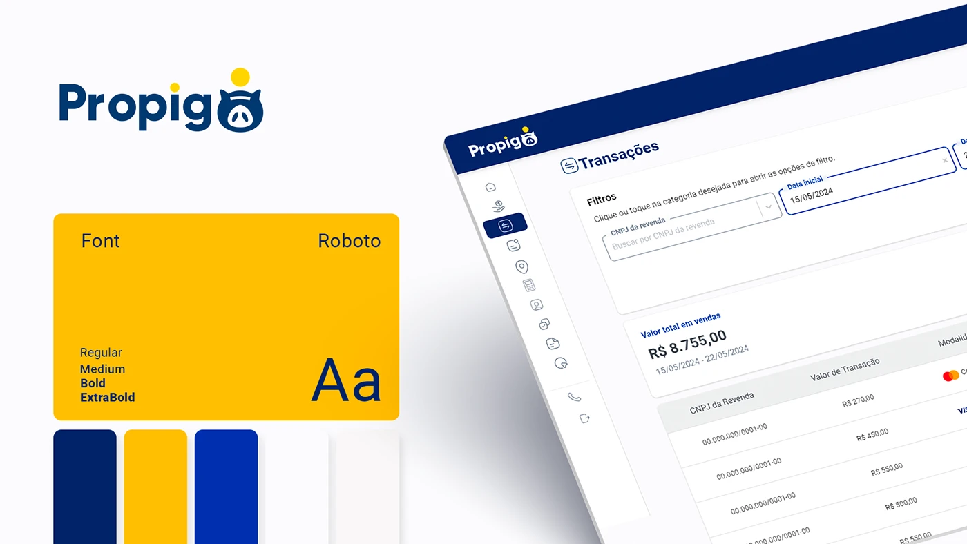
The final identity board shows Roboto in several weights beside the blue, yellow and white palette. The transaction screen shares that language. A consistent type and control system can give dense portal pages a calm reading order while keeping the brand recognisable. For your own content, test the system with long product names, real references and explanatory states. Those records will tell you more than a page filled with perfectly short labels.
Bosch Rexroth explains the relationship before the transaction
Bosch Rexroth’s public login and account explanation separates indirect users, direct users and partners. Indirect users can request quotations from Certified Excellence Partners, personalise a myRexroth dashboard and purchase by card in selected countries. Direct users require a customer number and are offered direct purchasing, net prices and order information. The partner description adds sales support and a training overview. The page describes SingleKey ID as the shared authentication route.
That distinction is useful for a manufacturer planning a portal: explain the account relationship in language a new partner can recognise. Bring your sales team into the decision about eligibility and access. Write the entry page around those agreed relationships, then make the next step clear for somebody whose customer number or account assignment still needs attention.
The manufacturer’s Spanish Rexroth Store guide describes product search, filters, comparison and CAD downloads. It also explains quick entry of references and quantities, material-list upload, quotations, wishlists and order history. Individual prices, delivery information and purchasing depend on the user profile. These are documented routes for that market, rather than functions we tested inside an authenticated account.
The design opportunity is the connection between product identity and account context. In your own project, take a reference through selection, quotation, order review and the subsequent enquiry. At each step, agree which system supplies the information, which partner can see it and how the screen explains an unavailable value. That gives the portal team a concrete journey to build and verify.
Build an industrial distributor portal brief for 2027
The references are most useful when you bring your own work into the conversation. Choose one distributor, one account manager and one operations colleague. Ask them to describe a recent task that crossed between the organisations. Follow the reference, document or request through that task before drawing a dashboard. The handovers will show where a shared workspace could make a difference.
Start with the work a partner returns to do
Write a short task list using the partner’s words. Find the delivery update for this order. Retrieve the drawing for this item. Check a quotation. Raise a service request against this machine. Choose a few jobs that matter often enough to justify a place in the first release, and identify the person responsible for each answer.
Give those jobs realistic starting points. A distributor may arrive with a manufacturer reference, an internal purchase order number or a customer’s description. A service partner may know a serial number. Decide which of those identifiers the portal will accept and show how they relate on the record. Use a small set of representative examples to test whether the route makes sense.
Let the dashboard explain what needs attention
A summary card should lead somewhere useful. If it reports open requests, define which requests it includes and make the route into that list clear. If it reports deliveries awaiting a decision, explain the condition and the person who needs to respond. Agree the meaning before choosing the chart or the number.
Review the empty dashboard as well. A new distributor may have no history, while an established one may have nothing urgent that morning. Give those situations suitable explanations and a way into the normal tasks. FleetEdge’s category-selection message is a good prompt for this review: the screen can guide somebody before it has a result to display.
Design the record and its next action together
Open a real order with your team and list the questions it prompts. Which item is this? Which quantity is confirmed? Which destination does it serve? What is the current status? Where is the supporting document? Decide which information belongs in the overview and which needs a detailed view, then keep the identifiers consistent between them.
Choose an unresolved case too. A delayed line, a missing reference or a request waiting for clarification deserves a clear explanation. Name the action the partner can take and the information that action should carry forward. The receiving colleague should be able to identify the record and understand the question without asking the partner to reconstruct the journey.
Make filters match the questions people ask
Plan filters from actual retrieval tasks. A partner checking an order may need the purchase order reference and date range. Someone arranging service may need equipment, location and request status. Test a small set of useful controls with real records before adding every available field to the screen.
Show the active selection and give the person a straightforward way to change it. Include the situation where a search produces no matches: explain what was searched and how to try again. On a phone, check that opening and applying the filters leaves the person in a recognisable place, with the result and selected criteria easy to find.
Connect technical documents to the correct context
Identify the files partners actually request. Drawings, instructions, certificates and commercial documents can have different owners and access rules. Decide which record should point to each file and what the user needs to know before opening it, such as its title, product reference, language or revision.
Use one document that has changed recently to test the publishing process. Can the responsible colleague update it and check the linked records? Can the partner understand which version they have found? Our industrial catalogue guide explores the product and document relationship in more detail. Carry that thinking into the account workspace where the information is used again.
Define account roles with the team that owns them
A partner organisation can contain buyers, administrators and service colleagues. Write down what each person needs to see and do. Include the scope of their records: a company, a branch, an assigned territory or a particular customer relationship. Give the interface enough context that the person understands which organisation or location they are currently viewing.
Then verify the implementation with accounts representing those agreed roles. Include changes of assignment and removal of access in the acceptance review. FleetEdge’s role boards and Rexroth’s public account explanation help frame the conversation; the actual access behaviour must be established for your own system and tested with the responsible team.
Specify the data handover before approving the interface
For each important field, agree who owns it and how it reaches the portal. An order status may come from one business system, a document from another and a support response from a separate team. Write the relationship down in ordinary business terms so everyone can review it before the technical work begins.
Specify what the screen should do when that information is unavailable or still being updated. Keep the partner informed and preserve a practical route to assistance. For the first release, a clearly explained request may be more useful than an ambitious screen whose information the team cannot reliably maintain. Choose the scope around the service you can deliver.
Review the complete task on desktop and mobile
Give reviewers a task and a starting record, then observe how they complete it. Finding a specific order, retrieving a document and following an unresolved request make useful exercises where they match your business. Note the moment of hesitation and what information or control would have helped. That produces a focused list of changes.
Repeat the important routes on a phone with long product names, realistic references and a record containing several items. Check table reading, filter controls, status explanations and the next action. Review the final published media and documents too. A responsive layout has to carry the actual information, including the awkward record that the cleanest demonstration leaves out.
Measure whether partners can complete the agreed jobs
Choose measures that fit the release. Your team might review successful document retrieval, completed repeat-order requests or the questions that still reach the account manager. Establish what can be measured reliably and what needs a conversation with partners. Record the starting situation so later discussion has a useful comparison.
Keep the review close to the people handling the work. A repeated question can reveal a missing explanation, a poorly named status or a handover that the portal does not yet support. Inspect that route, make an agreed improvement and check it again. This gives the portal a way to develop from actual use after the launch presentation is over.
Questions about industrial distributor portals in 2027
What is an industrial distributor portal
It is an account-based workspace that supports the relationship between a manufacturer and its distribution or service partners. Its scope follows the business model. A portal might organise product information, quotations, orders, documents, installed equipment or requests. Define the partner’s recurring jobs first, then decide which information and actions belong in that workspace.
Which distributor portal example is most useful for a manufacturer
Choose the reference that answers your design question. FleetEdge is useful for dealer records and an ongoing service relationship. Propigô is useful for consistent navigation through several distributor-facing tasks. Rexroth’s public documentation is useful for account distinctions and industrial ordering routes. Use them as complementary inputs to your own brief.
Does a distributor portal need online ordering
Decide from the partner relationship and the processes your team supports. Some projects can begin with product documents, quotation requests or service information. Others need a repeat-order route. Agree what the partner can complete, what still needs approval and how the portal explains that handover. The first release should have a clear, useful purpose.
How does a distributor portal differ from a digital catalogue
A catalogue helps somebody find and understand a product range. A portal adds the context of an account and the tasks associated with that relationship. They can share product references and supporting documents. Plan the route between them so a partner can keep the selected item in view as they move into a quotation, order or support request.
How should an industrial portal support mobile users
Identify the jobs people need away from a desk. Review those routes with representative records and a phone-sized screen. Give particular attention to long references, tables, filters and actions linked to a specific record. A field visit may call for a different starting point from an office review, even when both use the same underlying information.
Are these new portal launches for 2027
These are existing design presentations and manufacturer resources selected for planning in 2027. The article reviews public materials and offers our own commissioning recommendations. It does not establish post-launch commercial results for the visual case studies or validate private portal functionality. The project dates and source context are identified in the relevant examples.
Give your next portal a concrete starting point
Bring one partner task, one realistic record and the colleagues responsible for the response. They give the brief an immediate shape. For the wider visual direction, explore our industrial web design trends for 2027. To plan the product and partner journey together, discuss your industrial portal with Code Industrial.
Original projects and credits
FleetEdge Dealer Portal for Tata Motors by Aditya Jha on Behance · Propigô integrated B2B portal by João Dias and Itallo Minatti on Behance · Bosch Rexroth account documentation · Rexroth Store guide for Spain. Original project images belong to the credited creators and brands. The analysis and portal recommendations are written for this guide.