A product reference, a clear machine photograph and a specification that actually answers the question. Sometimes that is where a good industrial catalogue begins. Add a useful route through the range, a document someone can share and a next step that keeps the selected product in view, and the catalogue starts doing serious work.
Our selection of the best industrial digital catalogues for 2027 explores three complementary design references. Sirui Engineering shows an enquiry-led machinery catalogue. Bélanger shows several entrances into a manufactured product range. Kentec Composites shows how a technical document and its supporting materials can share a reading system. Together, they offer ideas for the collection page, product detail, document and conversation that follow.
These are existing projects reviewed for 2027 planning, with primary presentations on Awwwards and Behance. The selection is our editorial judgement of their usefulness as design references. It is not a ranking of tested procurement systems or a claim that the projects launched in 2027. We distinguish submitted interface images, creator descriptions and our own recommendations throughout.
If you are planning the wider website around the catalogue, start with our industrial website design examples for 2027 and the industrial web design trends for 2027. Here, the focus is the product journey. A visitor should be able to recognise the right family, understand an item and take the next useful step with its identity intact.
What makes an industrial digital catalogue worth studying
We look for a visible relationship between the product and the buyer’s task. A beautiful product collection can establish a strong identity. Its next job is to make the range understandable. A technical document can carry substantial detail. Its next job is to make a particular answer findable. A quotation form can collect an enquiry. Its next job is to preserve the information that makes the enquiry meaningful.
The examples below cover different parts of that journey. A machinery presentation is useful for studying collection-to-enquiry structure. A plumbing product catalogue is useful for studying selection by installation and other attributes. A composite-products document is useful for studying dense tables and component information. That variety helps a brief move beyond the appearance of a homepage.
We have reviewed the original project images and the creators’ public descriptions. Where a presentation shows a filter, document action or form, we describe that visible design. We do not infer a working integration or independently measured conversion gain from a screenshot. The recommendations that follow are our way of applying the design lessons to your own product range.
For the same reason, the best reference depends on your catalogue. A small range of configurable machines needs a different route from thousands of replacement components. A supplier whose products require a technical conversation needs different actions from a business with a defined online purchasing process. Choose the example that helps you ask a sharper question about your own buyers.
Sirui Engineering makes the machinery catalogue a route to a specific enquiry
A machine needs room to explain itself. Dexxy Studio’s Sirui Engineering presentation on Behance shows a collection of named machines, a product detail layout and an application page with distinct next steps. The collection uses consistent cards, while the detail board brings together a large product view, thumbnail images, a specification table and an enquiry column. We are looking at a published design presentation; its placeholder text and technical rows are not verified machine data.
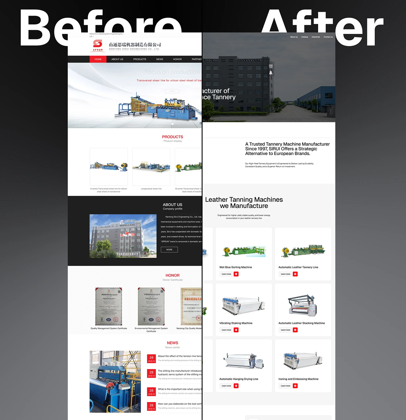
The before-and-after board is useful because it makes the change in organisation visible. The redesigned collection gives each machine the same kind of space. For a catalogue brief, that suggests a practical question: what should every card communicate before someone opens the full page? Decide on the product family, model reference, operating purpose and the most useful image. Keep those roles consistent so that a visitor can compare the information.
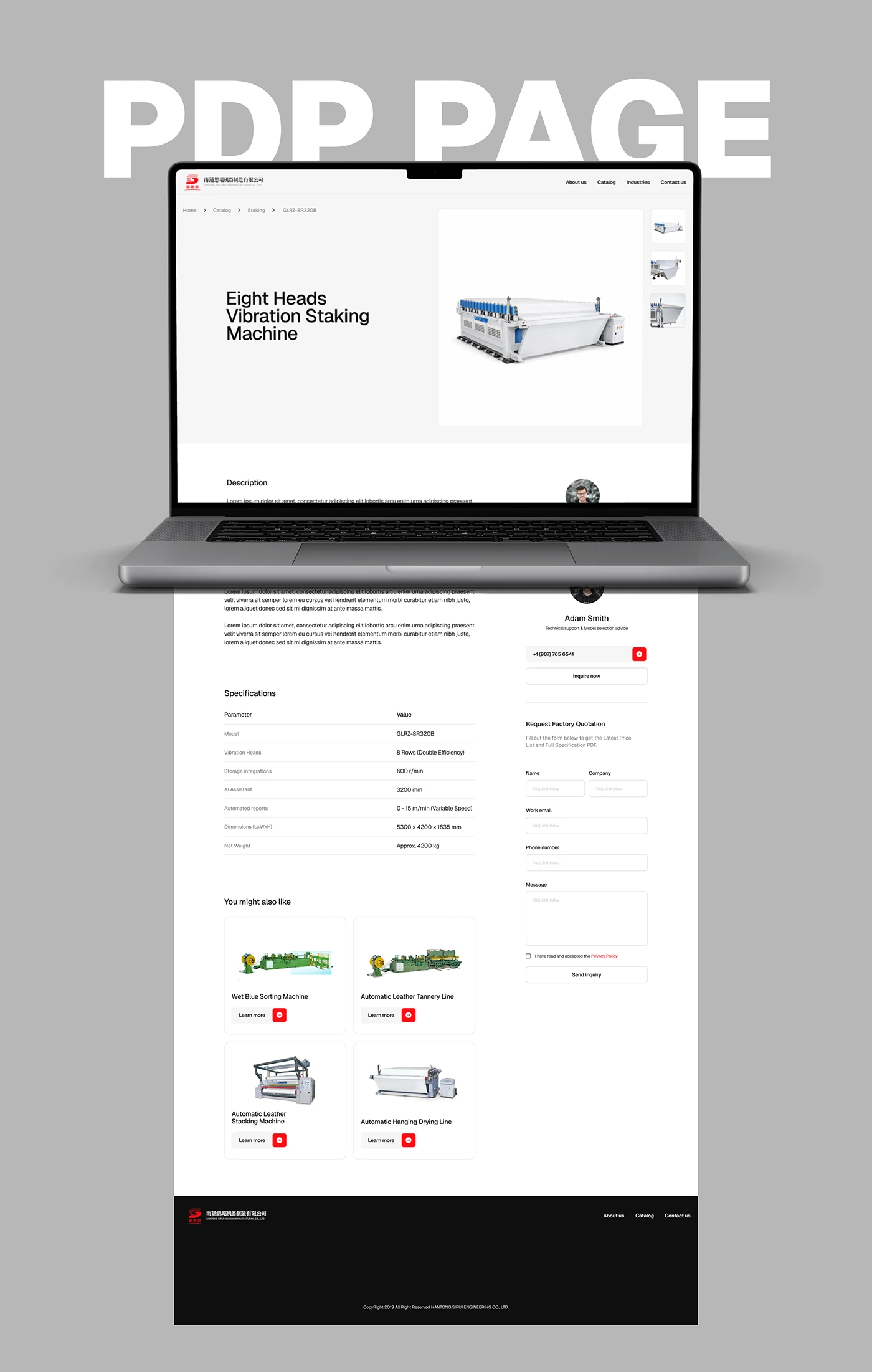
The product detail board puts a technical table beside a contact and quotation route. Its value as a reference is the relationship between the information and the action. For your own catalogue, the next step should carry the selected machine into the enquiry. A sales colleague should receive its exact model reference alongside the buyer’s application, rather than having to work backwards from a general message. Agree those fields with the people who will answer the request before designing the form.
A useful review starts with a real enquiry that your team has already handled. Ask what the buyer knew at the beginning, what they needed to compare and which missing detail caused another email. Turn that sequence into a catalogue task. Someone might need to choose between two machine families; another visitor might arrive with an exact model and only need its documentation. Give both people a route, then test whether the page helps them take the appropriate next step.
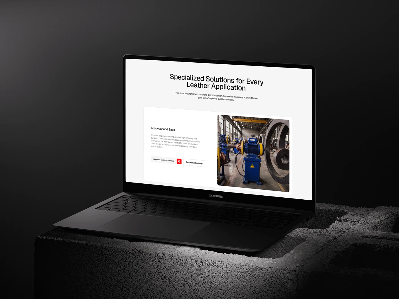
The application mockup presents separate catalogue and custom-proposal actions. That distinction can support a clear content brief for an equipment manufacturer. Describe which products serve an application, explain the important selection conditions and give the buyer a way to raise an exception. Our recommendation is to record the question behind each route, then make sure the destination answers it. A catalogue is most useful when the next conversation starts with shared context.

The cover gives machinery a confident visual presence. For your own photography brief, choose the view that explains the product’s purpose before choosing the dramatic crop. A collection image may need the whole machine. A detail image may need a connection or working area. An application image may need the installation around it. Give each view a specific job.
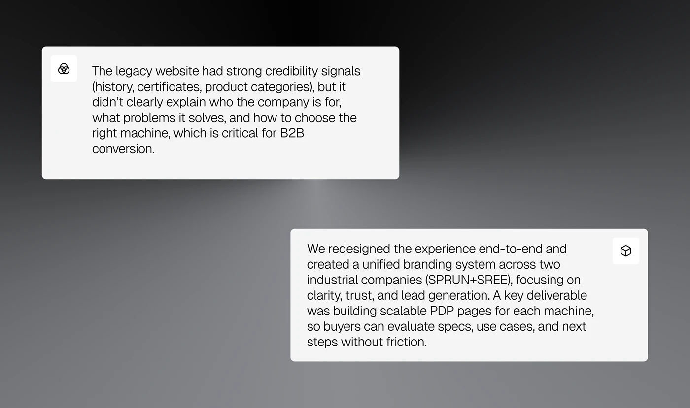
The project commentary frames the catalogue and reusable product pages as connected design work. That is useful when scoping your own redesign. Include the collection, detail page, document and enquiry in the same review. Otherwise, each screen can become individually polished while the passage between them remains unclear. Have sales and product colleagues follow one item through the entire sequence.
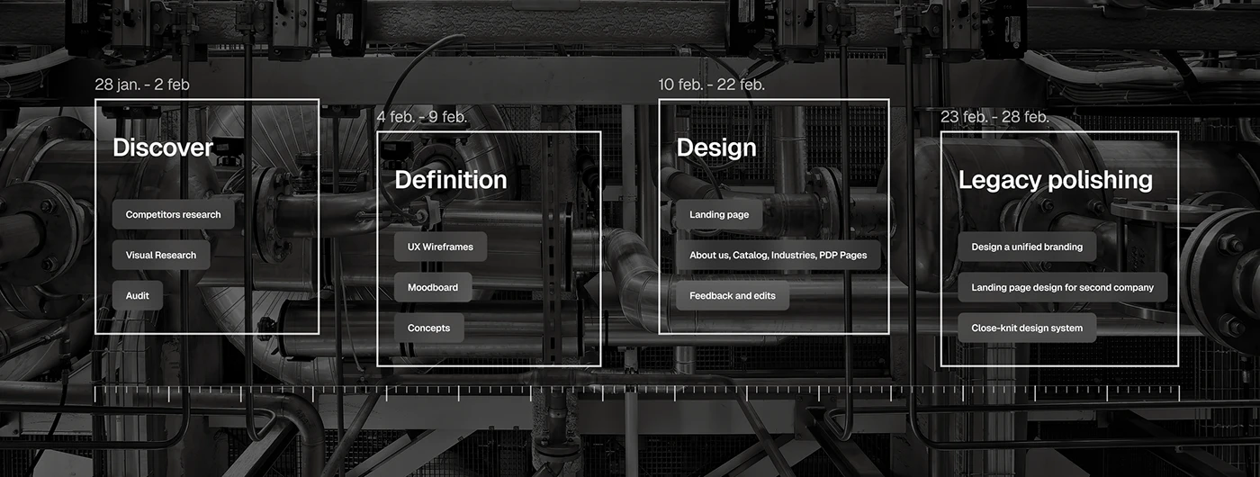
The process board includes discovery, definition, page design and a related-brand phase. A practical lesson for a catalogue project is to resolve the product structure early enough to shape the screens. Bring sample products, exceptions and documents into the first conversations. They are the material the catalogue has to organise, and they will expose questions that a blank page template cannot.
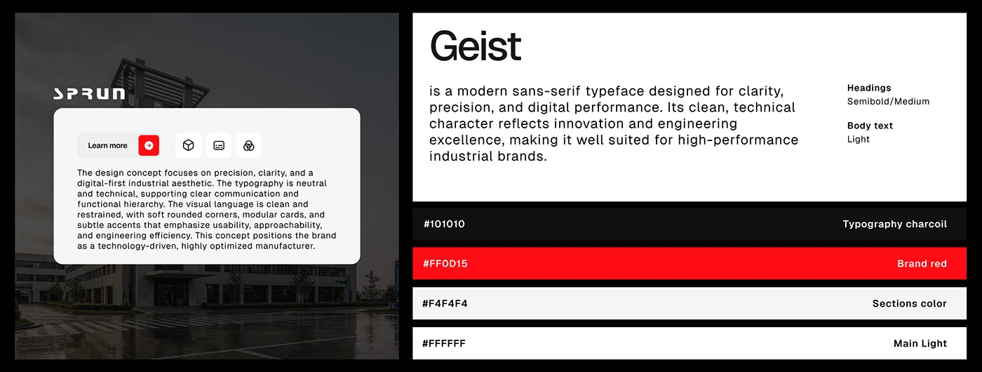
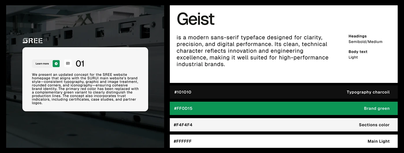
The two brand boards show a shared typographic and card language with different action colours. When your own group has several product brands, decide which elements need to stay recognisable across them. A product reference, technical table and enquiry action can follow a common logic while photography and accent colour give each range its character. Review the brand relationship using actual product pages.
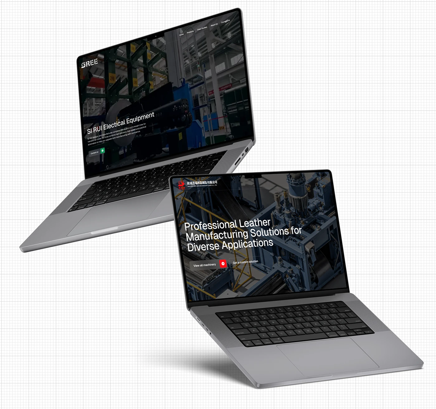
The paired device presentation makes those related interfaces easy to compare. Our advice for a multi-brand catalogue is to document the relationship in plain language. Which company supplies the item? Which team answers the enquiry? Where does the supporting document belong? The interface should help a buyer retain that context when moving between ranges or sending a link to a colleague.
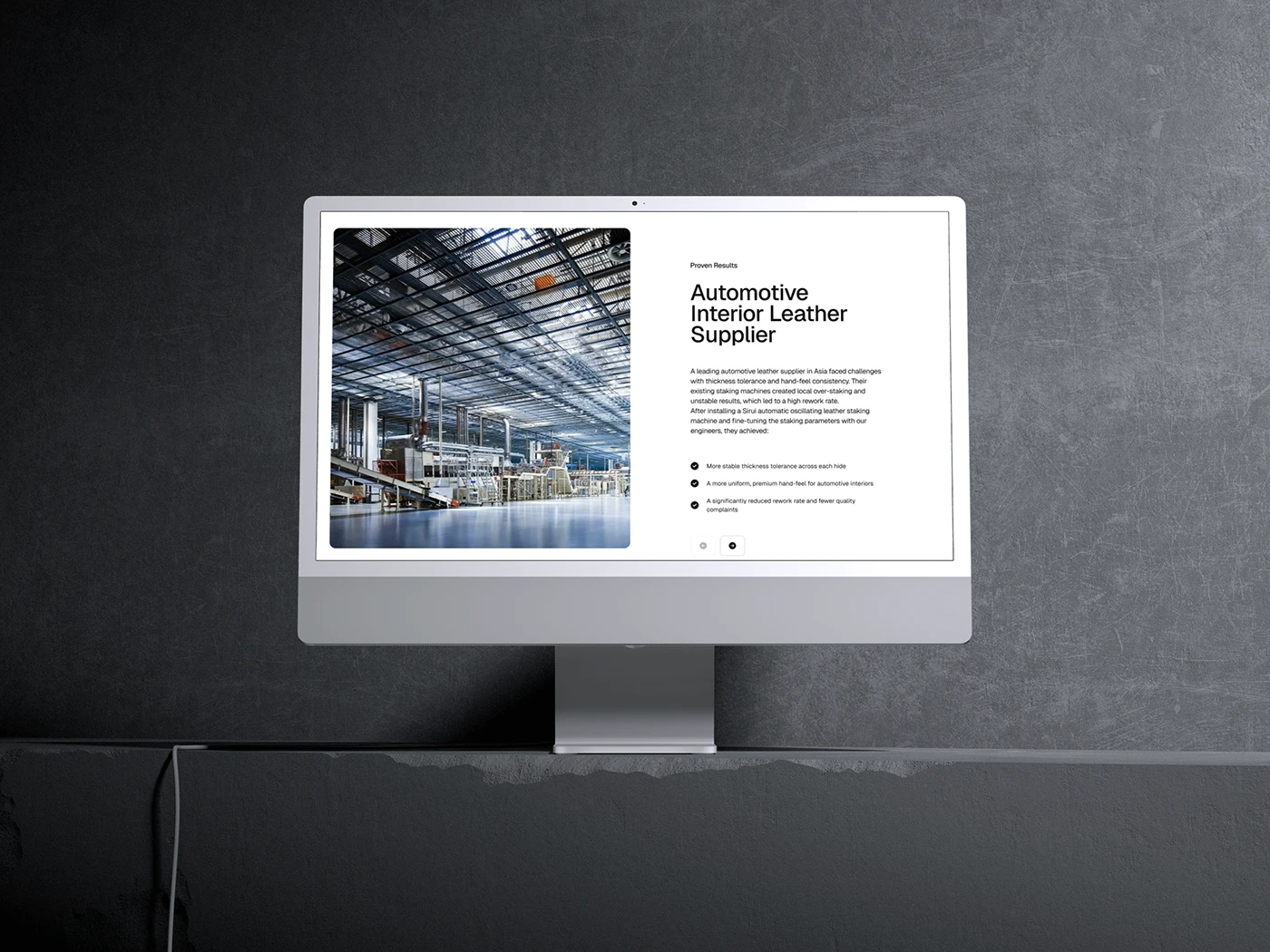
An application or project example can explain why a product belongs in a particular shortlist. For your own case studies, agree what evidence you can publish and how it connects to the product record. A useful example describes the selection conditions and links to the relevant range. Review the underlying claims with the responsible team so that the story and the catalogue remain aligned.
Bélanger gives one product range several useful entrances
LEEROY and the credited collaborators give Bélanger’s faucet catalogue a distinctive typographic identity. The Awwwards presentation also shows a practical selection structure: product lines, style and room sit alongside filters for installation, finish and other product attributes. Cards carry model references and status labels. This is an adjacent manufacturing reference for a 2027 catalogue brief, drawn from a project recognised in October 2024.
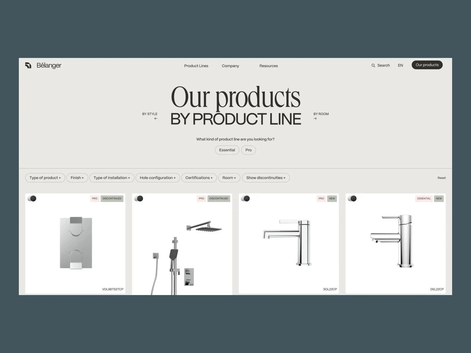
The design question for your own catalogue is which entrance matches the buyer’s starting knowledge. Somebody replacing an existing component may know a code. Somebody specifying a new installation may know the mounting condition and required finish. Build those routes from genuine product data and the questions your team receives. The catalogue should help a visitor turn what they already know into a manageable selection.
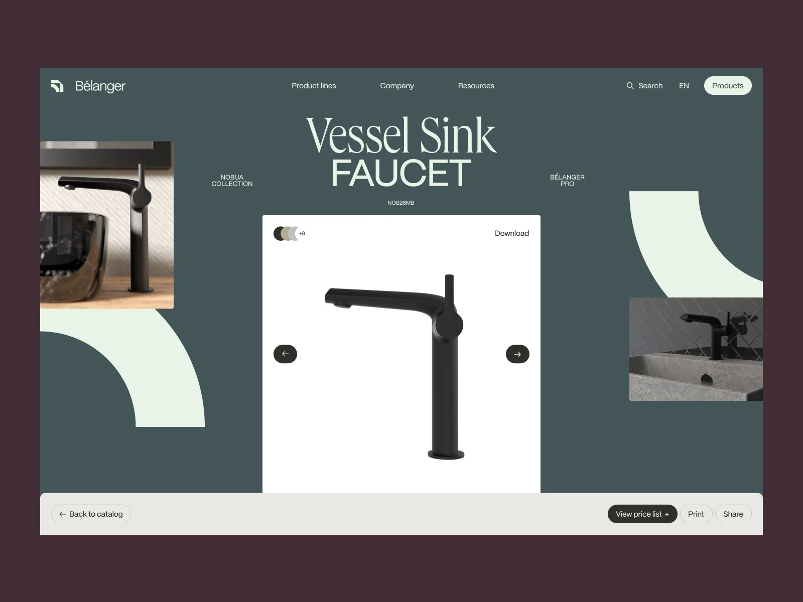
The submitted product header combines a model reference, finish choices, gallery and document or sharing actions. Our recommendation is to connect every document to the same product identity. Before launch, ask a colleague to select a variant, obtain its document and explain which reference they would put on an enquiry. If the page, file and form disagree, fix that relationship before adding more decorative detail.
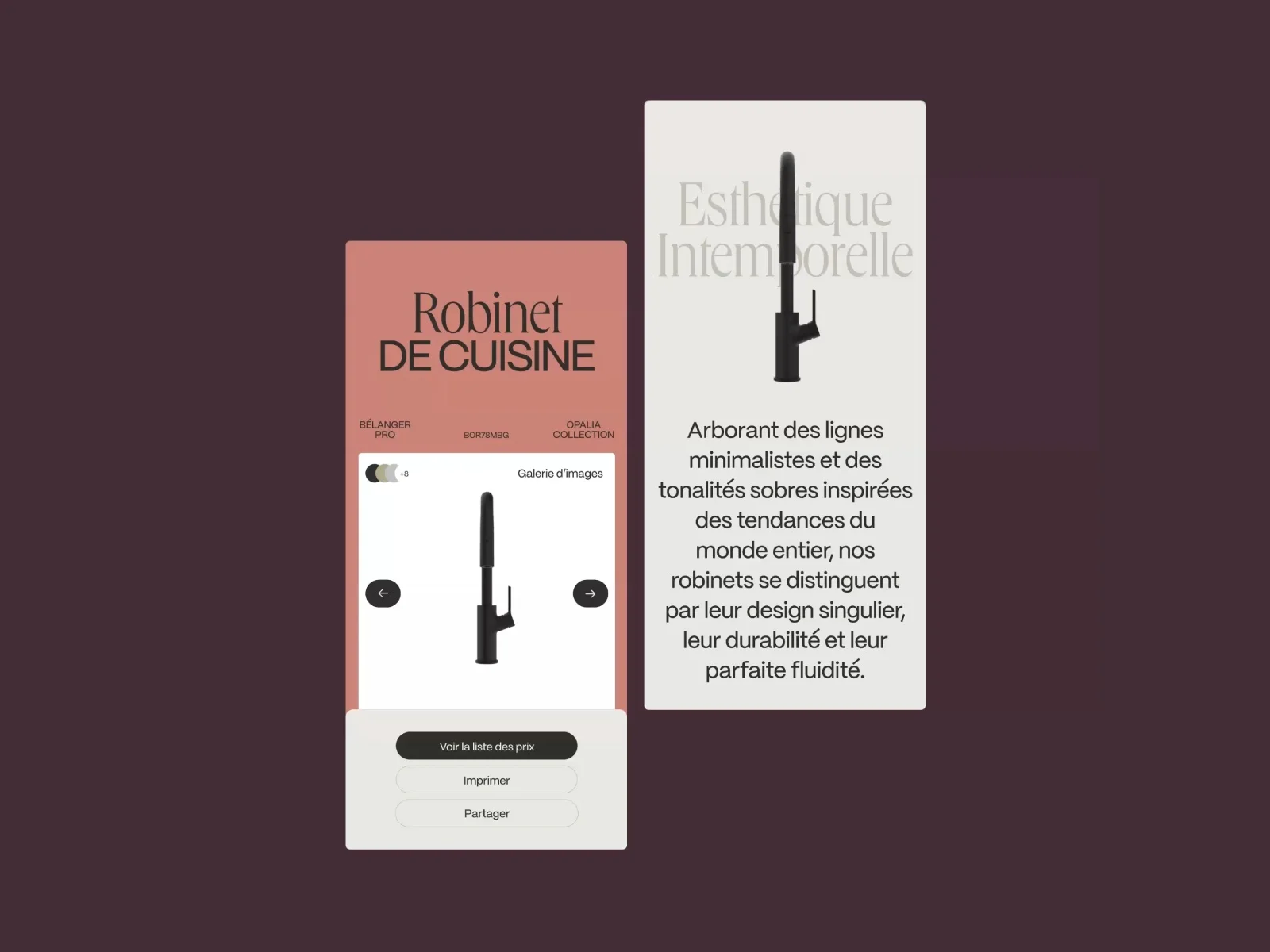
The mobile presentation preserves the product image and practical actions in a compact arrangement. For your mobile review, give a buyer a short real task: find a component, check one selection condition and send its reference to a colleague. Watch where the task becomes difficult. That can reveal a hidden model code, an unclear finish label or a document link that is easy to overlook.
A clear selection experience still has room for personality. Decide which screens need an expressive introduction and which need a reliable reading order. The product collection, detail view and supporting document can share an identity while giving different amounts of space to images and data. The strongest brief makes that decision deliberately, with the buyer’s task in view.

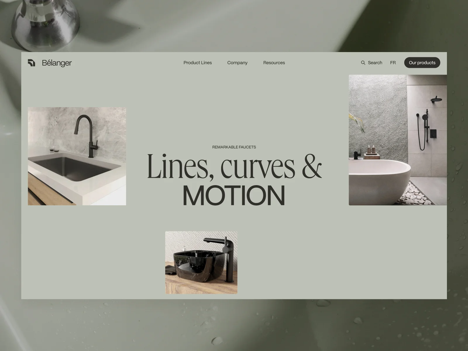
The mobile cover and desktop opening share a calm palette and a mixture of large serif and sans-serif type. That gives the product range a recognisable setting before the visitor enters the selection screens. For your own catalogue, decide how the opening composition hands over to the product collection. An expressive introduction can lead directly to a clear range structure.
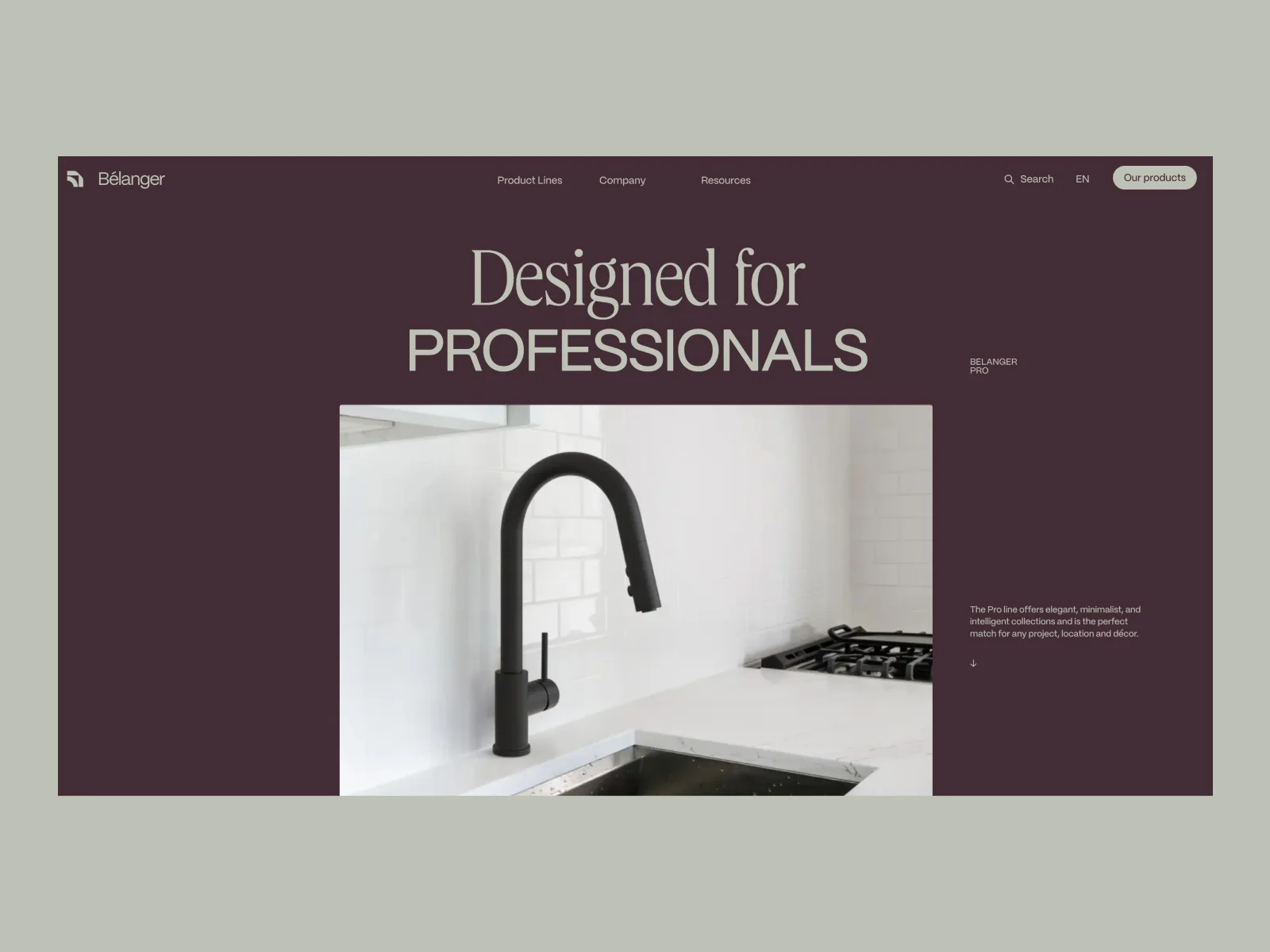
The product-line header creates a distinct introduction for a particular range. Your own family pages can do useful work in the same position. Explain the role of the family, the selection conditions that matter and where to compare individual items. Give the visitor enough context to choose a route, then make the products easy to reach.
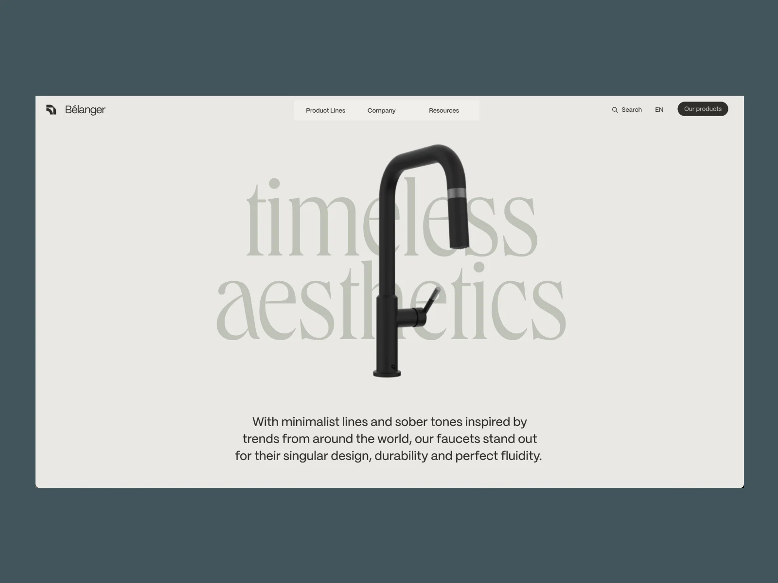
The isolated faucet view puts the product’s silhouette against a quieter background. The submitter labels this element as a rotation-on-scroll reference; the available asset is a still image. The lesson we can assess from it is the separation of product form from surrounding detail. For your own catalogue, choose imagery that helps someone identify the object, then provide the technical views needed for selection.
Kentec Composites gives technical documents a coherent reading system
Leah Dossey’s Kentec Composites project on Behance presents a technical catalogue and related sales materials. The creator describes a 48-page redesign with print and digital versions, including a clickable contents page in the PDF. The gallery shows document mockups; we have reviewed the layouts rather than independently tested the downloadable PDF.
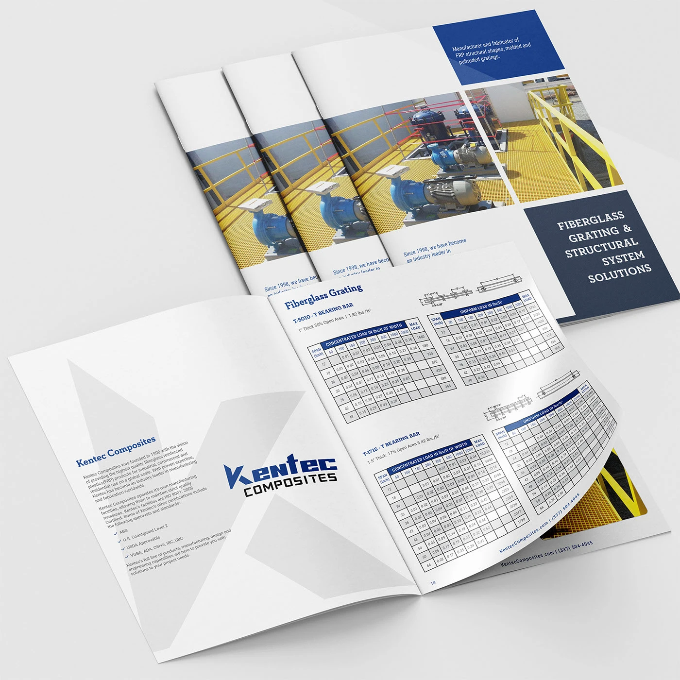
The grating spread gives dense tables a consistent structure. Blue headings, repeated column positions and nearby diagrams help establish which information belongs together. For a catalogue brief, take one demanding technical table into the design review. Ask the product team which comparison a buyer actually needs to make, and check whether the labels, units and conditions remain understandable at the intended reading size. The important test is a reliable decision with real data.
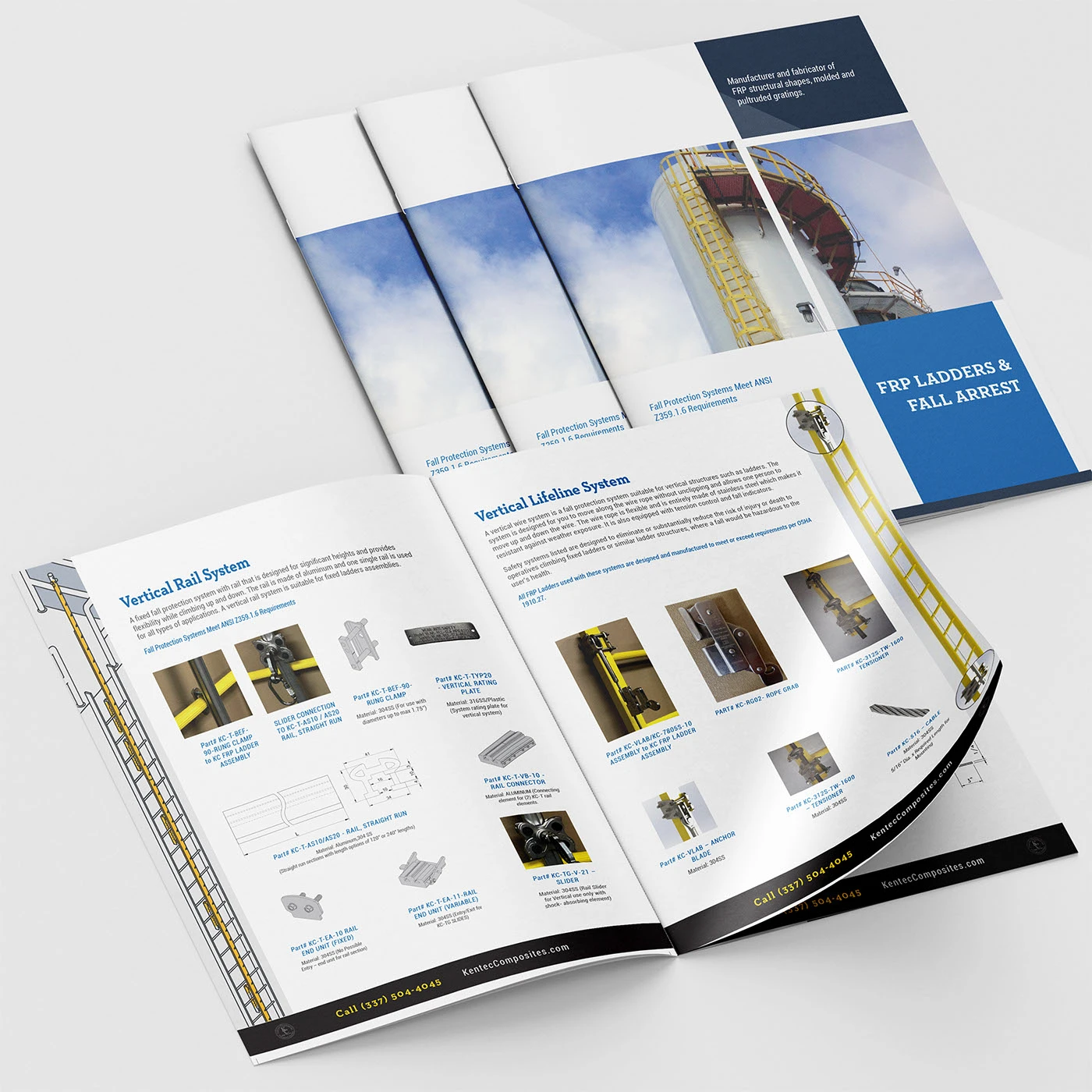
The ladder presentation connects a system drawing with smaller component pictures and references. That relationship suggests a useful way to brief your own component catalogue. Give the reader both a view of the assembly and a clear route to the individual item. Agree who maintains the reference numbers and which product document is authoritative. Our design advice concerns the reading structure; the compliance and performance statements pictured in the original project are not independently verified here.

The offshore spread brings an application image into the same visual family as the product detail. For your own range, decide which information belongs to an application introduction and which belongs to a particular item. A short context page can lead to a precise product record, while the downloadable catalogue can support a meeting or internal review. Keep the names consistent across those destinations.
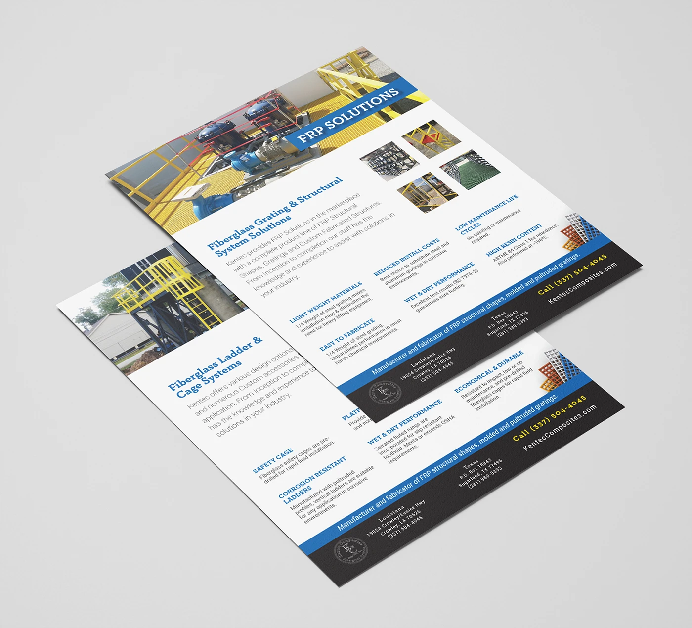
The supporting sheets retain the same colours and image hierarchy in a more compact format. A useful content review is to place your website, technical catalogue and sales sheet side by side. Follow one product through all three. Check its name, reference, imagery and document version. That exercise can reveal gaps between materials that look individually polished but leave a buyer uncertain about which information to use.
Build your 2027 industrial catalogue around one complete buyer journey
Start with a product family that matters commercially and has enough variety to test the structure. Choose a straightforward item, a product with several variants and an item that needs advice before quotation. Gather their photographs, references, technical information, documents and common sales questions. Those three records make a useful starting set for design review.
Describe the journey in the buyer’s words. An engineer might need a component with a particular mounting arrangement. A purchasing colleague might arrive with an existing reference. A project owner might know the application but need help selecting a machine family. Put those starting points next to the information your business can reliably provide.
Then agree the next useful action. It might be a technical document, a saved reference, a request for advice or an enquiry for a defined configuration. Write down what information needs to travel with that action. The catalogue brief becomes more precise when the team can explain the beginning, the selection and the handover.
Give the product record a dependable identity
A catalogue needs a consistent way to identify the item across its different appearances. Agree the product name, family, model reference and variant rules with the people who maintain the range. Use real records in the design. A short display name can work well on a card, while a detail page may need a fuller description and exact reference.
Keep those roles distinct. A marketing phrase can explain the proposition. A model reference can connect the visitor to a technical document or a sales conversation. A variant label can explain what changes between options. Decide which of those fields appear at each step, and check whether a colleague can identify the same item without guessing.
Include an exception in this review. Some products may have been renamed, replaced or discontinued. Define how your team wants to explain that status and what a buyer should do next. A clear product record can carry the current information while retaining enough context for somebody who arrives with an older reference.
Choose navigation and filters from genuine selection conditions
Collect the questions people use when narrowing the range. The useful conditions might concern application, size, installation, material, compatibility or a particular operating requirement. Decide which are suitable for a collection filter and which need an explanation on a family or product page. The right arrangement depends on the range and the buyer’s starting knowledge.
Use a small set of products to test the proposed labels. Give sales and technical colleagues a selection task, then ask them to explain each choice aloud. Watch for a term that means different things to different teams, a unit that is missing or a filter that groups incompatible values. Resolve those definitions before the catalogue grows.
A reset action, selected-filter summary and clear way back to the collection deserve space in the brief. Specify what should happen when the selection has no matching product. The page might suggest changing a condition or asking for help. Decide the message and destination with the team that will support the visitor.
Exact-reference search deserves a separate review where your buyers use it. Assemble a few genuine codes, older references and common abbreviations from your own enquiries. Check whether the proposed search experience makes the intended product easy to recognise. Keep the reference visible in the result so the visitor can confirm what they have found.
Match every image and technical document to its purpose
Product imagery can answer several different questions. A clear whole-product view supports recognition. A close detail can explain a connection or feature. An installation photograph can explain scale and context. A diagram can establish the relationship between parts. Write those jobs into the asset brief and use them to decide what the catalogue needs.
The same principle applies to documents. Name the file in a way that tells the buyer what it contains, and show which product or family it covers. Give the content team an agreed place for its language, revision and release date where those distinctions matter. Review the public page and the file together before they go live.
For a dense table, begin with the comparison someone needs to make. Identify the labels, units and conditions that make the values understandable. Review the table at the size it will actually be read, including on a phone where appropriate. A technical colleague should approve the information; the design team should make its relationships easy to follow.
The Kentec reference shows how document layouts and shorter supporting sheets can share an identity. For your own catalogue, keep a record of which public product pages point to each file. That gives the team a practical route for updating links when a document changes. It also makes it easier to find material that has outlived its product information.
Make the enquiry a useful handover
Design the enquiry with the people who answer it. Ask what they need to know to take a useful first action and which details can wait for a conversation. A product-specific request might need a reference, quantity and application. A project enquiry might need the desired process or installation context. Agree the purpose before deciding the fields.
Carry the selected product into the request where your implementation supports it. Show the visitor the same reference they have just reviewed, and make it clear how to raise a question about a variant. The receiving team should have enough context to understand the starting point without asking the buyer to repeat the catalogue journey.
For several products in one request, define how the list should be presented and reviewed. The buyer needs to see the selected items and make corrections. The team needs to receive the list in a form it can use. Test the handover with representative records, including an item that requires clarification, before extending the feature across the range.
Decide what the confirmation screen should explain. Tell the buyer what has been received and how the next step works, using a response expectation your team can support. Review the notification and destination with the responsible colleagues. A clear form is only one part of the conversation the catalogue begins.
Review the catalogue with real tasks on desktop and mobile
Choose tasks that fit your business. Find a known reference. Narrow a family by one important selection condition. Locate the relevant document. Understand a variant. Start an enquiry. Ask someone who was not involved in the design to attempt them and describe where they hesitate.
Repeat the important tasks on a phone. Check whether the product name, reference and next action remain easy to find. Inspect filter controls, table reading and the route back to the collection. A layout can fit the screen while a label or document action still becomes difficult to use. Record the difficulty and its effect on the task.
Check the actual media and files on the published page. Confirm that images load with their intended proportions, documents open and the enquiry reaches its destination with the selected context. Include a product with a longer title and one with a substantial technical table. Those examples can reveal limitations hidden by the cleanest sample record.
Keep a short record of the agreed fixes and verify them in the final version. That turns a broad opinion about the design into a practical launch review. The catalogue is ready when the team can explain what the visitor can find, how they can select and what happens after the next action.
Give the catalogue a maintainable publishing routine
Assign an owner for each kind of information. Product facts, imagery, technical documents and marketing descriptions may come from different people. Agree who approves a new record and who checks a change to an existing one. Keep the process clear enough that a correction can reach the public page without confusion.
Before adding a new family, review it against the existing structure. Does it use the same selection fields? Does it need a different table? Does its document cover one item or several? Make an explicit decision about the exception. A catalogue can develop naturally when the team understands which relationships are shared and which need their own treatment.
Use enquiries and buyer feedback to guide later improvements. Look for a repeated question, an unclear distinction or a document people cannot find. Check the relevant journey before changing the page. Agree what a useful improvement would look like, then review the result with the colleagues who handle those requests.
For a broader visual brief, return to our 2027 industrial web design trends. To plan the catalogue as part of your website, explore our industrial website design approach or discuss your product catalogue with Code Industrial. Bring a few representative products and a real buyer task. They give the conversation something concrete to work with.
Questions about industrial digital catalogues in 2027
What is an industrial digital catalogue
In this guide, it is a digital presentation that helps someone find and understand an industrial product range. It can take the form of a searchable website, a structured product collection or a technical document with digital navigation. The useful format depends on how buyers select products and what information your team maintains.
Which industrial catalogue design is best for a machinery manufacturer
Start with the journey your buyers need. The Sirui presentation is a useful reference for machinery cards, a product detail layout and a contextual enquiry. For your own range, decide which specifications and application conditions help someone select a machine, then connect them to an appropriate conversation with your team.
Should an industrial catalogue use a website or an interactive PDF
Choose their roles from the task. A website can provide a route into individual product records, while a document can support a meeting, internal review or download. If you use both, keep their product names, references and versions aligned. The Kentec example illustrates document layout; the reported PDF navigation comes from the creator’s description.
What information belongs on an industrial product detail page
Agree the answer with the product and sales teams. A useful starting brief includes the product identity, appropriate imagery, selection information, supporting documents and next action. Use a real item and a genuine enquiry to decide the detail. Some products need a comparison table; others need a clearer explanation of the application.
Are these industrial catalogues new releases for 2027
No. They are existing Awwwards and Behance projects selected as references for planning an industrial catalogue in 2027. The article describes the reviewed presentations and explains our design recommendations. It does not claim future launches, verified product specifications, working private integrations or measured commercial results.
Original projects and credits
Sirui Engineering presentation by Dexxy Studio on Behance · Bélanger Faucets by LEEROY, Frederic Lord, Nicholas Charbonneau and Vincent Rousset on Awwwards · Kentec Composites catalogue by Leah Dossey on Behance. Original project images belong to the credited creators and brands. The analysis and catalogue recommendations are written for this guide.