A machining cell fills the screen. Blue diagonals cut through the page. A robotic arm sits on an orange stage, while a component diagram makes its working parts easy to identify. Industrial web design has excellent raw material: equipment with a purpose, processes worth showing and products with a character of their own. The most interesting direction for 2027 is to let that material shape the whole experience.
This guide explores eight industrial web design trends we would bring into a manufacturing website brief for 2027. They connect visual identity with the questions buyers actually need to answer, from understanding a machine to choosing an application, comparing configurations and starting a technical conversation. There is room for big typography and a little theatre. There is also room for a brochure that somebody can find without an expedition.
Our references are existing projects published on Awwwards and Behance, selected and reviewed for 2027 planning. This is an editorial forecast, rather than a survey of market adoption or a list of future award winners. We distinguish submitted recordings and design presentations from independently tested live functionality. For a broader gallery of individual projects, explore our best industrial website designs for 2027.
Industrial imagery · Product presentation · Typography and colour · Applications and components · Capability evidence · Buyer actions · Web and documents · Mobile art direction
1 Industrial imagery becomes a complete brand language
Haruchika’s website presentation has a confident visual rhythm. Machinery fills the opening, a large white headline sits over the image and a diagonal edge carries the composition into the next section. Leapy,Inc.’s design uses blue, angular lines, technical drawing textures and a small red accent to make the manufacturing subject feel like part of a complete identity.
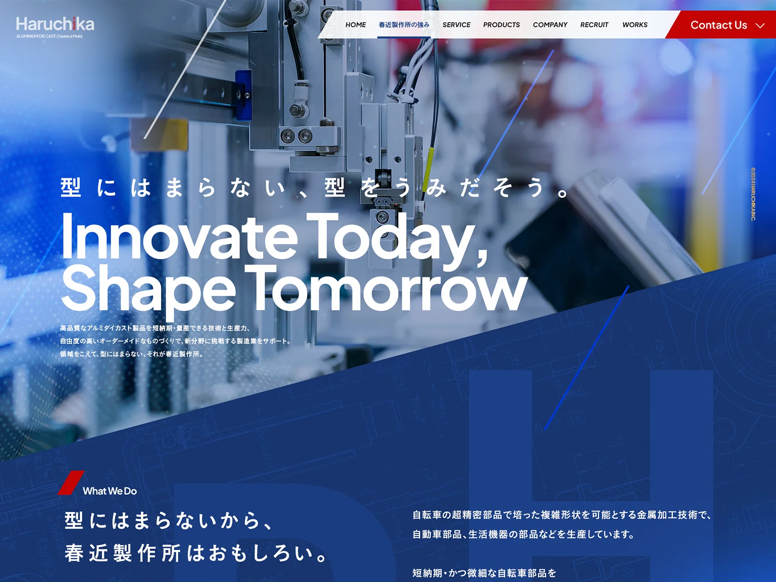
Look at the handover between the two sections in the desktop image. The lower blue area shares the angle of the strokes above it. The header’s contact area has its own sharp geometry. Even the technical texture supports the idea of making and engineering. These decisions give the photograph a framework that can continue through the website, instead of leaving the rest of the page to start again with another style.
That is a useful trend for a 2027 manufacturer website. Start with the real visual qualities of the business, then build a small set of repeatable design decisions around them. A metal specialist might work with edge profiles, surface finishes and precise cropping. A machine builder might use diagrams, operating environments and a particular view of the equipment. A process business might organise the identity around stages and transformations.
The submitted introduction recording develops Haruchika’s diagonal language into a short sequence: a large mark, a headline over a landscape and a change to machinery footage. It shows how the identity can move as well as sit on a page. The recording supports that visual observation; it does not establish loading speed or the behaviour of every visitor’s device.
When commissioning your own footage, write down what each shot needs to communicate. A wide view explains the environment. A close view can show a material finish or a precise operation. A human interaction establishes scale. Give the designer those distinctions, along with a stable still image for situations where video is unavailable. The result should have enough character to belong to your company even before the logo appears.
2 Machines get a clear and distinctive visual stage
CoPal’s published case study by Oleg Kasatkin puts a collaborative palletising system against a bright orange shape. The machine remains the focal point, surrounded by a light interface and restrained black type. In the tablet presentation, the product image and the main proposition share the opening without fighting for attention. The equipment has room to be understood.
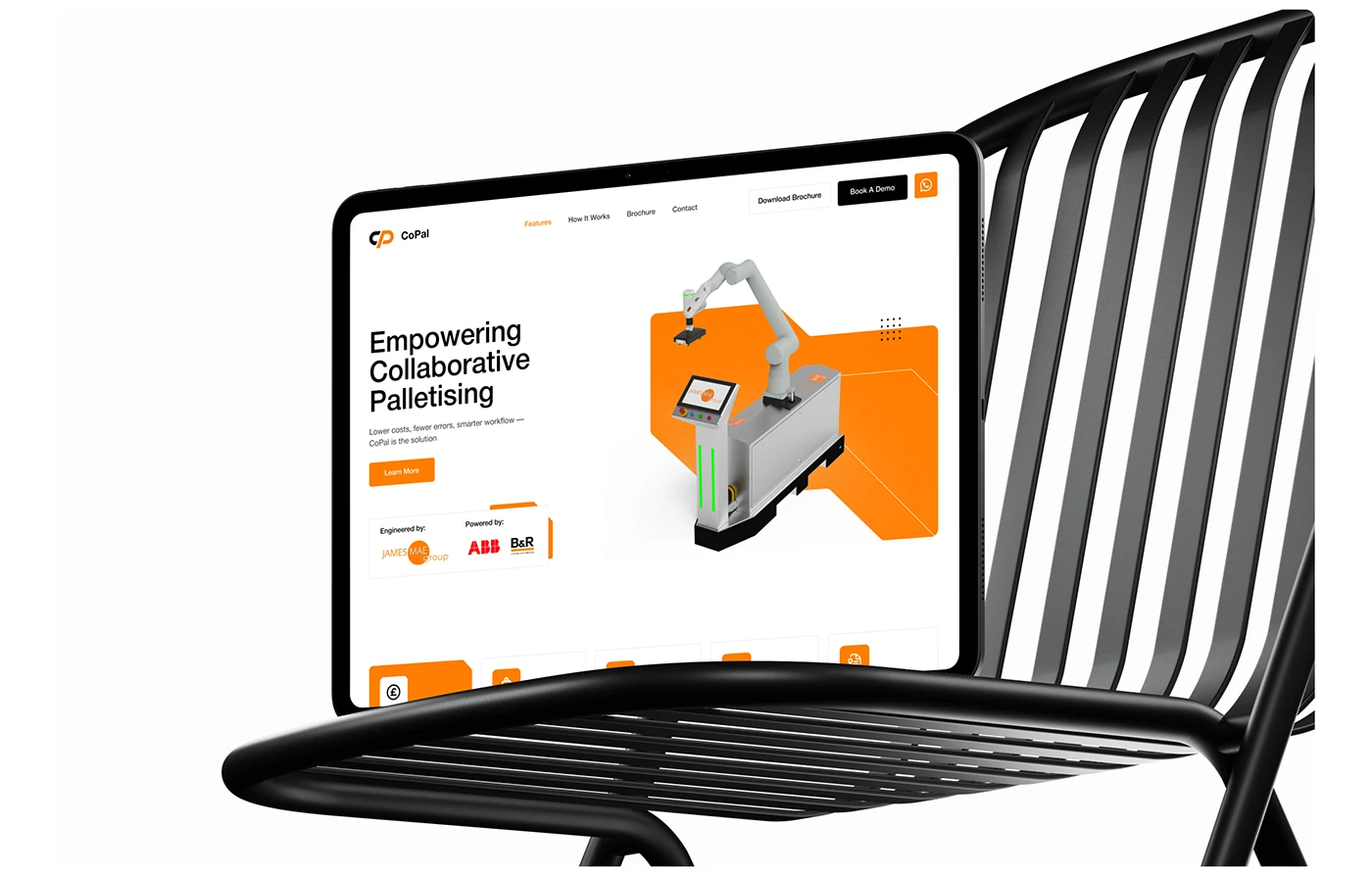
The orange stage does more than add energy. Its clipped edges establish a graphic motif that can return in cards, brochure pages and enquiry screens. That repetition makes the product presentation recognisable across the buyer’s journey. It is a good direction for businesses with machinery that is visually intricate but commercially easy to confuse with a competitor’s.
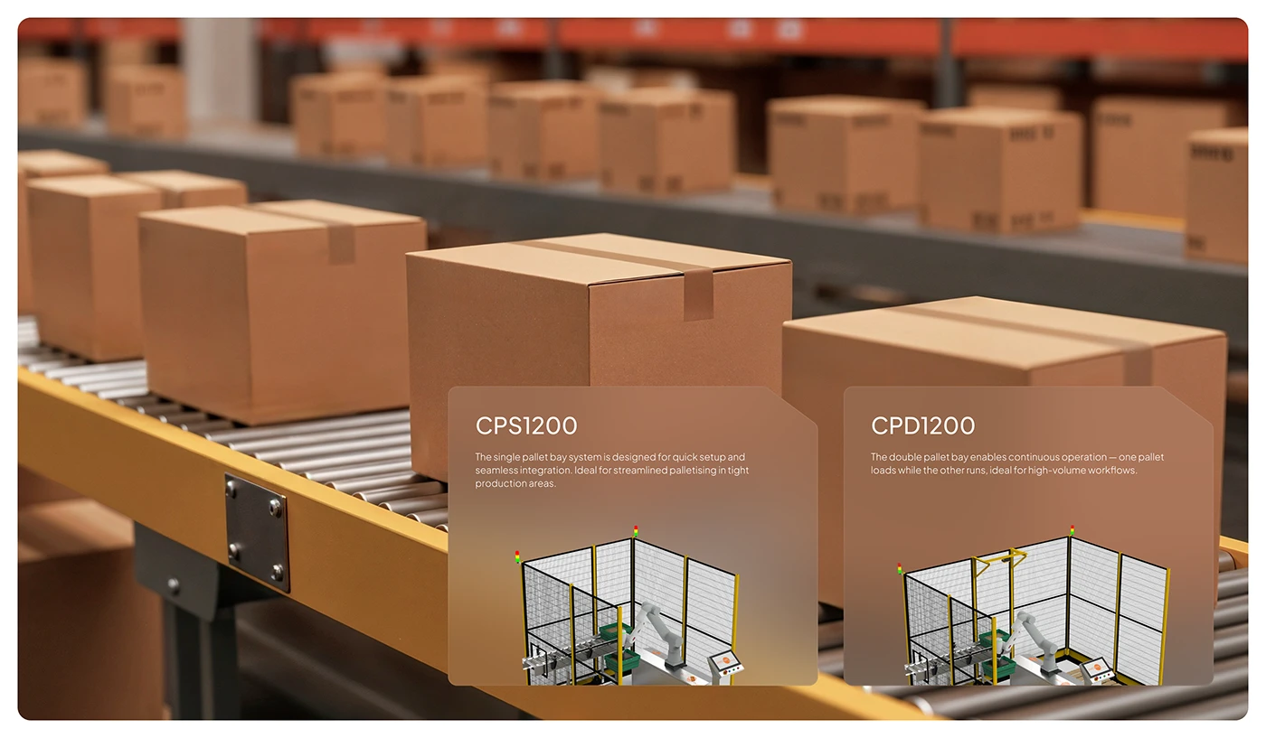
The configuration image introduces two versions of the installation in the context of a conveyor line. Their names and short explanations share the same card structure. This helps a visitor see that the business offers a choice, while the background keeps the choice connected to an operating environment. We are reading a design presentation here, rather than verifying the current equipment specifications.
For your own product family, decide which view makes differences visible. A beautiful close-up might conceal the footprint. A wide photograph might hide a change in tooling. An isolated rendering may clarify the shape, while an installation photograph explains how the system fits into a line. Those views serve different purposes, and a strong product page can use more than one.
The practical design brief is simple: establish one consistent opening view, then add the views needed to answer the next technical questions. Label the version clearly and keep the image tied to the correct configuration. If an optional accessory appears in the photograph, say so. Visual polish becomes much more useful when buyers know exactly what they are looking at.
3 Bold typography and colour carry specific jobs
A vivid accent and an oversized heading can make an industrial website memorable. Their best use is intentional. CoPal’s typography board identifies a hierarchy of heading, supporting text and body copy, alongside an orange, black and white palette. It makes the system behind the interface visible: scale directs the reading order, while the accent gives selected elements emphasis.
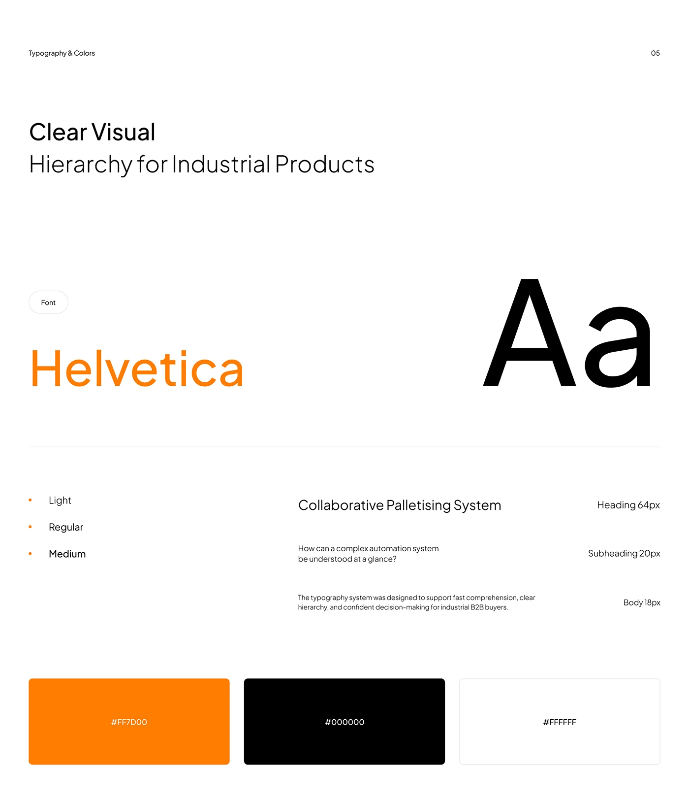
The board names Helvetica and shows different text roles. The lesson is the relationship between those roles, rather than a requirement to choose that exact font or copy the displayed sizes. A technical website may need a different typeface to handle multilingual content, product codes or dense tables. The hierarchy still needs to make a product name, a benefit and a specification recognisably different.
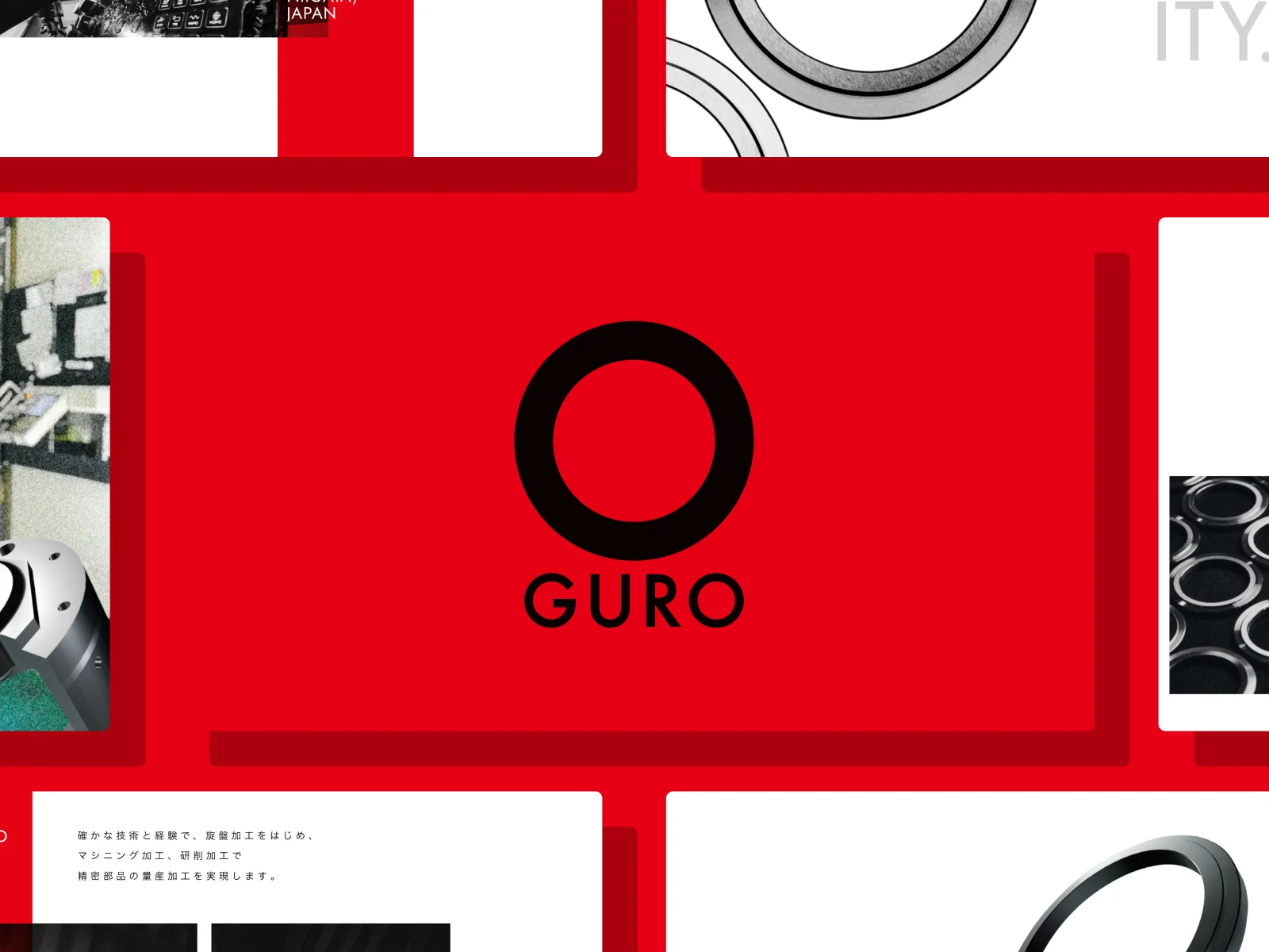
OGURO’s Awwwards presentation, created by OVERA, offers a more graphic counterpoint. A large black circular mark sits on red, followed by white panels featuring machined metal components and process imagery. The geometry of the identity feels related to the physical subject. It is a striking reminder that precision manufacturing can support a forceful brand expression.
For a 2027 brief, assign colour to a small number of roles. The main accent might identify a chosen configuration or the primary action. Neutral surfaces can support longer technical reading. A second emphasis may help explain a process stage. Document those roles so that a new product page does not introduce a new meaning for the same colour.
Typography deserves the same discipline. Test the longest actual product name, a reference code with letters and numbers, and a specification containing units. Then test the translated heading. A large title that survives only with three convenient English words has not finished its job. The expressive layer should be able to coexist with the precise layer that engineers and procurement teams use.
4 Applications and components lead the product story
A useful industrial website lets a visitor recognise an application before asking them to understand the entire product range. Haruchika’s submitted gallery recording presents four application areas on a shared blue stage. A bicycle, car, taps and robotic arm appear with numbered states and arrow controls. Familiar end uses provide a visual route into manufacturing capability.
The recording shows changing application imagery and a consistent composition. It gives us a clear design reference for connecting an end product to the work behind it. We would develop that idea into an application page that links to the relevant process, material or product family. A buyer arriving from a specific industry should be able to move towards evidence relevant to that industry.
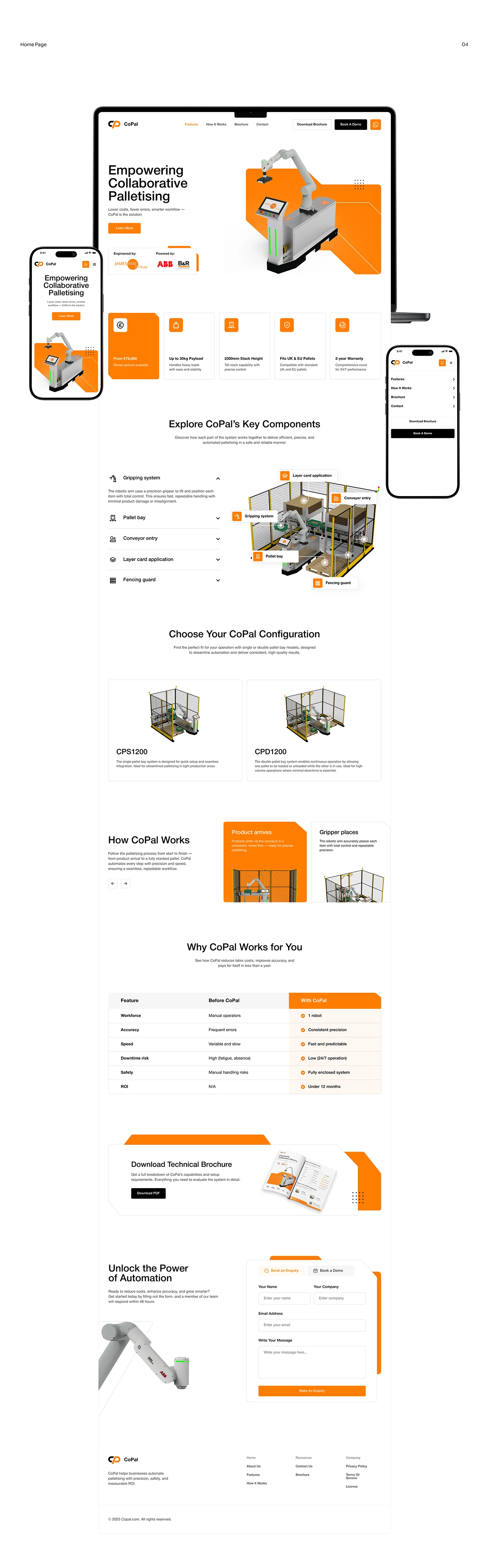
CoPal’s full homepage board works at a smaller scale of explanation. A labelled diagram identifies parts of the palletising installation; configuration cards then show alternatives, followed by process cards and a comparison area. The page moves between an overall picture and the details needed to understand it. Its mobile and desktop mockups also show how the same identity carries across different presentations.
This offers two complementary routes for a manufacturer. An application route begins with the buyer’s situation. A component route begins with the equipment and explains how its parts contribute. A complex site may need both, with careful links between them. The choice should follow the way your customers describe their need during a real sales conversation.
Choose one product and draw its path before redesigning the whole catalogue. Which application introduces it? Which process explains its suitability? Which configuration matters? Which document supports a technical assessment? This exercise gives the designer a meaningful sequence to work with. The visual effect can be ambitious because the content has a clear direction underneath it.
5 Capability becomes something the visitor can see
Haruchika’s scroll recording changes the type of evidence as the company story develops. Technical imagery gives way to diagonal capability cards, followed by a building photograph, CAD work and production equipment. The recurring blue and angular language ties these elements together, while each image answers a different question about the business.
The factory exterior establishes a physical setting. A CAD screen points towards design work. Production equipment shows another part of the operation. Large numbers are presented beside the imagery as company statements. We can observe how those statements are designed; we have not independently audited the figures or treated them as evidence of a commercial outcome.
For your own 2027 website, build a capability library with a purpose for every item. A process photograph should identify the operation it shows. A material example should connect to the relevant grades or finishes. A case study should make clear what was supplied and what can be disclosed. This makes the content useful to a buyer who is assessing whether the company can handle a particular requirement.
There is room for considerable visual strength here. A detailed machined part, a tool in use or a well-framed assembly can carry an entire section. Give the image enough space, then pair it with specific language. If the subject is a finishing process, describe the process. If it is an inspection activity, explain its place in the project. Avoid asking a generic caption to do the work of technical context.
The marketing team should also know how that evidence will stay current. Assign an owner for the underlying claim and record which images can be published. A reusable content structure can hold the application, process, evidence and related product links together. That is our implementation recommendation: the design becomes easier to sustain when the content has a reliable home.
6 Buyer actions reflect different levels of readiness
CoPal’s enquiry and mobile navigation presentation separates three useful next steps: downloading a brochure, booking a demonstration and sending an enquiry. The mobile menu gives the brochure and demo routes their own visible actions below the navigation links. The contact layout pairs contact information with an enquiry form, instead of leaving the visitor to infer the next move.
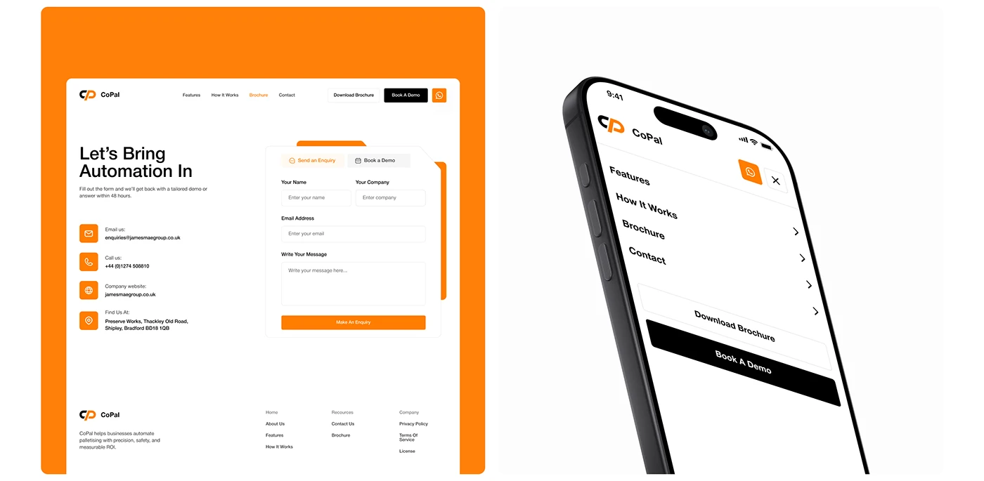
This is a practical direction for industrial web design in 2027. A procurement colleague may need a document to circulate internally. An engineer may want to discuss an unusual configuration. A project owner may already be ready for a demonstration. The website can support those different jobs with distinct routes and clear explanations of what follows.
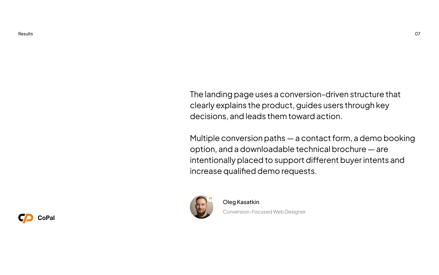
The designer’s results board describes those multiple conversion paths as part of the project rationale. It is useful context for the visible layout. It does not provide a measured before-and-after conversion rate, so our analysis rests on the design choices shown. The interesting point is how the actions correspond to different questions, rather than how many buttons appear on the page.
When adapting this approach, give each route an honest promise. Explain what the brochure contains. Say what a demonstration covers and whether it is remote or on site. Tell the buyer what information helps a technical enquiry reach the right person. The action label, the next screen and the sales team’s response should describe the same process.
Measure those routes separately after launch. A download, a demo request and a qualified project are different events. Review which content precedes them and whether the enquiry reaches the appropriate team. That provides a useful basis for improving the site without treating every interaction as an equivalent lead. The visual hierarchy should help people choose, while the operational process makes the choice worthwhile.
7 The website and technical documents share one system
CoPal’s brochure presentation repeats the product image, orange geometry and typographic hierarchy seen on the website. Beside it, a web layout gives the document a dedicated download area. That relationship matters in industrial sales, where the website often begins a conversation that continues through a document, an internal email and a meeting.
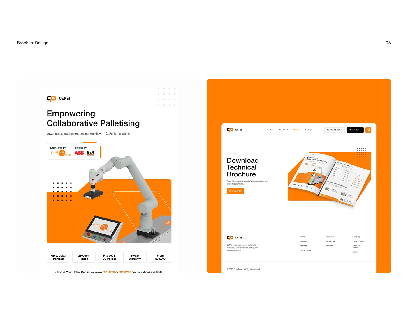
The brochure becomes a recognisable continuation of the product page. A buyer can carry the same product name and image into a discussion with colleagues. The website’s download area explains the document’s role instead of relying on a small PDF icon. This is an achievable trend even for a manufacturer that is updating one product family at a time.
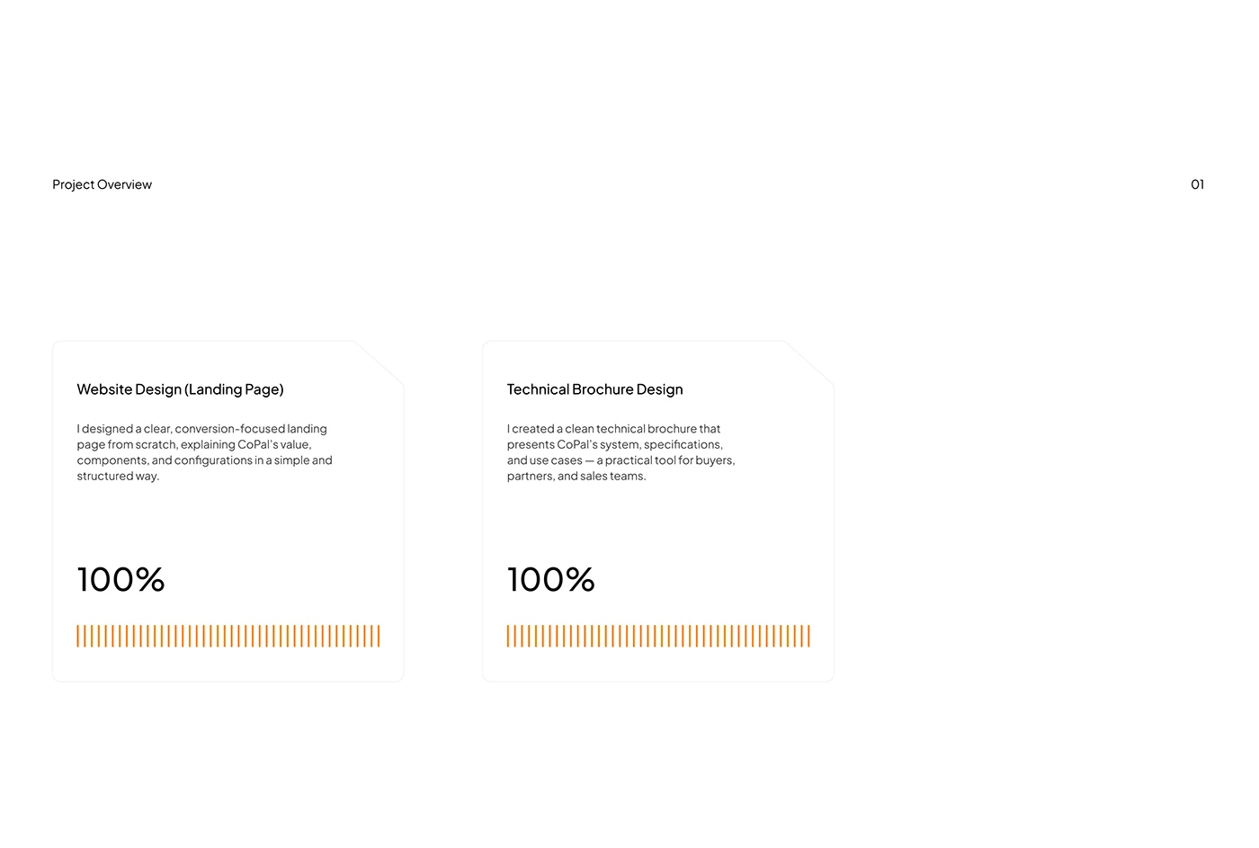
The project overview board explicitly places website design and technical brochure design beside one another. The displayed percentages refer to the scope presentation, and we do not interpret them as conversion results. The useful idea is that the designer considered both outputs as part of the same communication project.
For your brief, list the documents that a real prospect receives. Product sheets, application notes, installation requirements and sales decks may need different levels of detail. Agree which information belongs on the public page and which belongs in a downloadable document. Keep the product name, configuration terminology and visual references consistent across the two.
Give documents a revision date and an owner, and make their role clear before the visitor downloads them. A concise HTML summary can help somebody decide whether a long technical document is relevant. When a specification changes, the team should know which page and document need updating. A shared design system is most valuable when it supports that shared content responsibility.
8 Mobile gets its own art direction and reading order
Haruchika’s submitted mobile image stacks the main headline into short, emphatic lines. The logo and compact menu sit above it, while the blue imagery and diagonal accents retain the character of the desktop composition. The result shows a deliberate mobile hierarchy. The visual idea has been reorganised for a narrow view.
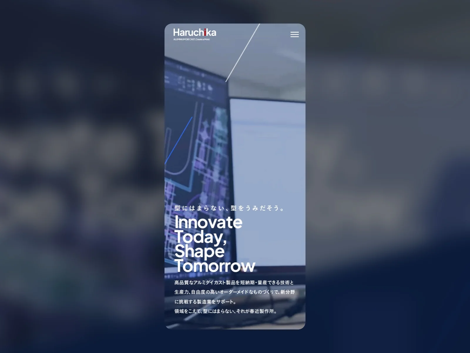
A manufacturer website benefits from this level of attention because a mobile visitor may be checking a supplier during a meeting, following up after a trade event or opening a product link sent by a colleague. The first screen should help them identify the business and reach something useful. The design can remain expressive while the reading order stays clear.
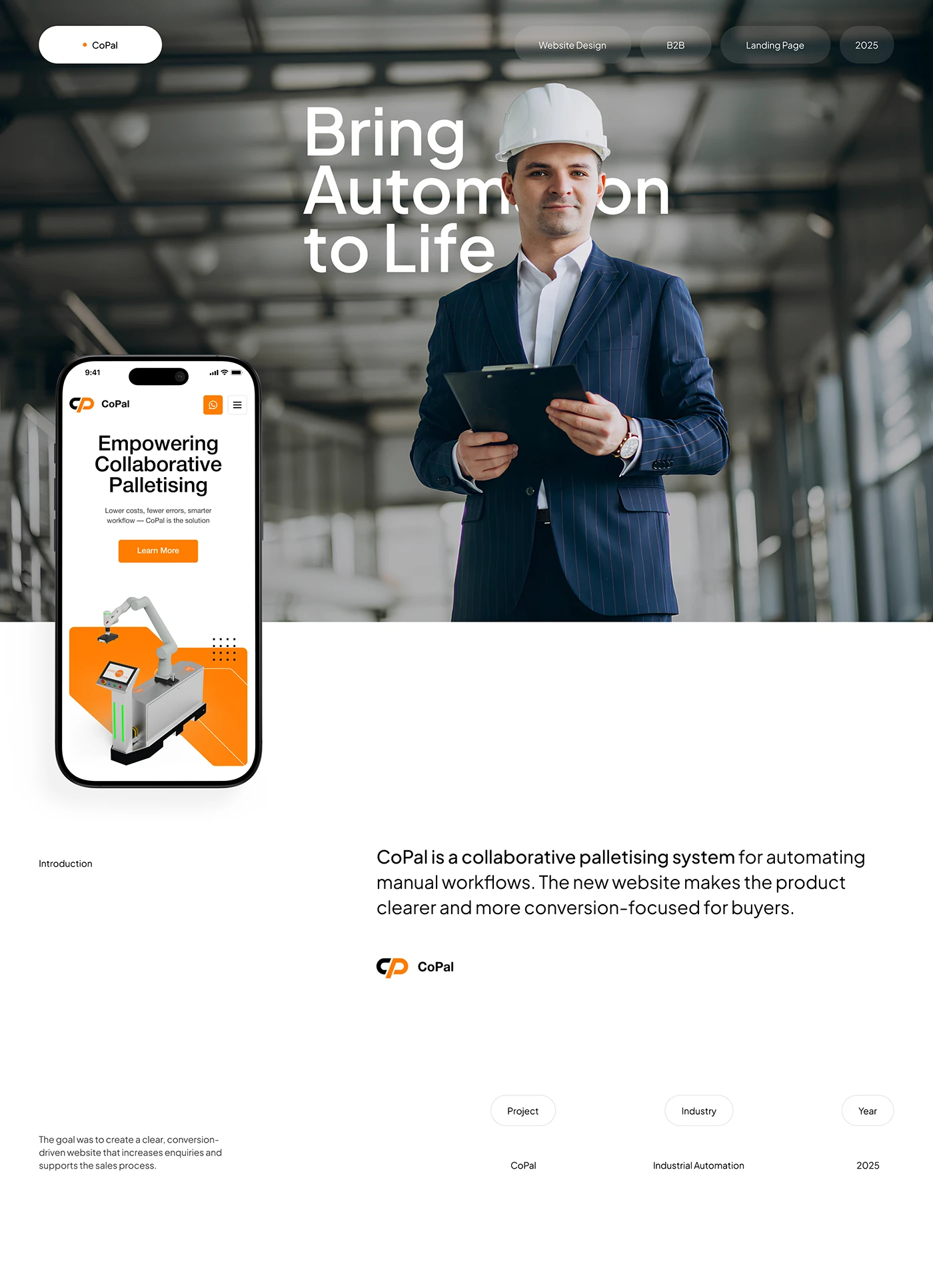
CoPal’s cover combines a human subject with a phone mockup showing the product proposition and machine. It is a Behance presentation image, rather than evidence that the human photograph is the live website’s opening screen. The phone view is still informative: the headline, action and equipment form a compact sequence that can be read in order.
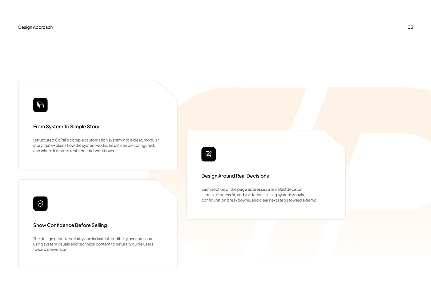
The project’s design approach board sets out the designer’s rationale around explaining the system, supporting decisions and establishing confidence. It helps connect the visual choices to the intended buyer journey. We would turn those intentions into concrete mobile tasks during a project review: locate a configuration, understand a component, find the brochure and start the right conversation.
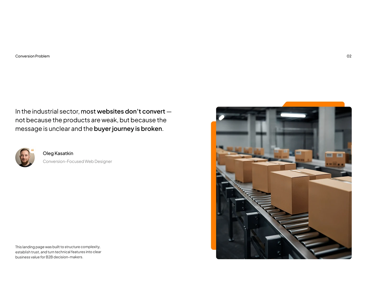
A further commentary board links a conveyor image to the designer’s view of clarity and buyer journeys. The accompanying statement is the creator’s general perspective, rather than a sector-wide finding established by this article. The image is useful because it grounds the communication in an operating setting. Your own content should make that connection with evidence specific to your product and customers.
Test mobile art direction with actual content. Use the longest product name, the most detailed card and the least convenient translation. Check that the diagram remains understandable and that the form can be completed without losing context. A mobile layout deserves its own review, including a clear path back to product information after an action. The best visual idea is the one that still helps when the screen gets smaller.
Turn the trends into a focused industrial website brief
You do not need to adopt every visual direction at once. Choose the decisions that help your business explain itself. A specialist component manufacturer might begin with strong product photography, an application route and a consistent specification layout. An automation company might prioritise component diagrams, configuration comparisons and a demonstration journey. A process supplier might lead with capability evidence and project examples.
Begin with one commercially important journey and use it as the design pilot. Select a real application, product family and buyer question. Gather the imagery, technical information and sales documents that answer it. Then design the route from the first page to the appropriate next step. This gives the project something concrete to review before the system spreads across the full site.
Bring sales and technical colleagues into that review with specific questions. Can they explain the configuration shown? Does the document match the page? Is an enquiry routed to the right team? Is the first useful action clear on mobile? Their answers help connect visual ambition with the work that follows a visit.
For more project-level inspiration, revisit the industrial website design examples selected for 2027. To apply these decisions to your own manufacturing business, explore our industrial website design approach or discuss your website project with Code Industrial.
Questions about industrial web design trends 2027
Which industrial web design trends are most useful for a manufacturer in 2027
Prioritise the trends that explain your offering: distinctive product imagery, clear applications, labelled components, capability evidence and buyer actions suited to different questions. Typography, colour and motion can give those elements more character. Start with a real product journey so you can assess whether the visual choices help a buyer understand and act.
Should an industrial website use large video backgrounds
Video can show an operating environment or process that a still image cannot fully explain. The Haruchika recordings demonstrate a visual direction worth considering. For your implementation, define what the footage communicates, provide a stable still alternative and review mobile and reduced-motion states. A background film should support access to the product information and actions.
How can a technical website be visually bold and precise
Give expressive elements and technical content clear roles. Use a distinctive opening composition, then make specifications, labels and configurations easy to read. CoPal’s presentation connects a bright product stage with diagrams and documents; OGURO connects a forceful identity with component imagery. Consistent terminology helps the visual system remain useful through the details.
Are these websites and projects from 2027
They are existing Awwwards and Behance references reviewed for planning in 2027. The year describes the article’s editorial horizon. Haruchika and CoPal were published as references in 2025. We are drawing design lessons from visible material, rather than claiming future awards, measured market adoption or verified conversion gains.
What should we prepare before redesigning a manufacturing website
Prepare real product and process imagery, the application structure, configuration information, current technical documents and a clear enquiry process. Choose one important product journey as a pilot. Assign owners to specifications and evidence, and review the proposed design with sales and technical teams before extending it across the full catalogue.
Projects and visual credits
Haruchika Manufacturing by Leapy,Inc. on Awwwards · CoPal industrial website design by Oleg Kasatkin on Behance · OGURO by OVERA on Awwwards. Original imagery and recordings belong to their respective creators and brands. The analysis and recommendations are written for this editorial guide.