A component worth looking at. An application a buyer recognises. A technical explanation they can share with a colleague. Industrial marketing has plenty to work with when the material, the product and the people behind it take centre stage. A useful 2027 plan connects those strengths to the questions that start a commercial conversation.
These industrial marketing trends for 2027 are eight directions for building that plan. They bring product and application content, a recognisable brand, useful technical evidence and a practical route to enquiry into the same brief. We use existing visual projects and current primary guidance as references. The directions are our editorial recommendations for the coming year, rather than measured predictions about adoption across the industry.
The guide is written for manufacturers and industrial businesses deciding what to publish, what to improve on their website and how their marketing materials should support sales. Start with one product family or application. A specific starting point makes it easier to agree the information, create the materials and review whether buyers can use them.
For the wider website brief, explore our industrial website design examples for 2027 and industrial web design trends for 2027. Here, we follow the content and commercial relationship across the pages, documents and conversations around that website.
1 Organise content around the buyer’s application
Choose an application your team knows well and describe the job the buyer needs to complete. A manufacturer supplying a component can explain the selection conditions and connect them to the relevant product family. A machinery company can show where a machine fits in a production process. Give the reader enough context to understand whether the page belongs to their situation.
Build the page with the colleagues who answer the enquiries. Ask what the buyer normally knows at the start, which details influence the recommendation and what still needs a conversation. Turn that knowledge into a readable route through the application. Use genuine terminology and explain the relationship between the application and the products shown.
Keep the product route close to that explanation. A visitor should be able to find the relevant item, understand a selection condition and reach the supporting information. Our industrial digital catalogue guide explores the collection, detail and document pages that support this part of the journey.
For the first release, select a manageable group of applications and agree who will maintain them. Review one page with a buyer’s question and a representative product. Ask whether the page helps the reader identify the next useful step. That review gives the team a basis for expanding the content with consistency as the range develops.
2 Build a recognisable brand across the buying journey
Metal, a construction grid and a flash of magenta. Hyperscale’s identity has an immediate visual signature, and the presentation takes it well beyond the opening website screen. Phenomenon Studio, Mikhail Olan, Dmitriy Kirsanov and Polina Chebanova show the same vocabulary across documents, presentations, advertising, physical materials and mobile layouts. Their Behance case was published in April 2026; we revisit its eleven visual boards here from a marketing perspective.
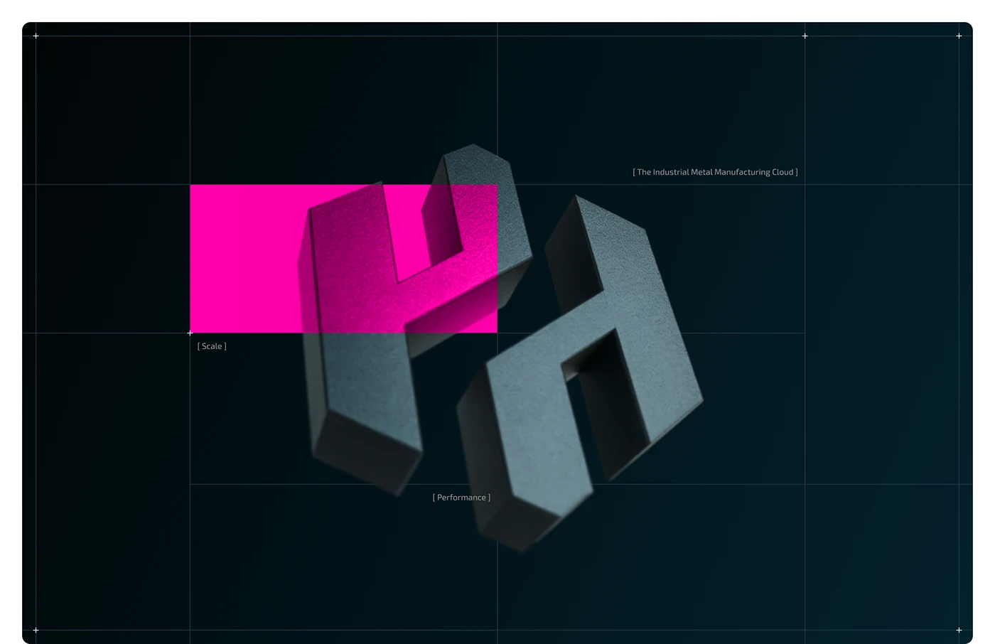
The dimensional H turns a letter into a material object. Its dark metal surface, grid and magenta overlay give the brand a distinctive starting image. For a manufacturer planning a campaign, look for an idea connected to what you make or how you work. Decide how that idea should appear in a small social card, an opening page and a sales presentation before commissioning a large collection of assets.
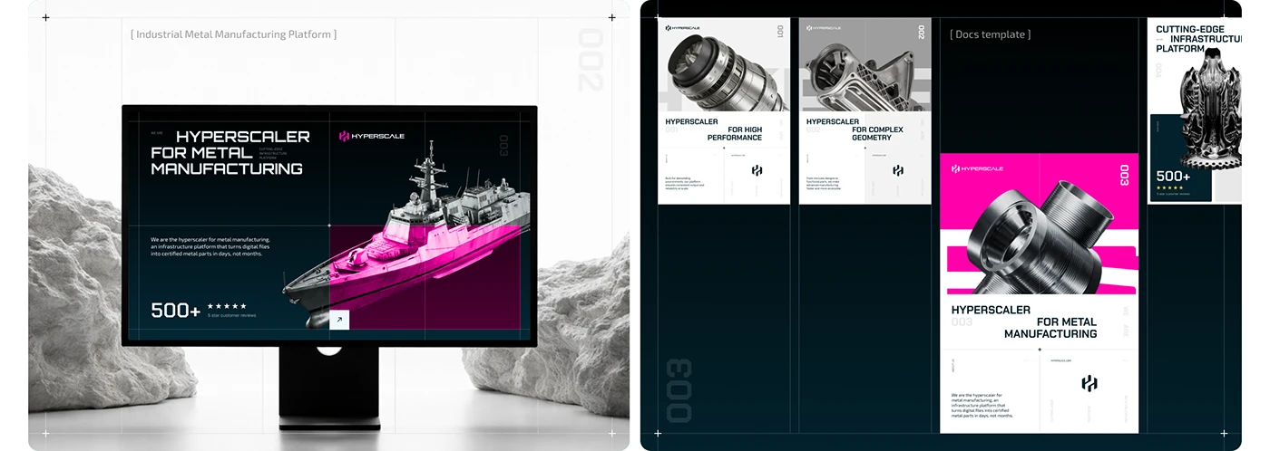
The website and document board connects a desktop opening screen to individual component layouts. The format changes, while product imagery and graphic relationships remain recognisable. That is a useful way to brief the material a buyer may circulate internally. Give the document a clear purpose and carry the same product names and visual identity through from the page where it is found.
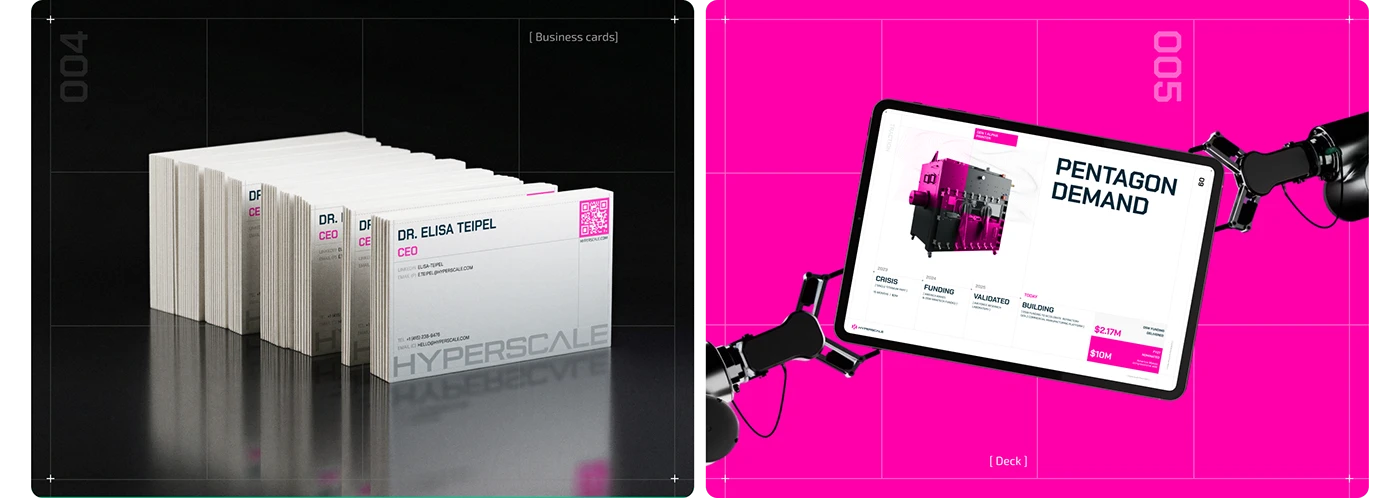
Business cards and a tablet deck place the identity in a sales context. The presentation on the tablet uses the same magenta, grid and typography as the website artwork. For your own materials, make the transition from campaign to meeting easy to recognise. Check the commercial claims in the actual deck with the team that owns them. The funding and demand figures inside this original mockup are not verified results of our review.
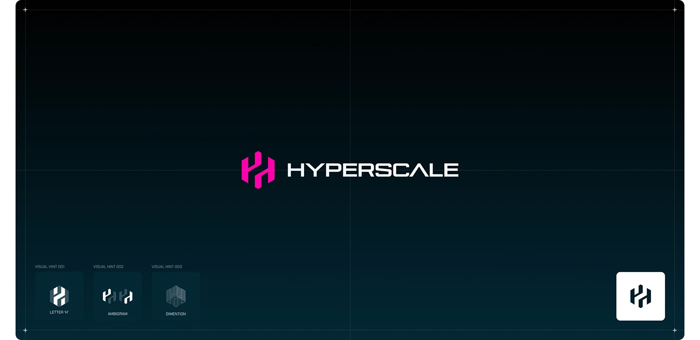
The logo board explains the H through letterform, ambigram and dimensional hints. This gives colleagues more than a file to paste into a slide: it shows the idea behind the identity. In a manufacturing marketing brief, specify the versions the team will need and the places they will use them. Bring a technical sheet and a compact digital header to the design review.
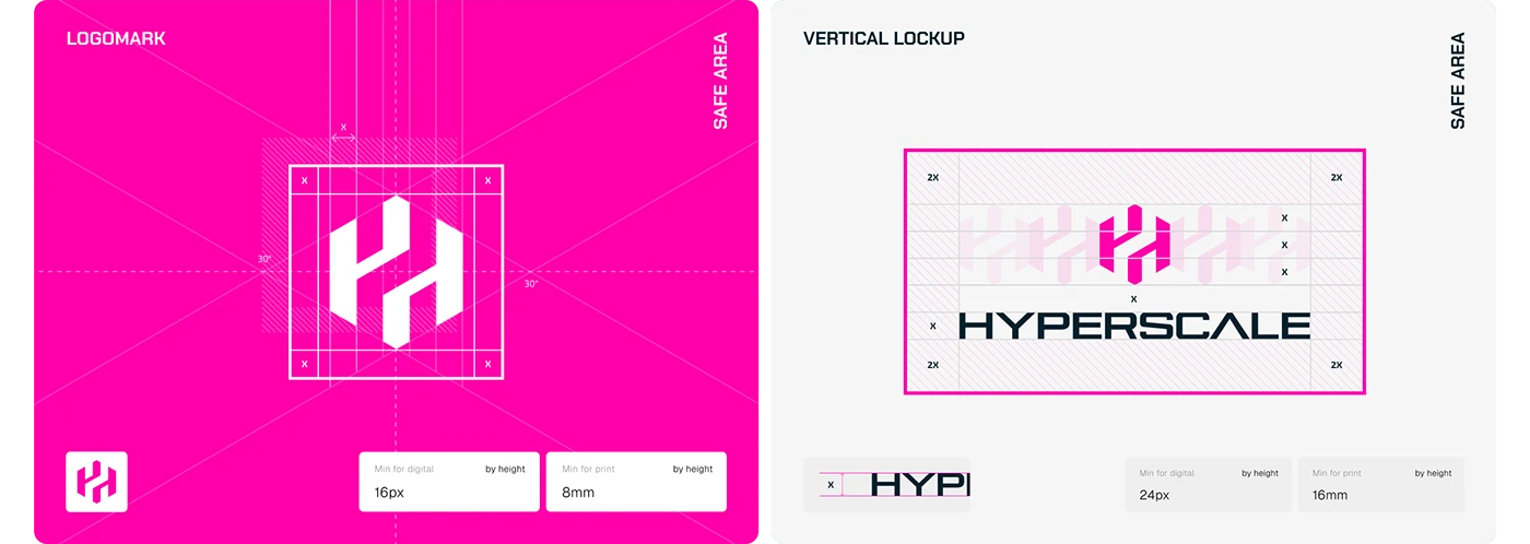
The next board turns that idea into rules for the mark, vertical arrangement and surrounding space. Digital and print size examples appear beside the construction. Those rules are useful when several people create distributor documents, event graphics or sales materials. Test your own identity on the smallest practical label and the longest company or product name the team expects to publish.
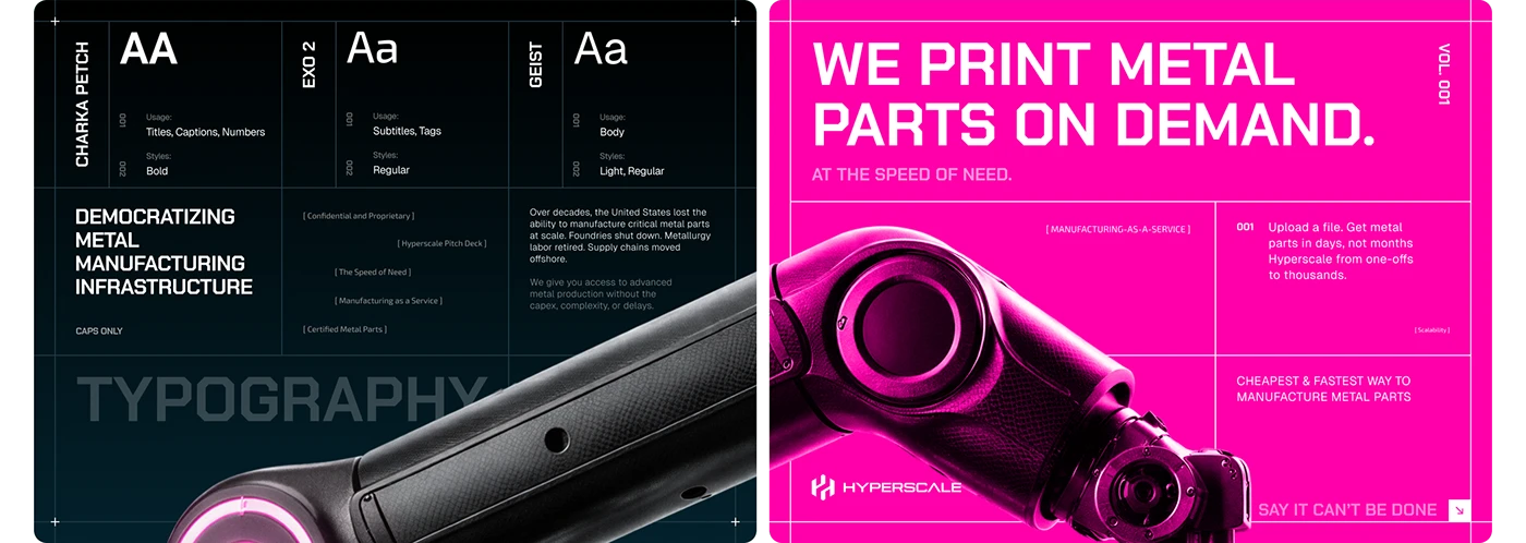
The typography board assigns different jobs to Chakra Petch, Exo 2 and Geist: titles and numbers, shorter labels, and body copy. Beside it, a manufacturing message uses the same system at campaign scale. The useful decision is the hierarchy. Make room for both the short headline and the technical explanation that follows. Review the system with a real specification and a paragraph a buyer needs to read.
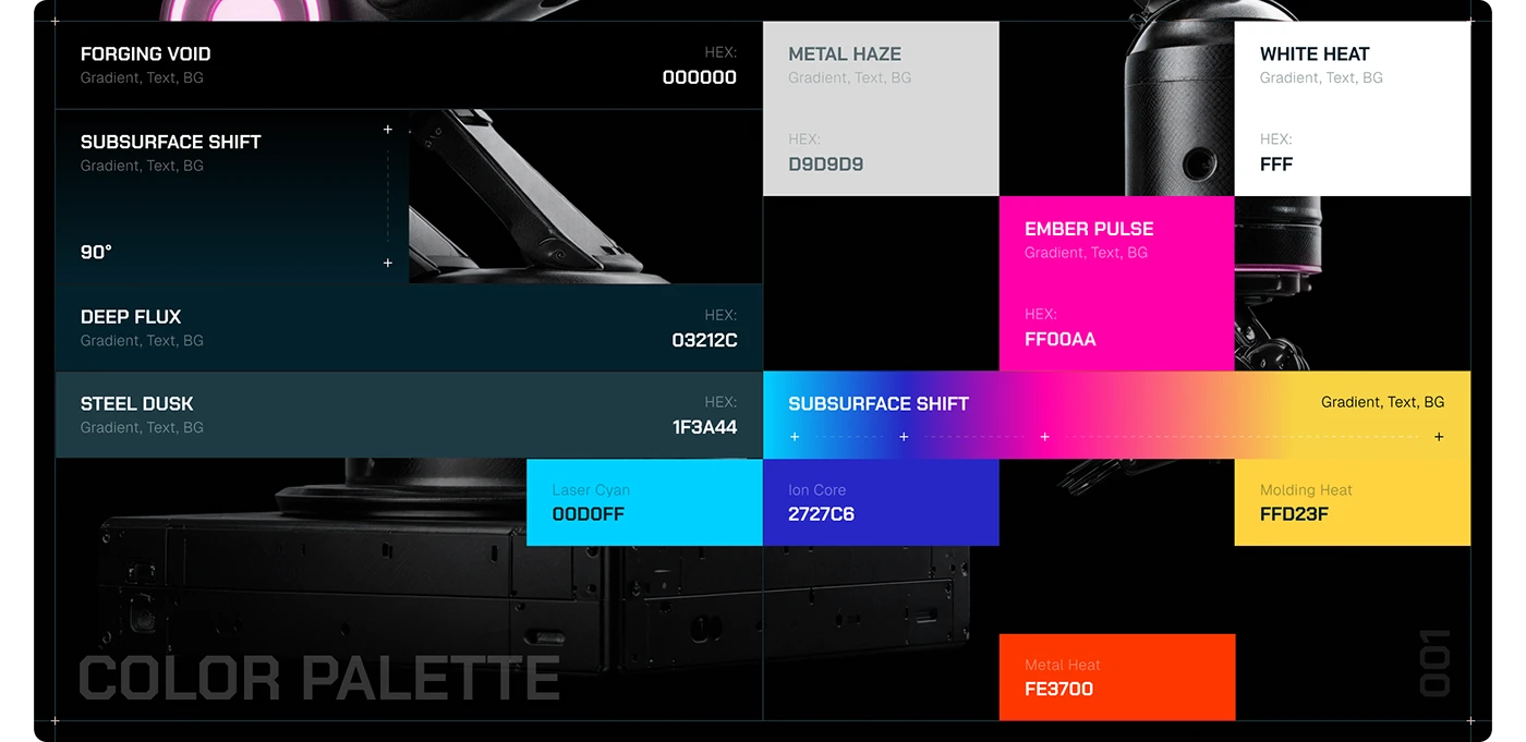
The palette connects near-black and dark blue surfaces to neutral greys, white and a bright magenta accent, with further colours shown for the wider system. The metal and robot-arm imagery makes those choices part of the industrial story. For your own campaign, define which colours carry identity and which carry information. Then check the actual combinations in the formats your team will publish.
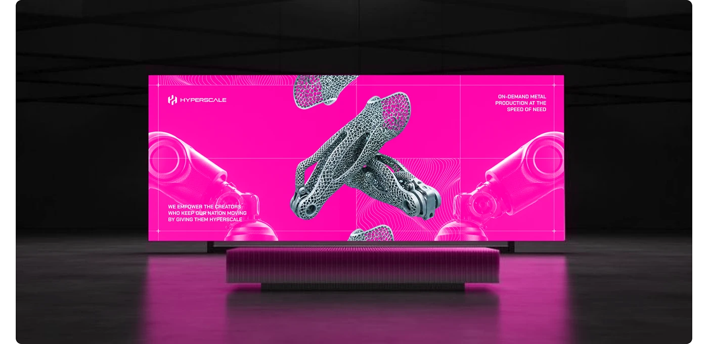
The billboard mockup lets the material take centre stage: robot arms flank a lattice component on a magenta grid. It is a brand application, rather than evidence of a live advertising campaign. The planning lesson is scale. An event graphic needs an idea that can be understood at a distance, while the connected landing page can provide the product and application detail behind it.
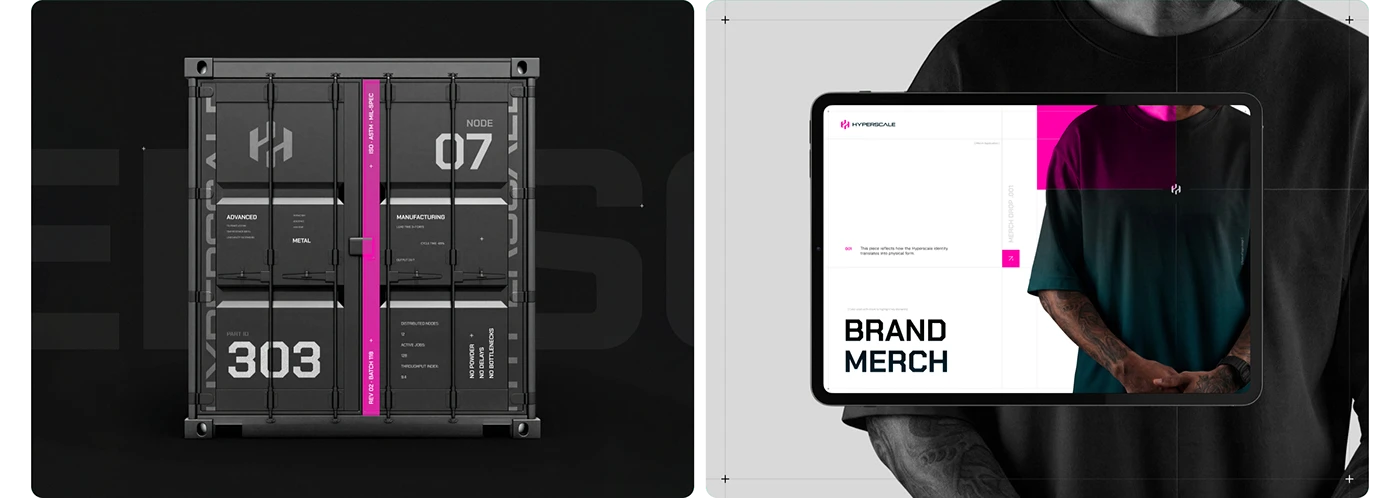
The container and merchandise board carries the identity into physical objects. Numbering, the H and the magenta strip create a recognisable relationship between the surfaces. A manufacturer can review its own website, exhibition stand, documents and delivered materials in the same conversation. Decide which marks and labels help the customer identify the organisation and the relevant product after the initial meeting.

The robot-arm composition reduces the message to a strong industrial image and the wordmark. Its magenta treatment makes it feel connected to the previous applications even without a long explanation. Use a similarly focused composition for the part of a campaign that needs immediate recognition, then give the interested buyer a clear route to the specific information they need.
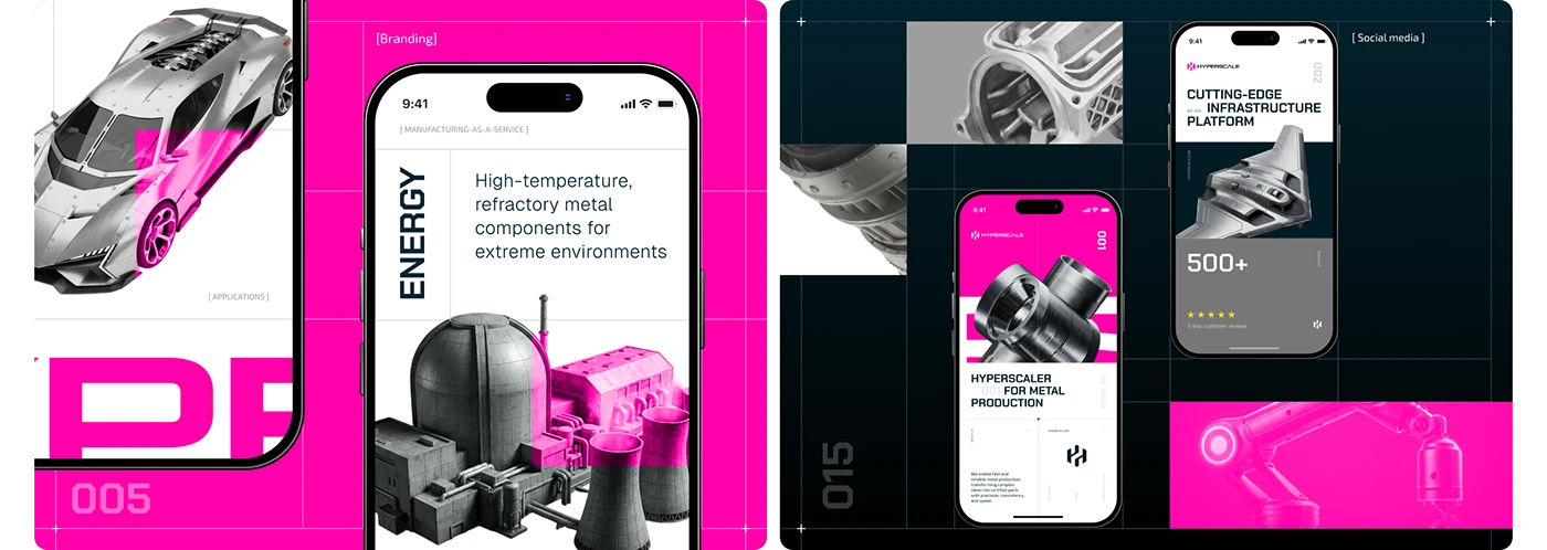
The mobile and social board brings the system back to smaller screens. Application wording, component imagery and the shared identity continue across the different layouts. For your own campaign, review the social post alongside its destination page. The buyer should be able to connect the subject and find the promised information. The artwork’s review counts and commercial statements remain part of the creator’s presentation, rather than independently established performance.
Hyperscale is useful here because the brand can be followed across many buyer materials. Our practical recommendation for 2027 is to commission that continuity deliberately: agree the product language, the reusable image idea and the document hierarchy together. The identity should give your team a system they can keep using as new applications, meetings and campaigns arrive.
3 Give the industrial offer a clear visual explanation
HappyOps gives its opening message room to breathe. A large headline sits above a short description, a visible contact route and a soft wash of colour. The Awwwards submission credits SERIOUS.BUSINESS and João (JARCOS) Ferreira and records an Honorable Mention in November 2023. We use the published design material as an existing reference for a 2027 communication brief.
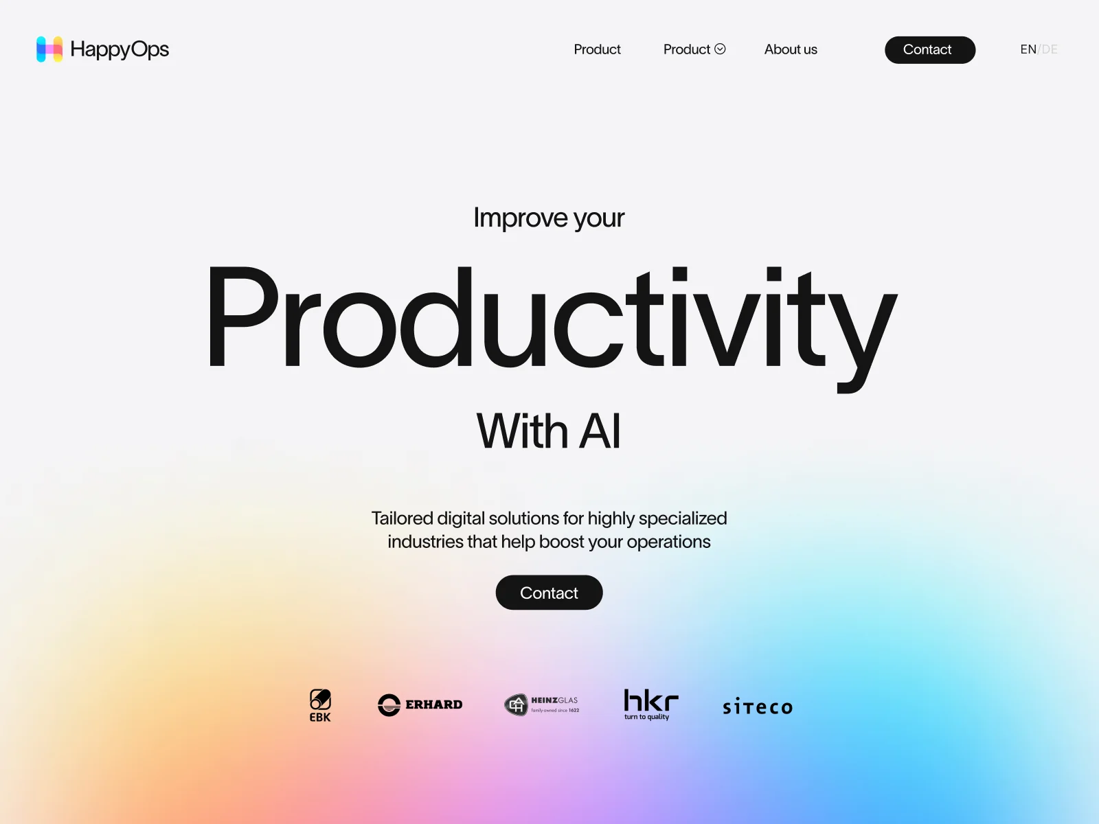
The submitted opening image separates the main idea, supporting explanation and next action. Product navigation remains visible above them. The useful marketing decision is the order: what the visitor should understand first, what helps them interpret it and where they can continue. In your own industrial brief, test that sequence with a specific application and an explanation your team can substantiate. The logos and productivity wording in the original artwork are not independent evidence of customer relationships or measured results.
The Start Page Scroll clip moves from the opening message to an explanation of the software and consulting offer, then into cards paired with factory imagery. Production, waste and energy each receive a recognisable place in the presentation. The useful communication idea is a sequence: introduce the offer, show the industrial context and give each subject an understandable explanation.
The machinery imagery keeps the factory visible while the accompanying text changes the emphasis. For a manufacturer’s campaign, choose a process or application image that helps explain the subject of the page. Keep the technical statement beside it specific and approved. The benefit wording in this submitted clip is part of HappyOps’ presentation; it does not establish measured production or environmental gains.
Later in the clip, glass, metal and component assembly have separate headings within the same layout. A marketing brief can use that structure to discuss related applications without losing the wider offer. Decide which distinctions matter to the buyer, then give each one a useful route into the detail. The clip is a recorded presentation, so we do not infer exact live animation timing from its sampled frames.
The product sequence connects four numbered factory points to an assembly workstation, performance charts, reporting and order tracking. Each change brings a new screen and a short explanation into the same layout. That pairing gives the offer a visible shape: a visitor can see the kind of interface being described.
For a manufacturing campaign, decide which part of the product deserves that kind of explanation. An interface, a component detail or an installation sequence may each need a different visual. Pair it with a question the buyer actually asks. Review the information with the product team before asking a designer to make the sequence more memorable.
A second clip uses coloured panels to explain discovery, custom software, AI integration and project transparency. The panel labels remain visible while the selected stage opens. It brings the service process into the product story and gives a reader an outline of how a project is presented.
Your equivalent brief can explain what happens after the enquiry: what the team reviews, what information the customer supplies and which decision comes next. Agree those stages with the people delivering the work. A polished process illustration is useful when it represents a process the team can follow.
The final clip moves through Collect, Process, Visualize and Mining. Large words carry the sequence; the adjacent explanation changes with each active stage. We are reading the submitted communication design here. The claims inside the recordings, including AI capability and performance language, are statements from the original brand material.
For your own page, write a short explanation that still works when someone reads it without animation. Then decide what motion adds to the relationship between the steps. Include readable controls and a usable small-screen layout in the review. The buyer should be able to understand the subject at the pace they choose.
4 Publish technical answers that can be found and understood
Build the article or product explanation around a question the team can answer with evidence. Which application does this product suit? Which dimensions affect selection? What information is needed for a quotation? Give the page a descriptive title, a clear opening answer and enough detail to help the reader make progress.
Google’s guidance on helpful content recommends original information or analysis, clear sourcing and a useful experience for the intended audience. It also states that Google has no preferred word count. For an industrial publishing plan, our recommendation is to choose the detail from the buyer’s task and review the technical facts with the responsible colleague.
Give important explanations a readable place on the page. A drawing or photograph can show a relationship quickly; the accompanying text should identify what the reader is looking at and explain the relevant condition. Name supporting documents clearly, connect them to the appropriate products and keep the versions aligned with the information the team approves.
Google’s documentation for AI features in Search says established SEO practices remain relevant to AI Overviews and AI Mode. It identifies internal links, textual availability of important content, useful media and consistency between structured data and visible content among the considerations. It requires no special AI schema or new AI text file for those features. Eligibility does not guarantee inclusion.
For your own plan, review the route from a useful question to the relevant answer. Link supporting articles where they help explain a product, process or choice. Keep claims specific enough to check and assign someone to update the page when the underlying information changes. That produces material your team can stand behind wherever the reader first discovers it.
5 Put technical evidence beside the product story
A strong product image invites attention. The evidence beside it helps the buyer decide what that attention means. Choose the specification, drawing, test information or application detail that answers the question on this particular page. Agree the relevant conditions and the version with the product team before adding a headline claim.
Write the explanation in a way that preserves the relationship between the claim and its scope. Identify the product or variant, the application and the circumstances that matter. When a result comes from a test or a customer project, decide what can be published and explain the context accurately. A reader should be able to distinguish a general capability from a specific example.
Use imagery to make the relationship easier to follow. A labelled detail can explain a connection; an installation photograph can show the application; a process image can identify the stage being discussed. Commission the picture around that purpose. Keep the caption close to the image and let it explain what the reader should notice.
Review the evidence with the colleague who will answer the enquiry. Ask which further question the page is likely to prompt and how the team would respond. Add the appropriate supporting information or next step where it belongs. This gives the product story a useful continuation from the visual into a technical conversation.
6 Design the campaign and enquiry as one journey
Choose the subject of the campaign and follow it to the destination page. If the message concerns an application, the page should help the visitor understand that application. If it introduces a product family, the relevant items and supporting information should be easy to find. Review the headline, image and first useful action together.
Then agree what the enquiry needs to accomplish. A product quotation, a project discussion and a service question can require different information. Work with the receiving team to select the details that make the first response useful. Explain the request in language the visitor can recognise and keep the selected product or application in view where the implementation supports it.
Review the confirmation and the internal handover too. Tell the buyer what has been received and how the next step works, using an expectation the team can support. Give the responsible colleague the context needed to identify the starting point. Test a representative enquiry through to its destination before sending campaign traffic to the page.
For a 2027 plan, begin with one complete route and document the decisions. Include the campaign material, destination page, enquiry, confirmation and team response. A concrete route gives marketing, sales and operations something they can review together. It also makes later changes easier to assess because the intended journey is clear.
7 Extend useful content into the partner relationship
Look at the questions that arrive after the first sale. A distributor may need a product document. A service partner may need information about an installed item. An account manager may need to explain the status of a request. Choose the recurring jobs that your organisation can support with clear, maintained information.
Give each kind of content an agreed home and owner. Public product information can support initial selection, while account-specific documents or tasks may belong in a portal. Decide that boundary with the team responsible for the relationship. Use product references and consistent names to connect the materials so the partner can recognise the same item across them.
Our industrial distributor portal examples for 2027 explore customer records, requests and account models in more detail. For a marketing plan, the practical question is which information the partner needs to use again and how they will find the current version. Bring a real document request or service enquiry to the review.
Start with a manageable set of materials and check the route with a partner. Can they identify the relevant product, find the information and understand the next action? Record where an explanation or handover is still needed. That gives the ongoing relationship a place in the content plan alongside the campaign that first attracted attention.
8 Review the commercial journey alongside traffic
Decide what a useful enquiry means for the campaign you are planning. Write the criteria with sales: the relevant application, product interest or project context, and the information needed for a first response. Keep those criteria specific enough that the team can review actual requests consistently.
Use search and website data to understand the route into that conversation. Review which pages receive impressions and visits, then look at the enquiries your tracking can reliably connect to them. A rise in impressions, a visit and a qualified request are different observations. Keep their definitions clear when the team discusses progress.
Take repeated questions back to the content. If several buyers ask about the same selection condition, review whether the relevant page explains it. If enquiries arrive without a useful reference, inspect the route from product to request. Choose a concrete improvement and agree what evidence would show that it helped.
Keep a record of the starting situation and the changes made. Review comparable periods while considering changes in campaigns, demand and the product range. Give the team room to interpret a small number of enquiries with care. The useful output is a decision about what to improve next, supported by the information you actually have.
Choose the first useful change for your 2027 plan
Put one product family, one application and one commercial route on the table. Review the current page, supporting document, campaign material and enquiry together. Ask where the buyer can make progress and where they still need information that the team could provide more clearly.
Choose a change with a defined owner and an achievable review. That might be an application page, a product detail template, a document system or a clearer enquiry handover. Agree the technical information and the material the marketing team will need. Create and verify the whole route before applying it across the range.
Keep the visual brief connected to the same decision. The opening image should introduce the subject; the technical explanation should help someone understand it; the next action should continue the conversation. A shared brief makes it easier for the design, content and sales teams to develop those parts together.
To plan that route with Code Industrial, tell us about your manufacturing marketing project. Bring representative products and a recent buyer question. They give the conversation a useful starting point for the website, the materials and the relationship around them.
Questions about industrial marketing in 2027
Which industrial marketing trends should a manufacturer prioritise for 2027
Start with the product and commercial journey that need attention in your business. Application content, useful technical evidence, consistent buyer materials and a clear enquiry can be reviewed together. Choose a manageable first change and define how the team will check it. The eight directions in this guide are planning recommendations, rather than an adoption forecast.
What should an industrial marketing content plan include
Choose the pages and materials from the questions your buyers and partners ask. A plan can connect applications, product information, technical documents, case explanations, campaign destinations and post-sale resources. Assign an owner to each kind of information and agree how updates will reach the published material.
How can industrial content support search and AI features
Publish useful, accurate explanations for your intended readers and make them accessible through clear pages and relevant links. Google’s current documentation says the established SEO practices remain relevant to its AI Search features. Review the technical availability and visible content with your website team. Inclusion and rankings are not guaranteed.
Should an industrial business redesign its brand before improving marketing
Review the materials your team needs to use. You may be able to improve their consistency with a clearer set of layouts, imagery and product language. A broader identity project can be useful when the business needs a new system across several touchpoints. Hyperscale illustrates that cross-format system through its public brand presentation.
How should industrial marketing results be reviewed
Agree what the campaign is meant to support and which observations can be measured reliably. Review search visibility, page visits and commercial enquiries with their own definitions. Connect the evidence where your tracking supports it, then inspect the buyer journey before deciding on a change. Keep sales involved in interpreting the actual requests.
Original projects and sources
Hyperscale by Phenomenon Studio, Mikhail Olan, Dmitriy Kirsanov and Polina Chebanova on Behance · HappyOps on Awwwards · Google Search Central helpful content guidance · Google Search Central AI features documentation. Original visual material belongs to the credited creators and brands. The analysis and manufacturing marketing recommendations are written for this guide.