The best industrial website designs for 2027 make the physical product memorable and give the buyer a clear way to explore it. A robot in its working environment, a machined component photographed like a design object, a truck with its digital layer made visible: industrial businesses have extraordinary material to work with. The opportunity is to turn that material into a website people want to investigate.
This selection brings together five existing projects from Awwwards and Behance for teams planning a manufacturing or industrial website in 2027. It is an editorial shortlist, rather than a ranking of sales performance. We have chosen references for the visible quality of their art direction, the relationship between the design and the industrial offer, and the lessons a manufacturer can take into a real project brief.
Some examples show a submitted website view; others show a broader design presentation. We identify that distinction in each case. These are projects published before 2027, selected for the year ahead. The year in the title describes the planning horizon, rather than an award date or a claim that these businesses have already launched a 2027 redesign.
Our central question is simple: what makes an industrial website worth looking at, and what should happen after it earns that attention? The first part gives the brand presence. The second helps an engineer, procurement specialist or operations manager decide whether to continue. Good industrial website design connects those moments.
Richtech Robotics makes the product the centre of the page

The Richtech Robotics project shows how a technical company can start with the machine itself. A robot stands in a working interior, occupying the centre of a broad hero panel. The headline sits low on the left, while a smaller news module fits into the right edge. White outlines and rounded corners organise the screen into recognisable pieces. The result is a product story with a clear visual system around it.
The most useful detail is the relationship between the two panels. The main image explains the physical offer; the inset gives a corporate update its own place. Visitors can recognise the difference between exploring the technology and reading company news. The upper navigation reinforces that separation with Solutions, Technology, Company, Investors and Resources. A distinct Contact us button remains visible.
For an industrial business planning its website for 2027, this is a reference for bringing the product closer to the buyer. Showing equipment in context can explain scale and setting more quickly than a row of abstract brand statements. That opening should lead into the technical material a prospect needs next: what the product does, where it fits, what constraints matter and how to start a relevant conversation. Those later requirements are our recommendation, rather than functionality proved by this submitted image.
Take the modular organisation as the lesson. Give product information, company updates and enquiry actions different roles, then make the route into the product range easy to understand. The rounded outlines are the visual expression of that structure; they are not the entire design strategy.
Existing project reference for 2027 planning. Your Creative, Richtech Robotics, Honorable Mention on Awwwards, 14 April 2025. No conversion results are asserted.
Gecko Robotics gives complex technology one clear opening
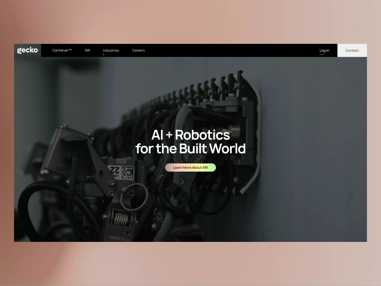
The Gecko Robotics project pairs a dark, close view of machinery with a short white headline in the centre. A compact button beneath it introduces AIR, while the navigation gives Cantilever, industries and careers their own routes. The composition has a useful kind of confidence: the photograph carries the physical complexity, leaving the opening message room to breathe.
Look at the contrast between the machine and the interface. Cables, mechanisms and components make the image visibly industrial. The text and controls are deliberately calmer. That difference helps a visitor identify where to look next without requiring the engineering image to become a diagram.
The visible Log In route matters too. It acknowledges that returning users have a different task from a potential customer arriving for the first time. That is a design lesson for manufacturers with customer tools, even though this public image tells us nothing about the private service behind the login.
For a 2027 redesign, borrow the hierarchy: establish the application, offer a clear next step and distinguish public exploration from account access. Then follow the strong opening with the evidence a technical audience will need. A concise hero earns attention; subsequent pages still have to explain the technology, its use and its limits. The submitted screen is a reference for the first part of that journey, rather than proof of measured sales performance.
Hyperscale gives industrial manufacturing a complete visual language
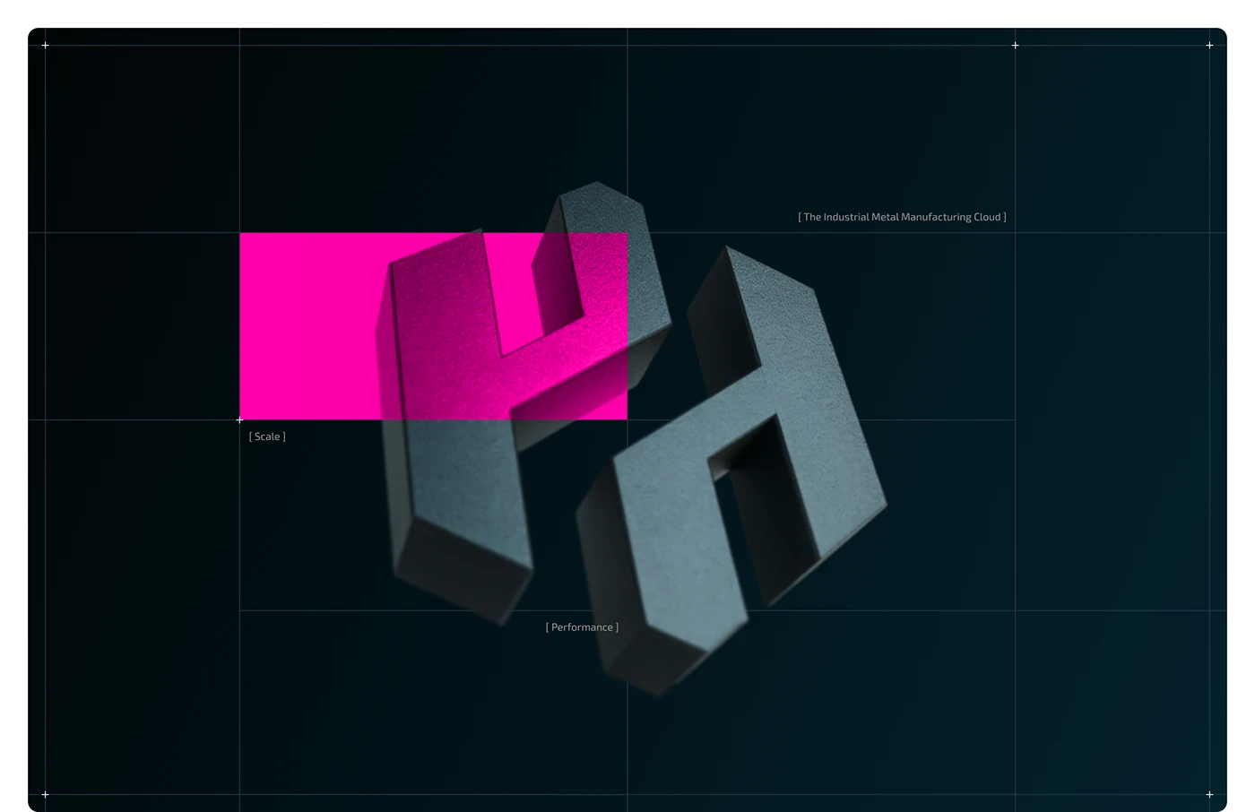
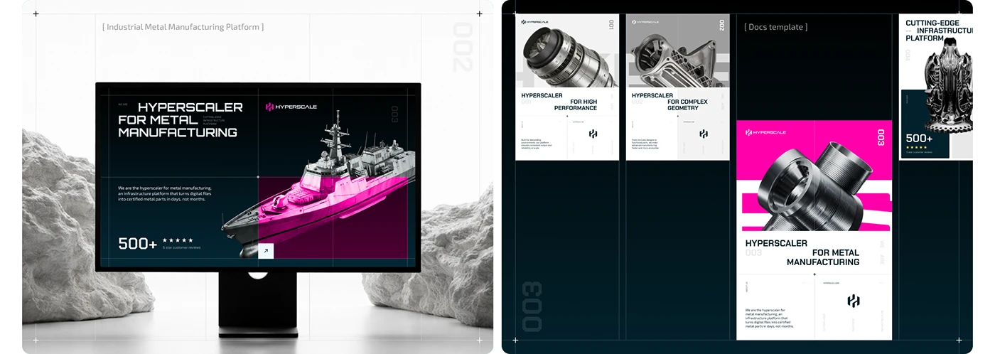
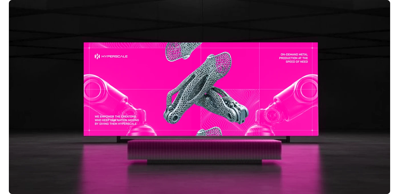
The Hyperscale presentation by Phenomenon Studio has the sort of visual confidence that makes you stop scrolling. A dimensional metal H sits over a dark technical grid; a sharp magenta rectangle interrupts the composition. The combination feels engineered and expressive at the same time. Metal provides the material cue, the grid provides order, and the pink gives the identity a recognisable signal.
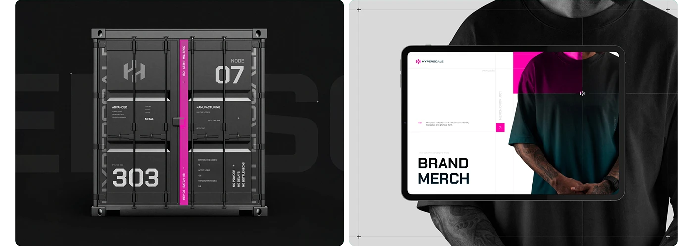
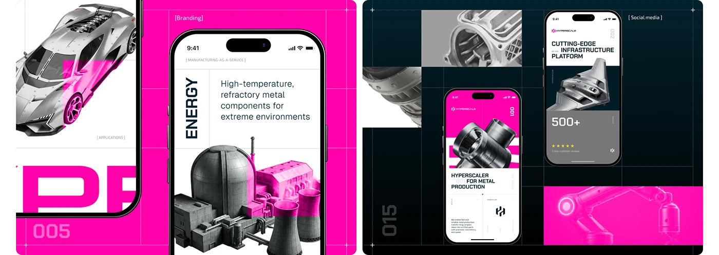
The interesting part is how consistently that signal travels. The project shows a desktop manufacturing website alongside document and page templates, then carries the same language into a tablet presentation, mobile screens, signage, a shipping container and merchandise. Those are different design applications, and the distinction matters. A billboard mockup does not prove that a website is easy to use. It does show whether the identity can hold together when the brand leaves the homepage.
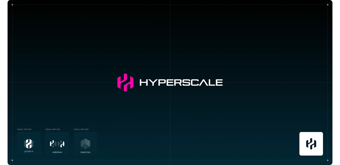
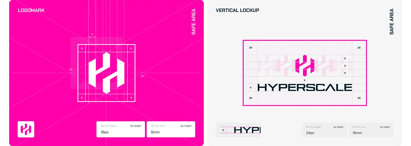
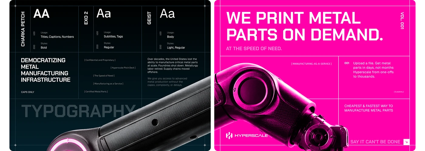
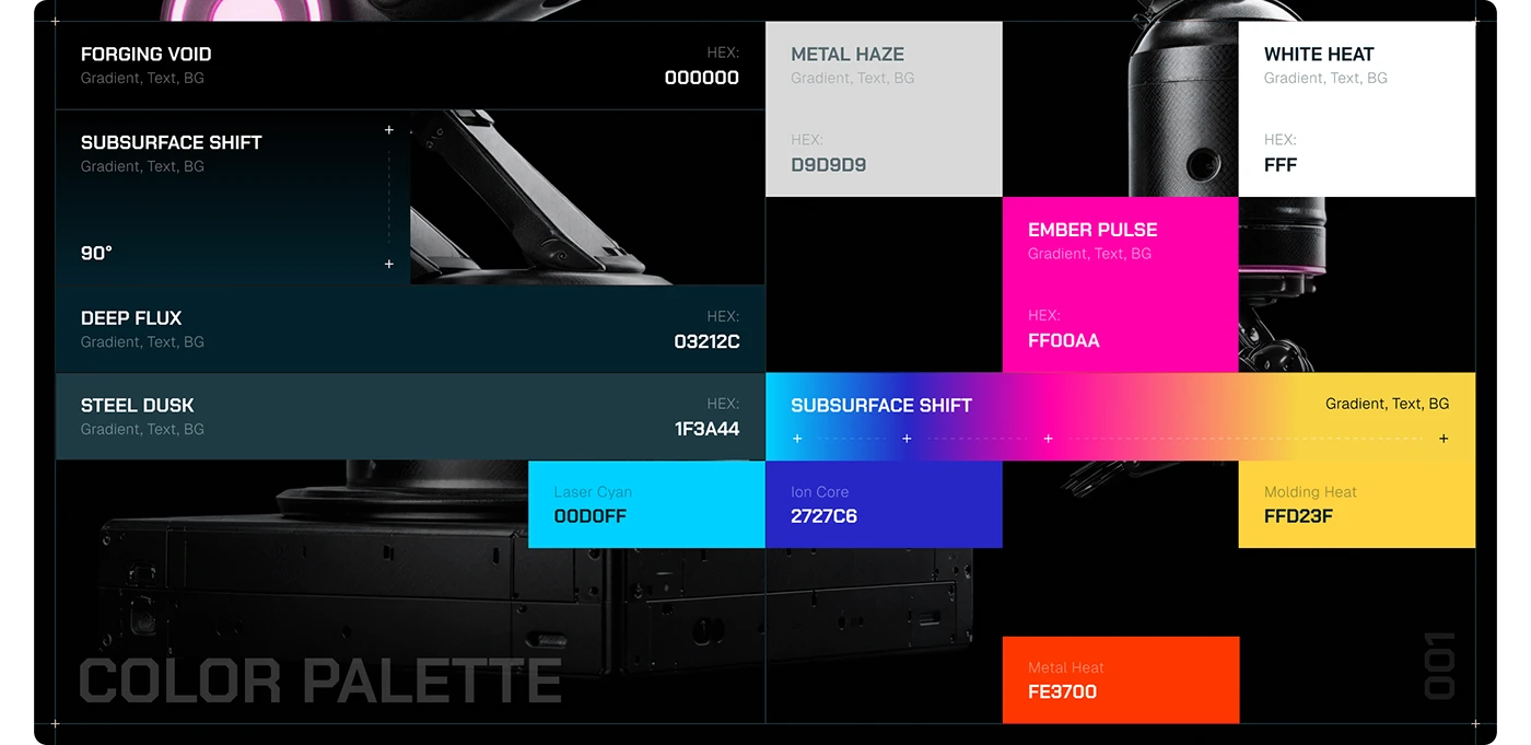
The website presentation uses a large manufacturing proposition, machinery and metal imagery, and a restrained underlying layout. The brand boards explain the system around it: a dimensional H mark, variations in the lockup, several typography roles, and a neutral base palette with much brighter accents. The result is a useful reference for manufacturers whose website, sales deck and technical documents currently look as though they belong to different companies.
For a 2027 redesign, the practical lesson is to build the visual system around real buyer materials. A specification sheet, application page, quotation introduction and mobile contact route should share recognisable rules. They do not all need the same dramatic hero. Keep the energy where it earns attention, and give dense information the quieter space it needs to be read.
Our favourite detail is the tension between the industrial object and the graphic overlay. The machinery remains recognisable; the colour and grid turn it into a brand asset. A manufacturer with distinctive processes, finishes or components could explore a similarly deliberate art direction using its own photography. That requires an original visual idea and accurate product representation, rather than borrowing another company’s pink rectangle.
This is a Behance design case, published in April 2026, selected as inspiration for 2027 planning. The visuals include commercial claims that we have not audited. We assess the visible design system and presentation; we do not treat those claims as verified business results.
The visual system behind the website
The identity boards expose the choices behind the finished compositions: the H mark, its lockup, the type hierarchy and the relationship between neutral colours and brighter accents. They are useful material for a design review because they show the rules that would need to be applied consistently across new pages.
From the website to sales and physical materials
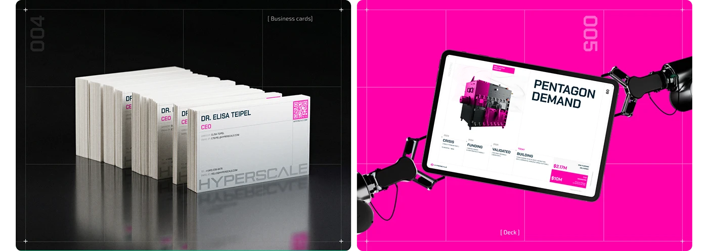
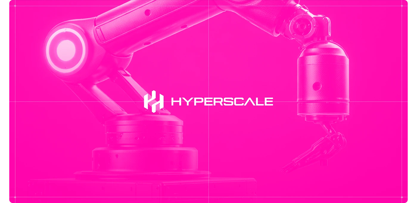
The remaining applications show the identity at different distances and in different formats: a business card, a tablet presentation, an outdoor billboard, a container and a full-frame robot-arm composition. The mobile and social mockups complete that sequence. Each is a presentation of the design, with its own role in the wider brand system.
Terminal Industries makes the digital layer visible
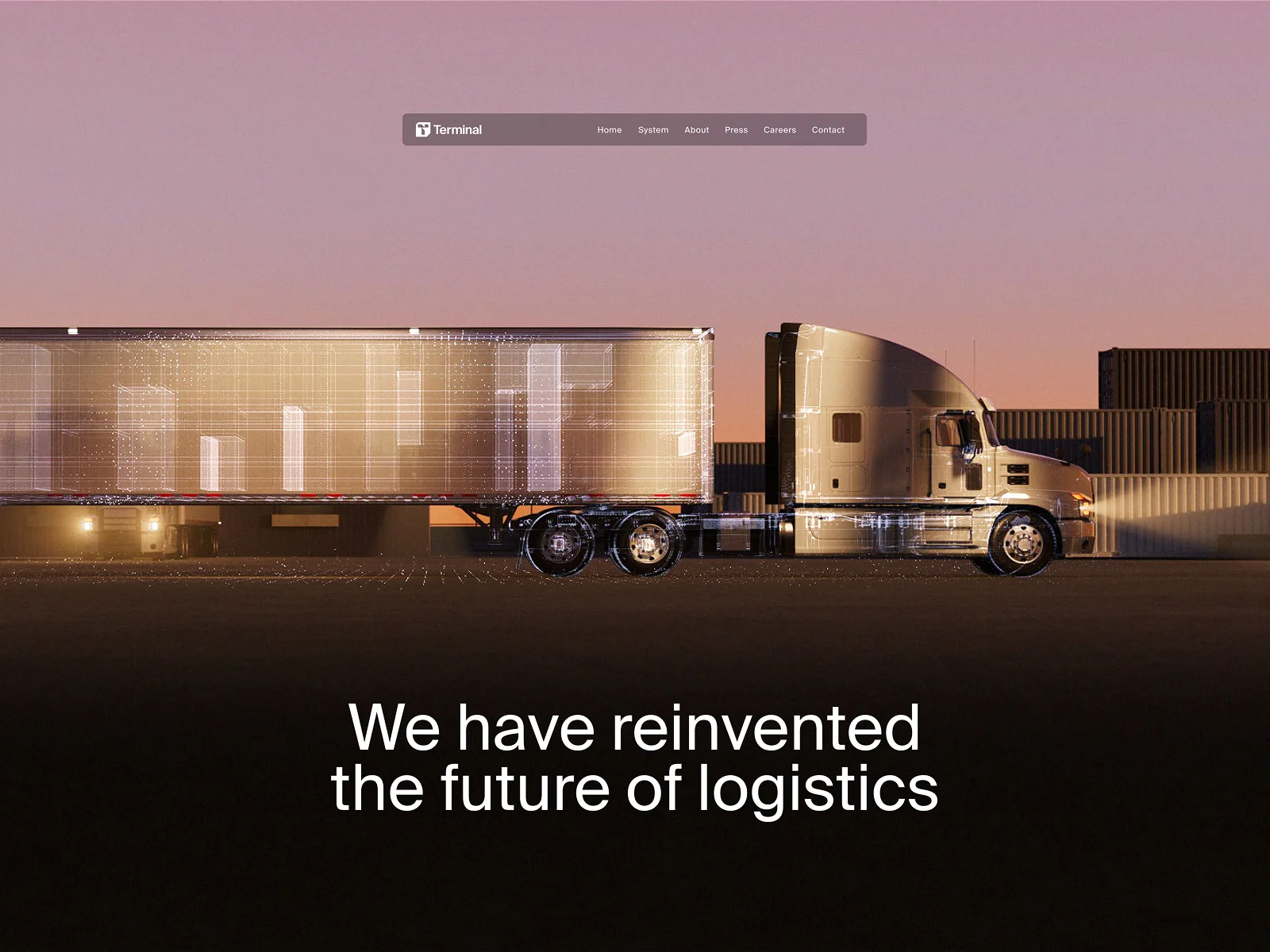
Terminal Industries brings a different industrial problem into focus: the relationship between physical logistics and software. The submitted image gives a truck almost the entire width of the screen. Fine white wireframe lines run over the trailer and chassis, while the sunset supplies a warm pink background. It is a familiar object shown with an unfamiliar layer of information.
That combination does the explanatory work. A truck alone would communicate transport. The digital overlay introduces the idea of visibility into an operation. The large logistics proposition sits in a darker area beneath it, where the text is easy to distinguish from the detailed scene. A compact navigation bar stays near the top, leaving room for the central visual.
This is a reference for manufacturers selling software-enabled equipment, monitoring or connected services. Their buyer often needs to understand the connection between something physical and something less visible. An illustration can help explain where the digital layer belongs: around a machine, inside a process or across an operating environment.
The important next step would be to connect that image with a specific explanation. What is being observed? Which person uses the information? What decision does it support? Those questions belong in the product content even when the hero answers only the first, broad question about the business. The visual suggests a relationship; it does not substantiate a measurement capability on its own.
The project is also useful as a lesson in restraint. There is a lot of atmosphere, but relatively little interface clutter in the submitted view. If your own site needs live data, configuration or a long technical description, give that material its own organised section. Let the opening establish the story, then let the evidence explain the offer.
OGURO turns precision components into a strong identity
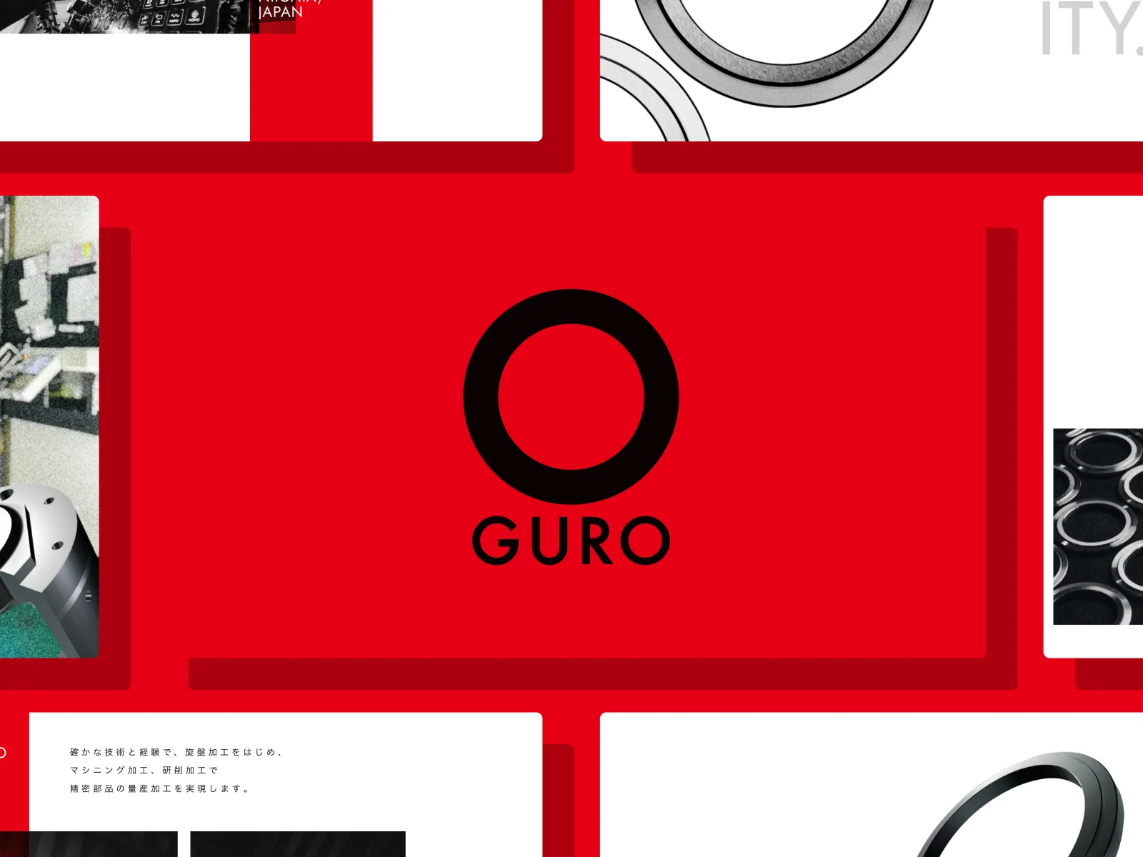
The OGURO project is a refreshing reference for a manufacturing business whose products are small, technical and easy to underestimate visually. Its Awwwards presentation is built around a saturated red field, a large black O and a collection of white panels. Inside those panels, machined rings, components and workshop views give the graphic system a clear connection to the actual business.
The metal objects do not need to be enormous installations to carry the design. Curves, holes, edges and repeated forms provide their own visual rhythm. The central O feels at home among those circular components, while the red brings a decisive contrast to the pale metal and white panels. It is a strong example of finding a visual idea inside the product category.
For a precision manufacturer, that is a useful starting point. Photograph a real surface finish, a distinctive profile or a sequence of parts with enough care and it can become the centre of the brand story. The same object can then appear in a more technical setting, with the process, material and relevant limits explained beside it. Product photography earns its place twice: first by attracting attention, then by helping a buyer recognise what the company makes.
The submitted visual is a project montage. It shows the relationship between the brand and the manufacturing imagery; it does not allow us to assess every live page or interaction. The practical recommendation is therefore specific: develop a visual language from recognisable components, then test whether that language also supports readable capability pages.
For a 2027 website brief, ask the team to show the identity on a machining capability page as well as on the opening screen. If the design survives a realistic block of process information, image captions and enquiry links, you have something more useful than a striking first impression. OGURO is our reference here for that connection between a memorable brand mark and tangible industrial material.
What the best industrial website designs have in common
These five references use different visual languages, but each begins with something recognisable about the offer. Richtech shows a robot in context. Gecko puts a physical mechanism behind its proposition. Hyperscale combines metal and a technical graphic system. Terminal gives logistics a visible digital layer. OGURO finds its identity in the geometry of manufactured parts. That relationship is what makes the inspiration useful.
The comparison also reveals why one fashionable treatment will not suit every industrial company. A bold red field can give precision components a memorable setting. A quiet modular layout can help a robotics company separate product discovery from corporate updates. A dramatic operational scene can introduce a connected service. Choose the approach that brings your own offer into focus, then develop its rules across the pages that buyers actually need.
Start with the industrial object
Before collecting interface references, collect your own material. Ask production, engineering and sales which objects or processes distinguish the company: a surface finish, a component family, a robotic movement, a testing setup or the scale of an installation. A precise creative brief gives a photographer or designer something substantial to work with. It also gives the technical team a clear opportunity to check that the resulting image represents the offer accurately.
A useful shoot list includes a wide view for context, a closer view for the distinctive detail and an explanatory view for the product page. Those images have different jobs. The wide view may establish scale; the close view may reveal a finish; the explanatory view may show the connection between components. Plan the sequence around what a buyer needs to understand, and allow the opening image to be the most expressive part of it.
Give the first screen one clear job
A homepage opening has limited room to establish the company. Decide what a new visitor should understand within that space. For a machine manufacturer, it may be the type of equipment and its application. For a component supplier, it may be the manufacturing capability and material. For an industrial software business, it may be the operation that the software helps people see or manage. Write that idea before designing its visual expression.
Then put the image, headline and primary next step together. The next step should match the proposition: explore a product family, understand a process or discuss an application. A general contact button can remain visible for visitors who already know the company. A first-time prospect often needs one more piece of information before being ready to enquire. Make that route evident rather than assuming everyone arrives with the same level of knowledge.
Let the design become quieter around technical detail
The hero and a technical specification table serve different reading conditions. A buyer comparing dimensions, materials or operating requirements needs stable labels, readable values and a clear relationship between rows. Carry the identity into that area through typography, spacing and a controlled accent colour. Save the largest visual gestures for places where they help explain the product or mark a meaningful change in the story.
Consider a precision machining company using OGURO as inspiration. Its homepage could show the geometry of a finished part at generous scale. The capability page would then explain the supported processes and materials, with approved working limits where appropriate. A drawing enquiry would carry the selected process into the form. The same visual idea can connect those stages while the information becomes more specific at each step.
Design the website and the buyer documents together
Hyperscale is especially useful for this part of the brief. Buyers may encounter a website, receive a sales presentation and pass a technical document to a colleague. A shared visual system helps those materials feel like parts of the same company. Define the relationship between headings, body text, tables, product images and document covers. Include a realistic document in the design review, using approved content rather than a few attractive sample words.
The website should also explain what a download contains. A link called “Brochure” tells a buyer much less than a link identifying the product family, document purpose, language and version. Keep the important selection information available on the page, and use the document for the depth that benefits from that format. Our guide to industrial UX for specifications, CAD and documentation explores that next layer of the buyer journey.
Give each audience an understandable route
Several of the references include corporate or investor material alongside product discovery. Your own architecture may also need careers, distributor information, service support and general company news. Map those audiences before writing the menu. The person comparing a machine and the person applying for a role can share the same brand experience while following different information paths.
A simple exercise is to write five realistic visitor tasks on separate cards: identify a suitable product, confirm a capability, find a technical document, locate support and send a qualified enquiry. Put the proposed navigation beside them. If the team disagrees about where a task belongs, resolve that structure before polishing the visual treatment. Clear names help a striking interface remain usable when the visitor moves beyond the homepage.
How to brief an industrial website redesign for 2027
Use the shortlist to start a concrete conversation with your design team. Choose one or two references and explain the specific quality you want to explore. “We like the relationship between the product image and the news panel” is a workable starting point. “Make it look like this” leaves the team guessing about which parts are relevant to your business.
The next step is to build one complete sample journey using your own content. For a manufacturer, that could run from the homepage to a capability page, then to a project example and a drawing enquiry. For a robotics supplier, it could run from an application to a product family and a relevant conversation with sales. The sample should contain genuine technical detail so the design can be assessed under realistic conditions.
Ask engineering to review product representation and capability wording, sales to review qualification and enquiry context, and the content owner to review whether the pages can be maintained. Those reviews answer different questions. A technically accurate page can still have a confusing next step; an attractive enquiry flow can still omit the information sales needs to respond. Review the whole journey with the people who will use and support it.
Keep a short decision record beside the design. State why a visual approach fits the company, which buyer task each main page supports and which content requires an owner. That record is useful when the project grows to more products, languages or brands. It gives future editors a reason for the design choices, rather than a collection of rules whose purpose has been forgotten.
For the wider preparation work, use our industrial website redesign checklist. It covers the structural issues that should be resolved before a team commits to a new visual direction. A strong reference becomes far more valuable when the underlying product information and buyer routes are ready to support it.
Review the mobile journey using the real material
Look at the opening image on a narrow screen before approving it. A wide equipment photograph may lose the very detail that makes it informative when it is cropped. Choose a focal point deliberately, or provide a separate mobile crop. If the image needs a caption to explain the important feature, ensure that caption remains close to it. The visitor should not have to reconstruct the relationship between a cropped visual and a distant paragraph.
Continue the review into the pages below the opening. Long product names, units, document titles and form labels are more demanding than neat sample text. Check a realistic technical table, a download link and the enquiry form on the same small screen. The aim is to preserve the information that helps the buyer make a decision, while adapting the layout to the space available.
Use motion to explain a process
A robotics movement, an assembly sequence or a manufacturing operation can benefit from motion. Give that sequence a defined explanatory purpose. A buyer should understand something about the product after watching it. Provide a useful still and text explanation as well, so the page remains meaningful when the sequence is paused, cannot load or is not comfortable for the visitor to watch.
The images in this selection are static reference views, so we do not use them to claim that any particular animation or live interaction works well. In your own project, review the actual sequence with the product team. Check the visible steps, the labels and the relation to the surrounding content. The same care that goes into an accurate technical photograph should go into an accurate animation.
How we selected these industrial website examples
We reviewed the available editorial visuals for each included Awwwards or Behance source and wrote the observations around what those visuals show. Four entries come from Awwwards submissions, and one comes from a Behance website and identity presentation. The selection covers industrial products and closely related operational technology, including a logistics example whose visual lesson applies to connected industrial services.
We favoured a clear relationship between the industrial offer and the design, a recognisable visual identity and a lesson that can be adapted into a manufacturing website brief. The entries are not ordered by awards, revenue or conversion rate. We did not run a complete functional, accessibility or performance audit of the referenced websites. The case commentary therefore distinguishes visible design decisions from recommendations for your own implementation.
The references also represent different moments in time. Their value here is as existing creative work for a 2027 project, with source links available for readers who want to explore the original submissions. A design can be useful without being the newest launch in its category. The relevant question is whether its underlying idea helps you explain your own product, process or capability more clearly.
Questions about industrial website design in 2027
What makes an industrial website design good?
A good industrial website gives the company a recognisable identity and helps a buyer understand its offer. The opening should make the product or capability clear. The pages beneath it should provide the information needed to assess suitability, find relevant documents and take the next step. Strong art direction is most useful when it supports that complete journey.
Should a manufacturing website use a dramatic homepage?
It can, when the image or visual idea explains something real about the business. A distinctive component, machine or process can provide the subject. Review the dramatic opening alongside a realistic product or capability page, so the team can see how the identity works with detailed content. The level of visual intensity should follow the purpose of each page.
Are these all websites launched in 2027?
No. They are existing Awwwards and Behance projects selected for teams planning a website in 2027. The title identifies the planning year. Each source link leads to the original project, and the commentary explains whether the available visual is a website view or a broader design presentation.
Can we use a Behance project as a website reference?
Yes, provided you identify what it actually demonstrates. A published design case can show typography, image treatment and a coherent brand system. It does not automatically establish that every screen is live or that a proposed feature works. Use it to discuss the design idea, then validate the real content and interactions in your own project.
What should we prepare before commissioning the design?
Prepare your priority buyer journeys, approved capability information, product imagery and a realistic sample of technical content. Identify who will approve engineering facts and who will maintain them. That preparation lets the design team test a direction against material the website will actually contain, rather than approving an attractive layout with little connection to the eventual site.
Build the website around what makes your company worth choosing
The most useful inspiration in this selection comes from the industrial material itself. Machinery, metal, movement and operating environments give these brands something distinctive to show. For your own 2027 website, begin with that substance, develop a visual idea around it and follow the buyer through the detail that comes next.
Code Industrial helps manufacturers connect identity, technical content and digital buyer journeys. Explore our approach to website design for manufacturing companies, or discuss your industrial website project with us.
Once a visual direction feels right, turn it into a priced requirement. Our industrial website cost guide for 2027 provides a quote worksheet and a worked planning example. Use it to separate design, catalogue data, integrations and launch work before requesting proposals.